| Image |
Comment |
| 10/03/2004 06:46:39 AM |
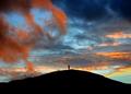
Solitudeby p_johnsComment: Gorgeous colours, it's a shame that the figure on the hill isn't clear enough. The silhouettes look oversharpened. I think the figure is looking to the left, I would have prefered them further to the right looking into the frame. Centered doesn't quite work for me. Great atmosphere evoked here though. 6 |
 Photographer found comment helpful. Photographer found comment helpful. |
| 10/03/2004 06:46:31 AM |
Rachelby dsa157Comment: Very nice portrait, the light on the right of her face is a bit too bright for my taste, we lose all the details of her complexion. Beautifully posed. I think I may have flipped this horizontally... I'm not sure I like her facing to the left in this shot. I think a closer crop may have been more effective... there seems too much negative space in the frame, especially above her. The skin tones in the shadow areas are perfect. Very effective dof, but I would have liked her right eye as sharp as the left eye. 7 |
| Photographer found comment helpful. |
| 10/03/2004 06:46:26 AM |
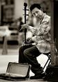
Interludeby PedroComment: Nice street candid, shot looks way oversharpened though, there's bad haloing around the instrument. B&W a good choice here. Not quite sure about your crop. I'd have him right against the right hand edge of the frame without the wall, and include more of the case. 7 |
| Photographer found comment helpful. |
| 10/03/2004 06:46:21 AM |
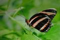
The Bearded Ladyby ellamayComment: Attractive shot, nice and sharp. Not sure about the composition though... it looks like you were trying to centre the head but didn't quite manage it. The background is too cluttered to make this a really 'wow' shot. It would be great if all the wing was in focus. Great colours. I would have gone for a much tighter crop. 7 |
| Photographer found comment helpful. |
| 10/03/2004 06:46:10 AM |
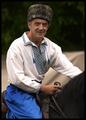
The Kozakby smokeditorComment: Great portrait, good subject. I wish the background were completely green, I find the white element a bit distracting, especially as it's the same colour as the shirt. This was a really tough exposure, and it's a shame some of the shirt is overexposed. My overwhelming impression though is that I'm waiting for him to look more dynamic... my imagination feels that we've just missed or are about to see him looking much more interesting. I feel we're missing action! 7 |
| Photographer found comment helpful. |
| 10/03/2004 06:45:58 AM |
Curves n' Linesby dinnComment: This is a great architectural view, I think I would have liked it if you had zoomed in further and made it a bit more abstract. Also, the texture is to 'bitty' for my taste. Great ratios and proportions in the composition, almost like golden mean. 7 |
| Photographer found comment helpful. |
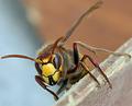
| 10/03/2004 06:45:53 AM |
The Hornetby rhipsterComment: Spectacular macro... the background doesn't quite work for me, it's too distracting especially as the change of colour cuts the hornet in half. Amazingly sharp, very deep dof for a macro such as this. It looks like you selectively blurred the foreground, and it looks a bit odd. 7 |
| Photographer found comment helpful. |
| 10/03/2004 06:45:49 AM |
Parrot Portraitureby buzzrockComment: I'm a sucker for parrot portraits, and this one's a cracker(!). The feathers aren't quite as defined as I've seen on other shots here, and it seems ever so slightly overexposed but the main thing that would have improved this in my eyes would have been to have nothing behind his beak. Above and to the right of his eye looks very blurred... did something go wrong in PS? 7 |
| Photographer found comment helpful. |
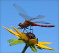
| 10/03/2004 06:45:39 AM |
Red Dragonby JackoComment: Wow. Great composition, well timed capture. I normally don't mind limited dof in a macro, but here I would have liked much more, especially on the wings. The greens could have used a bit of PS work, not quite vibrant enough here for my taste. The focus is slightly out... the eyes should be tack sharp, instead only a portion of some wings is really sharp. Not an easy shot though. 7 |
| Photographer found comment helpful. |
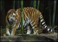
| 10/03/2004 06:45:34 AM |
Prowlin'by karmatComment: Wonderful shot, the head is nice and sharp. Shame the dof couldn't include the reast of the body. I love the bamboo. I'd definitely have gone for a tighter crop... the head is too far to the left for my taste in this shot. The foreground concrete thing really needs to go as well, it shouts 'zoo'! The perfect shot for me would have been a longer lens, with the head, upper legs and bamboo in portrait orientation. 7 |
| Photographer found comment helpful. |
Home -
Challenges -
Community -
League -
Photos -
Cameras -
Lenses -
Learn -
Help -
Terms of Use -
Privacy -
Top ^
DPChallenge, and website content and design, Copyright © 2001-2025 Challenging Technologies, LLC.
All digital photo copyrights belong to the photographers and may not be used without permission.
Current Server Time: 12/21/2025 05:23:56 PM EST.