| Image |
Comment |
| 10/08/2004 03:03:23 AM |
Peace Pleaseby SonifoComment: Sorry this didn't ribbon... I think this should have been 1st! |
 Photographer found comment helpful. Photographer found comment helpful. |
| 10/08/2004 02:58:43 AM |
|
| Photographer found comment helpful. |
| 10/04/2004 07:18:17 AM |
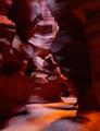
Slot Canyon by ArtifactsComment: Oh wowowowowowow... I've seen plenty of good photos of this place, but this just blows them all away. Absolutely incredible. |
| Photographer found comment helpful. |
| 10/04/2004 07:14:56 AM |
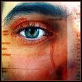
Photoreceptionby JPRComment: Simply stunning, and with a 602! I love your other recent urban work... you're on a roll! Message edited by author 2004-10-04 07:15:55. |
| Photographer found comment helpful. |
| 10/03/2004 06:48:17 AM |
The Guitaristby timj351Comment: I don't see any guitarists here. I'm not into your crop, I'm not sure where you intended the pof to be. Grain in b&w gig shots can work very well, but it hasn't done it for me here, maybe because there isn't enough tonal contrast here for my liking. There is loads of contrast on the arm though, but this stands out too much against the rest of the picture. I feel that the face is where I want to rest, and it's just not clear enough here. I think that the bass player would have looked like this throughout the entire gig, and you haven't captured him at a key moment. 4 |
| Photographer found comment helpful. |
| 10/03/2004 06:48:12 AM |
Granite Totemsby rcrawfordComment: Nicely polarised sky... not much here to keep my interest though. Looks like it was composed with rule of thirds in mind... but other than that I'm not quite sure what you were wanting to achieve with this. Some VERY bad JPEG artifacting... the photo is only about 90k, you could have saved a 150k file. 4 |
| Photographer found comment helpful. |
| 10/03/2004 06:48:03 AM |
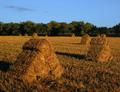
Haystacks - A Tribute to the Impressionist Masterby ColeyComment: I'm not really a fan of Monet's haystacks... maybe this is why when I look at this photo and admire the long shadows and rich colours I wish I were there to point my camera at something else! The haystacks don't really stand out enough against the ground for the composition to really 'wow' me, and it's a shame the wispy clouds on the left don't really add much interest to the sky. The greens in this photo are a bit dull... I'd have livened them up a tad in PS. I think the main problem with the composition is that there is no clear POF... my eye doesn't really know where to settle and where to flow to. 4 |
| Photographer found comment helpful. |
| 10/03/2004 06:47:58 AM |
"Back" Cover Girlby DougPazComment: This must have taken you a few goes to integrate the magazine with your model so flawlessly. I have to say though that this photo doesn't really do a lot for me... I see a well taken snapshot. I don't know why, but the edge of her left arm is grey... what did you do in PS that resulted in this?! 4 |
| Photographer found comment helpful. |
| 10/03/2004 06:47:52 AM |
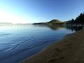
First Lightby autoolComment: Nice shot, reminds me of one of my shots from Scotland(!). Horizon well placed, breaking the frame into 3rds. Left hand edge of frame is too burnt out for my taste, and I don't like foreground diagonal leading my eye out of the right hand side of the frame. The foreground textures look a little soft... some sharp sand textures could have added some 'wow' to the shot, if you're using a DSLR you probably would have needed a tripod for the dof. Horizon on the right of the shot looks a bit cluttered. The footsteps are a nice touch, but are a bit too subtle. Some dodging and burning could have cured this. The sky could have done with a polariser, which may have solved your burnt out highlights. 5 |
| Photographer found comment helpful. |
| 10/03/2004 06:47:48 AM |
The Beaconby alanfreedComment: This shot doesn't really do a lot for me... it's the composition that I feel really lets this down. The Beacon looks like it just happened to end up somewhere near the middle of the frame, and there is no clear pof... there are too many cluttered distracting elements here. The foliage looks oversharpened. I like the fact that it looks like you used a polariser. 5 |
| Photographer found comment helpful. |
Home -
Challenges -
Community -
League -
Photos -
Cameras -
Lenses -
Learn -
Help -
Terms of Use -
Privacy -
Top ^
DPChallenge, and website content and design, Copyright © 2001-2025 Challenging Technologies, LLC.
All digital photo copyrights belong to the photographers and may not be used without permission.
Current Server Time: 06/24/2025 01:34:44 PM EDT.