| Image |
Comment |
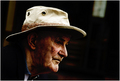
| 08/08/2007 03:35:52 PM |
- Candid Character Study -by kevrobertsonComment: As one of your 15 highest votes, I saw this as an interesting portrait that captures character and sets a mood, but I also thought the darker face shadows hide detail that would have been good to have.
No comment from me during voting partly because I am a newcomer and was still trying to calibrate myself in voting (being clear internally about why I think what I think makes it easier to be constructive). As the recipient of some helpful comments already, I appreciate how useful they can be. |
 Photographer found comment helpful. Photographer found comment helpful. |
| 08/08/2007 10:28:04 AM |
Amusement @ the Fairby annigComment: I usually avoid going on that ride because it makes me feel exactly like that image. The blur reveals just enough identifiable elements to convey a story given the explanation, but it works pretty well as an abstract too. Message edited by author 2007-08-08 10:28:31. |
| Photographer found comment helpful. |
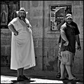
| 08/08/2007 12:20:13 AM |
"Take a look at the guy"by AranchaComment: When this one popped up during voting, I laughed out loud. Great fit with the title. And nicely done black and white conversion. I had it in my top ten for this challenge, and still do. |
| Photographer found comment helpful. |
| 08/08/2007 12:16:48 AM |
I Am Waitingby JudiComment: Excellent shot, and even more appreciated finally getting to see the notes about how you got it. Can't understand why the average rating wasn't higher - I put it easily in the the top 10 for sharpness, composition, and fitting the theme. |
| Photographer found comment helpful. |
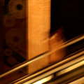
| 08/07/2007 11:39:12 PM |
day 6 - going-up croppedby GinaRothfelsComment: Interesting. Removing the brighter stuff on the left in the original helps make this more dramatic to my eyes. Having the upright post appear a lot thicker this time catches me by surprise, and seems to reduce the sense of motion. I see that you are keeping a square crop, but I wonder why. Cropping the original to a vertical rectangle might keep the post looking thinner, and allow the gold diagonals to be longer, but at the price of giving up the square format. Still, I like both versions, each in its own way. |
| Photographer found comment helpful. |
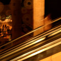
| 08/07/2007 09:10:38 PM |
day 6 - going upby GinaRothfelsComment: I like the diagonal gold lines and the strong upright support beam. The woman is just blurred enough and nicely separated from the beam. When I hold my hands up to the image, I think it might be even stronger with the left side cropped just enough to remove the rectangular bright area (display window?), which seems to detract from the main elements, and perhaps to remove half of the yellow triangle in the lower right (which becomes a bit more distracting after cropping the left, although I'm less confident about this). As a newcomer, I feel a bit of hesitation weighing in with any suggestion about an image posted by one who has so many excellent works and high scores. But sometimes new eyes see things differently because of not being there when the image was captured. I'm not suggesting you change your post again, but you might make those changes in a second version just to see if they work for you. |
| Photographer found comment helpful. |
| 08/07/2007 06:13:17 PM |
The World As I See It IIby levyj413Comment: I like this one much more than the other version, I think because of the colors and because of how well the elements hang together. The dark background makes an excellent contrast and sets off the gold tones well, the effect of colored balls (like party lights) contrasts with an obvious street setting, focused shapes through the glasses contrast with blurry shapes outside of the frames. This could be put into a teaching file as example of how a photographer can translate an rather mechanistic intellectual concept for an image into an artistic rendition. |
| Photographer found comment helpful. |
| 08/07/2007 12:09:06 AM |
|
| Photographer found comment helpful. |
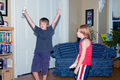
| 08/06/2007 11:41:58 PM |
A "Wii" ACEby QuigleyComment: The expressions capture it all, fitting the challenge so well that I went up a level in scoring despite the technical limitations. Besides, you have to grab the picture in the moment, so you probably didn't have had time to set up more elaborate lighting or even diffuse the flash. |
| Photographer found comment helpful. |
| 08/06/2007 11:16:41 PM |
Spider's Spinnakerby annigComment: Peaceful and flowing, with just enough of the web in focus to make it more interesting. Nicely done. |
| Photographer found comment helpful. |
Home -
Challenges -
Community -
League -
Photos -
Cameras -
Lenses -
Learn -
Help -
Terms of Use -
Privacy -
Top ^
DPChallenge, and website content and design, Copyright © 2001-2025 Challenging Technologies, LLC.
All digital photo copyrights belong to the photographers and may not be used without permission.
Current Server Time: 08/04/2025 08:24:27 PM EDT.