| Image |
Comment |
| 04/06/2010 01:20:47 AM |
|
 Photographer found comment helpful. Photographer found comment helpful. |
| 04/06/2010 01:16:33 AM |
|
| Photographer found comment helpful. |
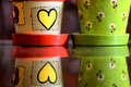
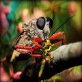
| 03/30/2010 07:56:49 PM |
caught by the boogeyman reEditby rozComment: Focus looks a lot sharper on the original more. Since the subject is an insect, and you are Roz, it needs to be sharper. Detail makes the whole photo. Try USM and I'll fav this 1,000,000 x over! |
| Photographer found comment helpful. |
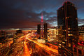
| 03/24/2010 11:40:46 PM |
Toronto's Event Horizon by wolfComment: I actually like the light in the sky. Great work. New fav, and I don't fav often. In my opinion, this deserved blue ...no offense to  Brent_S Brent_S. |
| Photographer found comment helpful. |
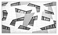
| 03/24/2010 11:38:21 PM |
Windows by ThingFishComment: That table and stool in the middle window just makes the whole photo for me. Nice job, congradz on Blue! |
| Photographer found comment helpful. |
| 03/20/2010 05:04:23 PM |
To dawn, Eos greets Helios.by wingyisleedsComment: Greeting, from the Critique Club! :D
I don't really have much to say here except... include something other then an orange gradient in your photo? If that is any help. Your score was so low because you got 11 "1's" from people who understood that what you submitted could be made with the gradient tool and dodge tool in photoshop in under 5 minutes. Wish I could be more helpful.
- ColemanGariety
The DPChallenge Critique Club |
| Photographer found comment helpful. |
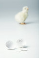
| 03/14/2010 03:19:50 PM |
Escapeby shankswareComment: The egg is a little bright. Maybe its my screen but it blends in with the background too much for my taste... |
| Photographer found comment helpful. |
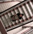
| 03/07/2010 08:48:49 PM |
Midwayby angkokwengComment: Feedback from the Critique Club! :D
This is VERY strange work! the guy on the stairs is really what makes the photo click. It's a tad blurry but maybe that's just me being picky. I really like the tones on the bottom floor in the bottom-right corner of the photo, and I wish the entire photo had that lighting. Even though looking at this photo makes me want to crank my head to the side, I still love it. great work! Not much else to say here except keep it up!
- ColemanGariety
The DPChallenge Critique Club |
| Photographer found comment helpful. |
| 03/07/2010 08:38:19 PM |
Radha Krishna - The real loveby amateurboiComment: Feedback from the DPChallenge Critique Club! :D
First of all, this is quite a charming subject, but since the entire photo has a lack of quality, and it wayyyy out of focus, it's hard to really connect with the image. This is quite an interesting setup, however you can't really see the feet of the figures and the rest of the image is filled with a low-detail background. The colors don't really work correctly here and those are the reasons why you didn't get above a 4.5 Lastly, almost always, you want your subject to be facing out into the largest portion of the photo. Like this. Photographers do this because it gives the eye the ability to fill in the rest and complete the tapestry of art the photography communicates. Cropping in a little harder on the right would set this photo to compositional correction. Otherwise, good eye for composition.
I wish I could be more helpful but I just don't see what else to fix in this photo. From your profile I can tell you have a good eye, but I just don't see that in this photo. I hope I was helpful! Message me with any questions you have.
- ColemanGariety
The DPChallenge Critique Club |
| Photographer found comment helpful. |
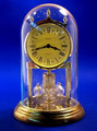
| 03/07/2010 08:26:29 PM |
Time In A Bottleby e10icusComment: Here's your critique and feedback from the DPChallenge Critique Club...
This is a very interesting shot indeed. First of all, your subject is great, no flaws there, and this could be done very well. The biggest problem I see is your background. Truthfully! It's just blue! I'd like to see something more interesting like a guy looking into the clock, or maybe just a plain white background. Second, I don't really feel that color ads much here, I'd love to see a high-contrast version of this in B&W if possible. And third, The dirty glass and the reflections on it just take all the rest out of the photo. if you could have captured that glass in a more pristine way, and found a background that better suits the subject, you would've gotten a MUCH higher score. Hope that was helpful! :D
- ColemanGariety
the DPChallenge Critique Club |
| Photographer found comment helpful. |
Home -
Challenges -
Community -
League -
Photos -
Cameras -
Lenses -
Learn -
Help -
Terms of Use -
Privacy -
Top ^
DPChallenge, and website content and design, Copyright © 2001-2025 Challenging Technologies, LLC.
All digital photo copyrights belong to the photographers and may not be used without permission.
Current Server Time: 07/30/2025 04:12:42 PM EDT.