| Image |
Comment |
| 03/31/2004 10:45:43 AM |
|
 Photographer found comment helpful. Photographer found comment helpful. |
| 03/24/2004 06:19:33 PM |
Parentingby sagestudioComment: This is a great looking lil kid, she looks spunky and cool, it is a great shot, fun perspective. One of my top 10 for this challenge. well done. |
| Photographer found comment helpful. |
| 03/24/2004 04:54:40 PM |
Photo by DrJOnesComment: You have captured that deranged model/sultry innocence mag cover look very well with this image. good use of black and white tones. |
| Photographer found comment helpful. |
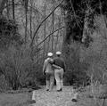
| 03/24/2004 04:53:14 PM |
The Golden Years - Springby zeuszenComment: This is a classic. The naturally curved branches, the detail, the tonal range. The natural pose and ordinariness of the subjects with their matching hats is wonderful, this looks like a shot where every detail was planed and set to enhance and highlight every other aspect of the shot. The couple ooze a mature emotion/connection to each other and the world around them. Perfectly executed , wonderful work. |
| Photographer found comment helpful. |
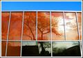
| 03/24/2004 12:57:41 AM |
Reflectionsby flip89Comment: This shot has a lot of appeal to me, but I really wish it were a much tighter crop, no blue and less on sides, I think you really saw something neat here. I would love to see some retakes or edited with the tight crop. |
| Photographer found comment helpful. |
| 03/22/2004 11:19:40 AM |
The Girl With A Pearl Earringby sherComment: Hi sher, this is a wonderful reproduction, I can't believe how much your niece looks like the girl in the painting!! You did a great job with the costume, lighting and challenge, this was one of my 2 picks for blue. Wonderful, wonderful job. |
| Photographer found comment helpful. |
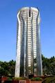
| 03/17/2004 02:50:47 PM |
Up in Flamesby tyt2000Comment: Greetings from the CC. Great building, well captured. Nice sharp clear image. The 'flames' are wonderful.
My only possible critiques are: one the building looks slightly tilted to the right. But it could just be the way the flame on the right sticks out. ANd the shot may have worked well with the building being composed a little bit more to the tright vs. a central crop. I really like the red brick in the front to add some color to it. Well done. Keep shooting! |
| Photographer found comment helpful. |
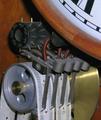
| 03/17/2004 02:36:48 PM |
Old School Clockby PoobaComment: Greetings from the CC, technically a well done shot, that fits the challenge an interesting detail and look at a subject. I think this sort of shot is a good historical documentation of a subject. I think you used the points of more general interest to draw the viewer to a subject that is not such a 'generally' interesting shot. I think that is a unique skill. It is effective at drawing us in. Well done, keep shooting!! |
| Photographer found comment helpful. |
| 03/17/2004 10:27:19 AM |
Did you see that?by simbambaComment: this was one of my favorite shots of the challenge I would love it if you told us where how shot it, how did you get white background? |
| Photographer found comment helpful. |
| 03/16/2004 02:12:10 PM |
"Technical Silence"by middelboschComment: Hi greetings from the CC. I like the composition of your photo, and it certainly meets the challenge. I wish the black was not quite as dark. My biggest struggle with this shot is that it is challenge limited (tho i suppose it could be for hearing aid company). I think the challenge topic makes for shots that only hold interest in a very limited way.
I think otherwise your lighting is well done, it is sharp and well composed.
Hope that helps a little.
lynn |
| Photographer found comment helpful. |
Home -
Challenges -
Community -
League -
Photos -
Cameras -
Lenses -
Learn -
Help -
Terms of Use -
Privacy -
Top ^
DPChallenge, and website content and design, Copyright © 2001-2025 Challenging Technologies, LLC.
All digital photo copyrights belong to the photographers and may not be used without permission.
Current Server Time: 08/13/2025 11:37:51 PM EDT.