| Image |
Comment |
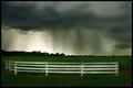
| 08/23/2005 10:20:18 AM |
A Storms Serenity by shabbychicComment: First, congratulations on your ribbon. I find curtains of rain quite interesting.
I'm sure the gloominess of the image is probably what you were going for however I am feeling the image is slightly under exposed as I think the fence should be white rather than a shade of grey (I'm just guessing though). Selecting a point on the fence as the white point when applying curves would be a way of getting the fence to show more as white. Just a thought.
Keep shooting. |
 Photographer found comment helpful. Photographer found comment helpful. |
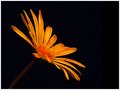
| 08/22/2005 11:49:45 AM |
Yellowby RikkiComment: What works: colour and background, great contrast
What doesn't work: Even though the stem is coming from the corner and leading the eye into the image I feel that there is too much stem and the flower itself should be placed more in the lower left of the image.
Also, the image feels a little soft on focus and possibly slightly underexposed though strong colours are hard to get right, mainly reds and yellows of which orange is a derivative. |
| Photographer found comment helpful. |
| 08/20/2005 04:03:42 PM |
1957by KaDiComment: This image would make a very good high key image and has a good start to that end. However, I believe the transition between bright and dark areas of the image is way too harsh giving it the feel of overexposed rather than high key.
IMO, for high key to work all important detail should still be present with a nice even flow from bright to dark kind of like fading. |
| Photographer found comment helpful. |
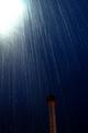
| 08/16/2005 05:54:48 PM |
The breakby rameviComment: I like the perspective however I feel it needs more contrast. Using curves and using the white and black point droppers may help in that regard. |
| Photographer found comment helpful. |
| 08/16/2005 03:49:03 PM |
Hard Rain Over Coney Islandby Nikolai1024Comment: The composition seems to work however the bright area in the top left is very distracting as is the underexposed tower. Exposing more for the tower and cropping out the upper left corner I think would have worked better. |
| Photographer found comment helpful. |
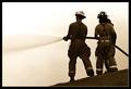
| 08/10/2005 03:25:48 PM |
Between Bright and Darkby tonyvComment: Totally agree with phinbob's assessment of this image however I feel that the sense of depth in the image could be exploited more if the image was horizontal rather than vertical. |
| Photographer found comment helpful. |
| 08/10/2005 12:11:01 AM |
Feline Eyesby jenesisComment: He's saying 'Don't Mess With Me'. Good colour and contrast. Maybe a little too shallow on the DOF. |
| Photographer found comment helpful. |
| 08/09/2005 11:27:19 AM |
Trist Fallsby JeremyFleuryComment: What works: colour though saturation of the red bridge could probably be increased, flow of the water, contrast and texture
Very serene.
What doesn't work: horizon seems slightly tilted to the left, dead weeds in the foreground are a bit distracting, focus seems a little soft Message edited by author 2005-08-09 11:27:47. |
| Photographer found comment helpful. |
| 08/03/2005 10:01:32 AM |
|
| Photographer found comment helpful. |
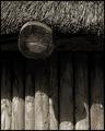
| 07/28/2005 11:19:47 AM |
Hutby aznymComment: The change in lighting is probably a bit too drastic between the lit part at the bottom and the shaded area. If it were more gradual, leading to the texture of the roof area I think it probably would have done better. On some monitors there may have been no detail to be seen in the middle. |
| Photographer found comment helpful. |
Home -
Challenges -
Community -
League -
Photos -
Cameras -
Lenses -
Learn -
Help -
Terms of Use -
Privacy -
Top ^
DPChallenge, and website content and design, Copyright © 2001-2025 Challenging Technologies, LLC.
All digital photo copyrights belong to the photographers and may not be used without permission.
Current Server Time: 08/16/2025 03:19:58 AM EDT.