| Author | Thread |
|
|
07/28/2005 11:19:47 AM |
|
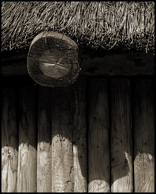
The change in lighting is probably a bit too drastic between the lit part at the bottom and the shaded area. If it were more gradual, leading to the texture of the roof area I think it probably would have done better. On some monitors there may have been no detail to be seen in the middle. |
|
 Photographer found comment helpful. Photographer found comment helpful. |
Comments Made During the Challenge  |
|
|
07/26/2005 07:04:18 PM |
|
Because of the bold use of light and shadow, I was very impressed with this piece. Wonderful texturing on that roof. No mistake as to what it feels like. One of my top 10 favorites of this week. |
|
| Photographer found comment helpful. |
|
|
07/26/2005 06:50:48 AM |
|
This is a very appealing composition; balanced asymmetry! The shadow of the log end is especially good. And the image showcases the several textures effectively. Also a finely judged exposure, given the tonal range you've managed to capture. Plus it's B&W ... Bravo! 8 |
|
| Photographer found comment helpful. |
|
|
07/22/2005 01:02:31 PM |
|
More saturation would help. Lighten the shadow area....levels. |
|
| Photographer found comment helpful. |
Home -
Challenges -
Community -
League -
Photos -
Cameras -
Lenses -
Learn -
Help -
Terms of Use -
Privacy -
Top ^
DPChallenge, and website content and design, Copyright © 2001-2026 Challenging Technologies, LLC.
All digital photo copyrights belong to the photographers and may not be used without permission.
Current Server Time: 06/29/2026 09:10:58 PM EDT.