|
|
| Image |
Comment |
| 04/25/2005 07:46:44 AM | |  Photographer found comment helpful. Photographer found comment helpful. |
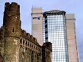
| 01/26/2005 05:39:07 AM | Symbols of Powerby Toby-DogComment: Nicely done, and good contrast between the two buildings. And if I'm not mistaken, this looks very much like Swansea... | | Photographer found comment helpful. |
| 12/13/2004 05:07:21 AM | Pride of London by ImagineerComment: I shoulda know that your shot would do this well, you lucky lucky git :o) Seriously, congrats on a great shot. | | Photographer found comment helpful. |
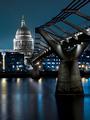
| 12/08/2004 06:05:05 PM | Pride of Londonby ImagineerComment: Woah, as the photographer of 'Saint Pauls', I think I recognise this location ;) Interesting choice of colours, esp the B&W cathedral, and the long(ish) exposure helps soften that water nicely. Good to see such good photos of London in this challenge :)
ROFL, thanks for the comment ;) | | Photographer found comment helpful. |
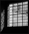
| 04/02/2004 03:50:01 PM | Old Panesby KaveyComment: I think I've seen this one somewhere before... :o) The mood of the shot and the patterns of light are great - makes it looks like a sunny day as viewed from a dark room. Wonder if you can spot my entry ;o) | | Photographer found comment helpful. |
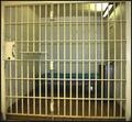
| 03/20/2004 10:13:25 AM | Parallel Barsby DanBennettComment: Lots of parallel lines in this shot, no doubt about that! Just a few suggestions - given that this shot is very yellow due to the lighting, it might have helped to make this one b&w, to bring out the textures. Also, some levels adjustment (bit more highlight, bit less midrange) would also help contrast the bars against a darker cell. Hope this helps! | | Photographer found comment helpful. |
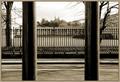
| 03/18/2004 05:23:38 AM | .by KaveyComment: This one looks familiar.. The foreground bars definitely give this shot impact, and the DoF is nice. Pity the clouds above the observatory come out as flat, but we couldn't control the weather ;o) Why call it '.' though? | | Photographer found comment helpful. |
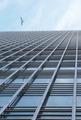
| 03/17/2004 12:21:59 PM | Into The Blueby gandersComment: I remember you taking this shot, and Kavey shouting about the bird :o) Coincidentally, this is the same building as the one in my entry! Good shot overall, but might have benefitted from a bit more postprocessing, esp focus and levels (the bird is a bit blurred, and the colours could be a tad richer). | | Photographer found comment helpful. |
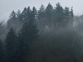
| 01/26/2003 09:40:42 AM | Misty Mountainby SwashbucklerComment: Critique Club comment :o)
Composition:
There are two main lines of trees to this shot - the darker ones slightly to the foreground, and the misty slightly lighter ones in the background. However, since the shot is so gloomy, its very hard to tell them apart, so the depth that the mist should have given is mostly lost.
The trees and mist fill the frame well, but there's no focal point or points in the image, so the eye tends to just wander around, rather than going to any particular point. The lines of the shot are good, but I feel that the shot could do with a bit less of the bottom of the frame, and a bit more sky, which would at the same time put the tree lines on the RoT lines.
Background:
The background is an integral part of this landscape, so I can't say much more than I did in the above.
Camera Work:
The focus and DoF seem reasonable on this shot, considering that its a foggy / misty scene, but without specific camera details (Aperture, ISO, Shutter) I can't really say much more.
Post Processing:
Since you've not provided any details, I can only guess as to the post processing you've done, if any. One important thing to mention is that this shot is only 108Kb, out of a maximum 150Kb, therefore you may have lost a bit of detail by compressing the image down to that size - I always recommend that you try to get as close to the 150Kb line as possible, so that as little detail as possible is lost.
Since this shot is so gloomy (due to the mist), it may have been worth adjusting the levels to get a bit more contrast between the foreground trees and the background trees, which would add more depth to the shot. Also, given that this photo is nearly monochrome, perhaps making it a b&w shot would have helped make it feel more misty.
For an example of what I mean, I took the liberty of downloading and post processing this image myself - you can see the finished result here (I appreciate that this is your copyrighted material, so please PM me if you want me to remove this image from my website).
My Opinion:
I personally think that this shot meets the "landscape" challenge, but it definitely doesn't do anything more than that. The general gloom and lack of any real focal point means that there's nothing in the shot to get interested in, which makes this a below average to average shot.
If you have any questions about this critique, please feel free to contact me via the PM system. | | Photographer found comment helpful. |
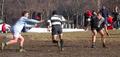
| 01/25/2003 03:39:43 PM | Rugby: Ballet for Blokes.by catpixelComment: Critique Club Comment :o)
Composition:
The positioning of the players within the frame is great, and it definitely capures the moment well. The framing and wide aspect crop helps a lot, as it draws the viewers' attention to the players. Unfortunately you'd can't see the ball in this shot, so it makes it slightly trickier to work out what's going on at first glance - viewers will probably either be drawn in by this mystery, or pass over it.
Background:
With this sort of action shot, it's always difficult to control what exactly ends up in the shot when you take it. The background is probably a bit too busy, since it distracts from the players - perhaps a different position or angle would have helped, but since you're in a busy Central Park, its hard to say :o)
Camera Work:
I'd guess that this shot was was taken using full zoom, and probably digital zoom too - I personally never use digital zoom, since it lowers the quality of the shot and gives you less control than just cropping it afterwards. The focus on the players is good, but perhaps a shallower DoF would have helped blur the background a bit, making the players stand out more.
Post Processing:
Since you've not provided any post processing details, I've no real idea if you've done much to this shot. One important thing to mention is that this shot is only 86Kb, out of a maximum 150Kb, therefore you may have lost quite a bit of detail by compressing the image down to that size - I always recommend that you try to get as close to the 150Kb line as possible, so that as little detail as possible is lost.
One suggestion I have for this shot would be to play about with the saturation & colour balances, since this shot could probably do with being a bit more green and a little less blue, which would make it seem a little warmer and improve the contrasts a bit (even if it wasnt a warm day ;o).
My Opinion:
I'm a Brit myself, so I know what Rugby is :o) Out of curiousity, do you know if they were playing Rugby League or Rugby Union? Anyway, this is a good action shot, well composed, and as such I quite like it. However, it's definitely borderline as to whether it meets the "humor" challenge, and is only really saved by the title. Overall I'd rate it as an above average shot, but its not right for the challenge.
If you have any questions about this critique, please feel free to PM me about it. | | Photographer found comment helpful. |
Home -
Challenges -
Community -
League -
Photos -
Cameras -
Lenses -
Learn -
Help -
Terms of Use -
Privacy -
Top ^
DPChallenge, and website content and design, Copyright © 2001-2025 Challenging Technologies, LLC.
All digital photo copyrights belong to the photographers and may not be used without permission.
Current Server Time: 08/21/2025 08:57:43 AM EDT.
|