| Image |
Comment |
| 06/12/2006 04:15:00 PM |
|
 Photographer found comment helpful. Photographer found comment helpful. |
| 06/12/2006 04:13:54 PM |
tag.... you're it!by margiemuComment: I think the capture of the shadow is very interesting. I might have taken this further and cropped for just the shadows, eliminating the chidren, or maybe just included their feet and legs. I really dislike the dirt backgroundIt's very distracting. |
| Photographer found comment helpful. |
| 06/12/2006 04:09:37 PM |
Shadows, color and textureby AndrewTOComment: I like the color a lot. I'm not too sure if the rest is quite gelling for me as a creative visual statement. I think I would like this better [iwithouti] the shadows actually. The shadow create more distraction then asthetic appeal for me. |
| Photographer found comment helpful. |
| 06/12/2006 04:07:16 PM |
Shadow Of A Doubtby GeneralEComment: Clever...I'm not really seeing this as a photograph though. It looks more like digital art or design to me. |
| Photographer found comment helpful. |
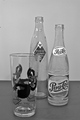
| 04/24/2006 02:01:47 PM |
Old Glassby meyersComment: This looks like a ebay listing to me. Not much thought seems to have gone into the background and setting. There isn't much of a visual connection between the old bottles and the glass. |
| Photographer found comment helpful. |
| 04/24/2006 01:57:56 PM |
|
| Photographer found comment helpful. |
| 04/24/2006 01:55:36 PM |
Stop Motion by Minoltaby MAKComment: I really like the idea of this shot but her face looks weird right behind the camera like that. The way the camera is covering her mouth it looks like it is stuck to her face or she is eating it or kissing it or something. It's just an awkward capture, IMO, which is a shame because there was obviously a lot of thought that went into this and there most have been many shots to choose from. This seems like an odd choice to me. |
| Photographer found comment helpful. |
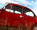
| 04/24/2006 01:51:50 PM |
Ole' # 9by yetiComment: This is a good subject but it seems to lack sharpness. I think I different angle would have worked better---something that shows more of the peeling paint and perhaps eliminates the weeds in the foreground which don't add much. This crop feels very cramped to me. |
| Photographer found comment helpful. |
| 04/24/2006 01:47:26 PM |
|
| Photographer found comment helpful. |
| 04/24/2006 01:43:17 PM |
Old Friendby GoodEndComment: The focus is a bit fuzzy in the torn area which is where you really want to see sharp detail. the background material is bad---it looks random and adds distracting texture and detail. |
| Photographer found comment helpful. |
Home -
Challenges -
Community -
League -
Photos -
Cameras -
Lenses -
Learn -
Help -
Terms of Use -
Privacy -
Top ^
DPChallenge, and website content and design, Copyright © 2001-2025 Challenging Technologies, LLC.
All digital photo copyrights belong to the photographers and may not be used without permission.
Current Server Time: 08/23/2025 01:57:41 PM EDT.