| Image |
Comment |
| 08/09/2004 12:31:33 PM |
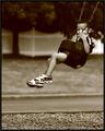
Growing Upby pitsamanComment: While there are feet in this shot, they really don't play a creative role. The main subject is obviously the boy on the swing and not his feet. Challenge aside, the shot is okay in terms of exposure and sharpness but the capture isn't very compelling. We can't really see his expression as his face is obscured by his hand and the chain. As an action shot it is very static. I don't get the feeling of joy and exhilaration of being on a swing. |
 Photographer found comment helpful. Photographer found comment helpful. |
| 08/09/2004 12:27:47 PM |
|
| Photographer found comment helpful. |
| 08/09/2004 12:16:18 PM |
Feetby JiaBobComment: The pink stuff in the background is distracting. I kind of like the yellow. |
| Photographer found comment helpful. |
| 08/09/2004 12:15:10 PM |
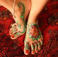
Painted Mandalaby RoosterComment: This needs a simpler background which doesn't compete with the painted designs. A sandy beach would have been appropriate.
Edited post-voting Hi there...I'm sorry my comment was kind of blunt and overly critical sounding.
My feelings about this image were that her feet were gorgeous and the painting was beautifully done but the rather busy carpet tends to compete with the painted elements. My instinct was that you chose the carpet to enhance the Eastern theme of the mandala and I should have made it clear that I was aware you had made a specific choice. My opinion is that an outdoors, natural background (my instinct says sand or sand and water) would have emphasized the organic,free-spirited quality of the woman who belongs to these lovely feet. Message edited by author 2004-08-20 14:28:53. |
| Photographer found comment helpful. |
| 08/09/2004 11:59:31 AM |
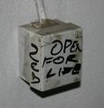
Electricityby runarComment: Hello from the Critique Club!
Hmmm....this is a challenging image for a Critique Club evaluation. At first glance, this is a very mundane subject. My guess is what captured your attention was the writing which appears to read "Open for Life". This certainly raises questions, the first being, "Did they mean to scribble, "Open for light?" Beyond this bit of interest, try as I might, it is hard to connect with this photo on an asthetic or emotional level. It seems to be a very literal documentation of an electrical box. There is very little in the way of form, color, or tonal contrast to create an interesting viewing experience. It is possible that a straight ahead shot of the front of the box would create a flattened, more abstract viewing plane and make the phrase, "open for life" the main focus. |
| Photographer found comment helpful. |
| 08/09/2004 11:33:12 AM |
Data Storageby menardmamComment: Hi there from the Critique Club!
Hmm...this one is a bit difficult for me. The subject matter is not something that I found visually interesting or appealing but that is a somewhat subject opinion. Obviously, judging by some of the comments, other people found this a highly interesting subject.
From a technical standpoint, the focus is sharp and the lighting is such that very few distracting glares or reflections were created. The cropping is tight so that there is very little to distract the eye from the main subject. I would suggest that the dust on the black base should have been wiped off before shooting. I wish
I could offer a more in-depth critique then this but, frankly, this just isn't the kind of image or subject that provokes an emotional response in me or raises any interesting questions. It clearly documents an object that I use but never see. That is about as far as this photo takes me. |
| Photographer found comment helpful. |
| 08/09/2004 11:18:02 AM |
On the Window Sillby adineComment: This was an image I kept coming back to. It displays the wonderful trickery of photography. This is due to the infinite DOF. All the objects are at equal distance in the viewing plane. My eye is seeing an impossiblity which creates a moment of pure confusion until my brain catches up. This two-dimensionality was precisely what fascinated some of the great early landscape photographers. It is clear you made a deliberate choice when you framed your image this way. You could have gone for a conventional still-life POV and still had a nice image but I find this approach for more interesting and humourous. The only thing I might suggest is cropping out the area of shadow at the top of the frame which adds a bit of depth and detracts a bit from the flat, abstract quality. Very strong graphical image which I enjoyed immensely. It was one of my favorites from this challenge.
Thanks for sharing it. |
| Photographer found comment helpful. |
| 08/09/2004 10:52:36 AM |
Peppercorn Blendby OneSweetSinComment: Hi there from the Critique Club!
This was an interesting choice for a Macro challenge. It reveals a desire to achieve something original (oddly, I toyed with the idea of vari-colored peppercorns myself). You don't mention what you were aiming for so I'm going to evaluate this based on the assumption that you were going for a flat, graphic quality rather than a more three-dimensional study. If this is the case, you were fairly successful. There are no distracting glares or hot-spots to interfere with the pattern created by the peppercorns. There are shadows but they are compressed and black enough to work as a sort of outline throughout the design. The white peppercorns at first seem rather distracting but a longer viewing reveals an S-shape created throughout the vertical plane accented at either end by a red and green peppercorn. This may be purely accidental but it is interesting enough to be worth noting. I have to agree with other commenters that the image is a bit grainy. I'm not convinced that it hurts this image though. It might be interesting to add even more grain and see what results.
In closing, I find that although it is not an entirely successful photograph, it reveals curiousity and a desire to explore the texture, form, and color of your environment beyond the 'safe' subjects, which is a step in the right direction.
Thanks for sharing it. |
| Photographer found comment helpful. |
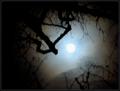
| 08/09/2004 10:19:15 AM |
Blue Moonby trainComment: Hi there from the Critique Club!
This is an interesting and challenging image to critique. Having spoken with you in the past and seen the quality of some of your nature and landscape studies I feel you probably intended the soft focus, fuzzy quality of this image. Or, at least, having seen it, decided it was a happy accident and chose to be brave and offer it up for DPC voters. ;-D
I applaud you for sticking by your creative guns. You've certainly entered enough challenges to know the mind of the average DPC voter and that this was likely to suffer in the voting.
Leaving aside the soft focus for a moment, let's concentrate on the composition. I feel it is quite good and shows a skillful eye for using the foreground to frame a far away subject to draw the viewer's eye. This view through the shadowy branches creates an almost eerie 'watcher in the wood' like mood. Very likely not the intention but effective nonetheless. The casual viewer probably did not notice the lovely pale blue ring around the moon so you probably suffered from 'doesn't meet the challenge' voting. This blue,combined with the extreme glow of the moon, creates an interesting confusion in my mind. It could be the sun shining in a twilit sky. Very surreal. There is a vignette effect created within the frame of the trees by the darker clouds which I find heightens the surreal mood. I have to admit, I quite like this shot. If I had not been critiquing for the CC I may have dismissed it as 'too blurry' but having the time to really peruse it, I find it has a dreamlike quality to it--much like the images created through a pinhole camera. It is not the type of image that will ever win a ribbon on DPC but I rather like that you saw an opportunity and went ahead and made the image despite the lack of a tripod. Certainly, the pioneers of hand-held photography attempted similar 'experiments'.
So, in closing, I find I enjoy the eerie, dreamlike quality of this image which I attribute to the combined factors of the pale blue sky and glowing moon, the soft focus, the vignetting of the clouds, and the 'watcher' like mood of the framing.
Thanks for sharing it. |
| Photographer found comment helpful. |
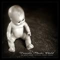
| 08/02/2004 12:44:24 PM |
Daniela Plastic Childby frumoazniculComment: Cristi, I gave this a 10. I thought it was very authentic as cover art. I admit, I thought it was a grigigirl photo because of the dark humour and the gritty b&w quality. You placed well but IMO this was superior work that should have placed much higher than it did. |
| Photographer found comment helpful. |
Home -
Challenges -
Community -
League -
Photos -
Cameras -
Lenses -
Learn -
Help -
Terms of Use -
Privacy -
Top ^
DPChallenge, and website content and design, Copyright © 2001-2025 Challenging Technologies, LLC.
All digital photo copyrights belong to the photographers and may not be used without permission.
Current Server Time: 08/27/2025 05:53:53 PM EDT.