| Image |
Comment |
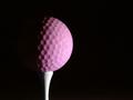
| 02/07/2005 08:26:34 AM |
"Tee Rose"by casualguyComment: Simple and powerfully graphic. The texture of the ball combined with the lighting gives this a rather lunar appearance that exaggerates the significance of the ball and makes an almost humorous statement. I'm not sure if that was the intention but it works for me. |
 Photographer found comment helpful. Photographer found comment helpful. |
| 02/07/2005 08:24:30 AM |
Optimismby LevTComment: This is quite nice but I think it would have worked better without the stars. I understand they are meant to represent 'starry-eyed optimism' but the star at the left of the frame obscures the sillhouetted couple. I don't usuallly enjoy selective desaturation but here it works well. The shades looming so largely in the foreground give the image the feel of a surrealistic painting. The soft, grainy appearance of the sky enhances the theme quite nicely.
|
| Photographer found comment helpful. |
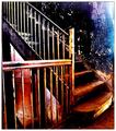
| 01/17/2005 04:24:42 PM |
In a straight lineby arnitComment: I love this sort of shot. I think it would be a much more powerful statement with the roof and second story windows cropped out. |
| Photographer found comment helpful. |
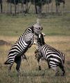
| 01/17/2005 04:22:53 PM |
bravadoby ellamayComment: Very nice capture. I kind of wish the grazing animals in the background were a bit more blurred. They distract a bit as I find that the zebras actually act as a frame for them, directing my eye right toward them. |
| Photographer found comment helpful. |
| 01/17/2005 04:21:32 PM |
|
| Photographer found comment helpful. |
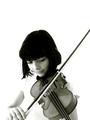
| 11/10/2004 09:54:47 AM |
first love by whiteroomComment: This is lovely! A very natural portrait of a beautiful young musician. She will treasure it for years to come. Congrats on your first ribbon! |
| Photographer found comment helpful. |
| 10/27/2004 12:07:07 AM |
|
| Photographer found comment helpful. |
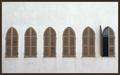
| 10/25/2004 04:18:12 PM |
Windowsby yael27Comment: Very nice composition. My only beef is that it is a bit tilted. Otherwise, nice and spare yet interesting. |
| Photographer found comment helpful. |
| 10/22/2004 07:57:29 AM |
|
| Photographer found comment helpful. |
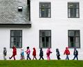
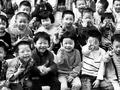
| 10/21/2004 04:07:37 PM |
School is fun by TiberiusComment: Very sweet candid photo. You've managed to capture some great expressions. I love the motion blur from the hands of the boy in front. I have a couple of minor nits. It appears slightly overexposed. The kids in the first two rows in the center have rather washed out skin tones. Note there is almost no detail (in terms of shadow and highlight) on the jeans worn by the girl in the first row. The other nit is the blue-cast. This is more ust be a matter of taste but I'm not a fan of black and white photos that have too much blue. I prefer a warmer black and white. Anwyay, it's a very nice candid portrait.
Hi there again! After realizing that I've left a few comments for b&w photos regarding the bluish cast (and noticing it on my own b&w entry) I took a look at the grayscale bar and realized the greys there have a definite bluish cast so it is obviously the monitor on my laptop! I did my entry on my other computer and it definitely did not look blue) Please disregard my comments regarding this. :-D |
| Photographer found comment helpful. |
Home -
Challenges -
Community -
League -
Photos -
Cameras -
Lenses -
Learn -
Help -
Terms of Use -
Privacy -
Top ^
DPChallenge, and website content and design, Copyright © 2001-2025 Challenging Technologies, LLC.
All digital photo copyrights belong to the photographers and may not be used without permission.
Current Server Time: 08/26/2025 11:21:51 PM EDT.