| Image |
Comment |
| 07/19/2003 07:43:46 PM |
Illusion - Side to Sideby MusicmanComment: I'm really interested to find out what the title means. The focus is good, DOF is great, light is about just right. Color and sharpness could maybe be a little better for me, but it's somewhat subjective - I can see the appeal in it. |
 Photographer found comment helpful. Photographer found comment helpful. |
| 07/19/2003 07:27:16 PM |
Recordby skiphilkahComment: A second light source would have lightened the shadows a little - they're a bit too stark for me. And your existing light source is a little harsh. |
| Photographer found comment helpful. |
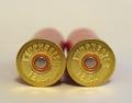
| 07/19/2003 07:25:38 PM |
Blue like waterby KissakiManComment: Hey, Culligan Man! ;-) A more sqare crop would have worked better to accentuate "round" to me. And while I joked about the Culligan logo, the writing at the bottom is a bit of a distraction. But I like the color, the focus is well enough on the bottom of the bottle, the dimples or droplets are a nice effect, and the DOF works well. |
| Photographer found comment helpful. |
| 07/19/2003 07:21:50 PM |
Self Portrait #2/ Contact Lensby BobsterLobsterComment: The tone is interesting, and the image is sharp. I think that it would have been better to have positioned yourself without the distracting reflections in your eye. The curves of your eye do make for an interesting take on "round". And I like the way the border sort of fades out of the left-top portion of the shot. |
| Photographer found comment helpful. |
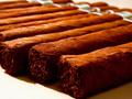
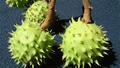
| 07/19/2003 07:11:47 PM |
Well Rounded Pleasureby cmrk74Comment: They look more square than round. Composition is good, and I like the DOF. I'm not wild about the lighting. I'd have liked the front to be a little less dark and shadowy. |
| Photographer found comment helpful. |
| 07/19/2003 07:08:15 PM |
School Yard Funby MitonskiComment: Not sure I get the title, but good subject matter, lighting and focus are OK, and composition is good. |
| Photographer found comment helpful. |
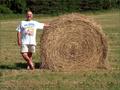
| 07/19/2003 07:05:32 PM |
Just Fooling (ROUND)by margieComment: Having the person in it gives it a bit of a "snapshot" feel. The bale would have worked well on its own. Not a bad photo though. |
| Photographer found comment helpful. |
| 07/02/2003 02:27:05 AM |
Flash of Redby BlinksComment: Very noisy. Try NeatImage. Not a real strong feeling of speed, but definite motion, so it's at least close. Composition is a bit tight. |
| Photographer found comment helpful. |
| 07/02/2003 02:22:30 AM |
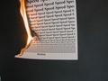
Speed Readingby ColeyComment: I get it, but I don't get it... What does the flame have to do with speed reading, and why is speed repeated 100+ times, and why does it get smaller and smaller. I don't know, maybe too deep for me.
The photo itself is OK. Looks like you may have a hot pixel (no vote deduction) You should have cropped out the bottom left corner. The background's a little noisy at the right, and you got what looks like some JPEG artifacts on the paper - don't compress so much. The composition is interesting. The edges of the paper are sharp enough, but the text could be sharper. |
| Photographer found comment helpful. |
| 07/02/2003 02:09:46 AM |
Fast Foodby laurenrhaeComment: Good idea - the execution just didn't work. I'd have no idea what was in this shot without the title - I assume its a burger? Needed a little more work with the lighting, shutter speed or something. |
| Photographer found comment helpful. |
Home -
Challenges -
Community -
League -
Photos -
Cameras -
Lenses -
Learn -
Help -
Terms of Use -
Privacy -
Top ^
DPChallenge, and website content and design, Copyright © 2001-2025 Challenging Technologies, LLC.
All digital photo copyrights belong to the photographers and may not be used without permission.
Current Server Time: 08/25/2025 11:49:05 PM EDT.