| Image |
Comment |
| 03/13/2006 03:50:30 AM |
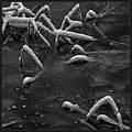
It snowedby jjbeguinComment: Yeah well - simply the amount of time you've worked in this square format has put this out of reach of most judges understanding; I'm glad you submitted - an interesting lesson in composition, even if it were nothing else. Message edited by author 2006-03-23 03:29:53. |
 Photographer found comment helpful. Photographer found comment helpful. |
| 03/10/2006 04:29:31 PM |
Profile Squaredby jbsmithanaComment: I don't know what your options were re cropping, but I'm not sure you've got this quite right, really; square has a different dynamic, and the 'thirds' lines rae less comfortable in it, I think. |
| Photographer found comment helpful. |
| 03/10/2006 04:28:07 PM |
It snowedby jjbeguinComment: Can't quite get away from this image - I almost just passed on, but the composition grabs my eye. The chaos of those snow-lines is intriguing, especially as it resolves in the top left; the little echo of it bottom right is somehow just not quite there - the focus not being as crisp, nor the processing to bring it quite into the same luminance space - it detracts a touch from the relationship of the two areas; with advanced editing, that should be fixable, no? And the composition is so subtle that I'm surprised its been missed. Interesting photography, whatever. |
| Photographer found comment helpful. |
| 03/10/2006 06:33:07 AM |
The Oddest Couple of All; Mankind and Natureby GIS_boyComment: from the Critique Club
I thought, at first, that this must be from a 'Blue' challenge, and got left over. An odd photograph, for an odd challenge. I'm sure you can see for yourself why it got voted down the way it did - the weird tonality, the punter's version of odd being different from yours (and mine, as it happens).
I kind of like the image though, somehow. Despite a bunch of stuff that ought not to work really - the mid-point horizon, a slight lack of real fine detail (as in may of your submitted images - enough to make me think it's more of style choice than an accident), and a certain vacancy about it all. Of course there's an implication of 'where's the fisherman?', but that adds a simplicity to it that might simply have been ordinary otherwise. I'd be interested to know your thinking around this one. |
| Photographer found comment helpful. |
| 03/09/2006 05:19:07 AM |
Night Eyesby sir_bazzComment: Love this - strong sense of composition, and all the technical stuff in place. The fade to black is well done, also. |
| Photographer found comment helpful. |
| 03/09/2006 05:16:23 AM |
Female natureby NunoComment: Has a feel almost from the early days of photography - that blurring, and slightly strange focus, and the overall dark-ish but low contrast feel. the pointing finger makes it feel like a comic entry, but the processing works against that. |
| Photographer found comment helpful. |
| 03/09/2006 05:14:52 AM |
Mysteriousby tryals15Comment: Good colour, detail, depth of field. Does it work square? ... I'm not completely sure: the jaw line is perhaps what bothers me - it seems to upset the balance of the image slightly. Your placing of the visible eye dead centre really works though - I think in square the centre point of the imagae becomes much stronger. |
| Photographer found comment helpful. |
| 03/08/2006 01:09:21 PM |
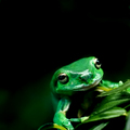
playfulby CreativeFlyPhotoComment: Lots of good technical things - especially colour and light; I find the composition a bit lumpy, perhaps cropped a touch too close? For a subject that's not intrinsically very interesting, I don't think you've managed to add the necessary magic: but it's entirely competent nevertheless. |
| Photographer found comment helpful. |
| 03/08/2006 01:06:04 PM |
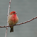
***by PhotoRynoComment: Good detail, great moment, works in this crop, excellent exposure. My only (very) slight quibble would be with how dark the trees etc. are compared to the bird - perhaps just a touch less contrast there? Minor point - very minor. Fine photograph. |
| Photographer found comment helpful. |
| 03/08/2006 08:02:55 AM |
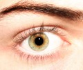
The Eyeby NyckComment: Nice try, but the exposure has let this down a bit - too much glare around the skin, and perhaps generally over-exposed half-stop or so. It would have more impact, more sense of tone and depth, if the brightness overall were reduced. Oh, and of course, it isn't really a square crop now, is it? |
| Photographer found comment helpful. |
Home -
Challenges -
Community -
League -
Photos -
Cameras -
Lenses -
Learn -
Help -
Terms of Use -
Privacy -
Top ^
DPChallenge, and website content and design, Copyright © 2001-2025 Challenging Technologies, LLC.
All digital photo copyrights belong to the photographers and may not be used without permission.
Current Server Time: 08/24/2025 03:26:53 AM EDT.