| Author | Thread |
|
|
03/10/2006 06:33:07 AM |
from the Critique Club
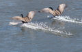
I thought, at first, that this must be from a 'Blue' challenge, and got left over. An odd photograph, for an odd challenge. I'm sure you can see for yourself why it got voted down the way it did - the weird tonality, the punter's version of odd being different from yours (and mine, as it happens).
I kind of like the image though, somehow. Despite a bunch of stuff that ought not to work really - the mid-point horizon, a slight lack of real fine detail (as in may of your submitted images - enough to make me think it's more of style choice than an accident), and a certain vacancy about it all. Of course there's an implication of 'where's the fisherman?', but that adds a simplicity to it that might simply have been ordinary otherwise. I'd be interested to know your thinking around this one. |
|
 Photographer found comment helpful. Photographer found comment helpful. |
Comments Made During the Challenge  |
|
|
03/05/2006 07:17:31 PM |
|
way too much blue. Can adjust this in photoshop type software by using color variations and hue shifts. Wood should not have that much of a blue tint, even next to water. |
|
|
|
03/03/2006 05:47:31 PM |
I like this pic alot... and a pretty nice take on the challenge... not sure all will see it your way but it works for me nicely... :)
|
|
| Photographer found comment helpful. |
|
|
03/02/2006 09:34:15 PM |
|
great idea. i would have cropped closer to that lovely cloud |
|
| Photographer found comment helpful. |
|
|
03/02/2006 03:30:56 AM |
|
Wow! Incredible blues. Just love this image and just perfect for the challenge. Well done. 10 :) |
|
| Photographer found comment helpful. |
|
|
02/28/2006 08:06:40 PM |
|
The blue cast doesn't seem natural to me. Without the title, I wouldn't get where you were going with this. |
|
| Photographer found comment helpful. |
|
|
02/28/2006 12:21:18 AM |
|
I love fishing off a wharf... a little less of a vibrant blue might give this photo a bit more 'punch' |
|
| Photographer found comment helpful. |
|
|
02/27/2006 08:02:18 PM |
|
I'm trying hard to accept your concept here, but it is too much of a stretch and completely reliant on the title for even that. I like the composition, but I'm not fond of the blue cast. |
|
| Photographer found comment helpful. |
|
|
02/27/2006 03:40:32 PM |
|
LOVE the blues. The graduation in the sky is super, and the lighting on the railing is nice, too. Nice placement of the pole. Very good composition. 10 |
|
| Photographer found comment helpful. |
|
|
02/27/2006 02:25:46 AM |
|
can you say shoehorn? :) Nice image, though. |
|
| Photographer found comment helpful. |
Home -
Challenges -
Community -
League -
Photos -
Cameras -
Lenses -
Learn -
Help -
Terms of Use -
Privacy -
Top ^
DPChallenge, and website content and design, Copyright © 2001-2026 Challenging Technologies, LLC.
All digital photo copyrights belong to the photographers and may not be used without permission.
Current Server Time: 06/30/2026 09:40:36 PM EDT.