|
|
|
Showing 731 - 740 of ~2866 |
| Image |
Comment |
| 04/24/2006 05:51:37 PM | The MG Old but still elegantby kiwinickComment: TF? TD? My obsession with the dear old things has waned somewhat, though I still keep my own (though not in this league, I'm afraid). It's an interesting shot, but I think the voiters are going to knock your choice of dual subjects, especially as those balloons aare not so old. Almost a classic example of the kind of fine shot not to submit I would say - obviously you have an 'old' primary subject, so what's the problem, huh? Well, the mass of punters don't see like that ... |  Photographer found comment helpful. Photographer found comment helpful. |
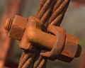
| 04/24/2006 05:47:53 PM | High Tensionby Nikolai1024Comment: Quite a harsh light you have chosen, which doesn the tonality of your subject few favours I'm afraid; the composition is not bad, but the image prompts the feeling to me that there may ahve been more to draw out of this structure by showing us the receding cable - perhaps even some sense of whatever it is attached to - more simply, the tension to which your title refers isn't really so evident in the actual image. | | Photographer found comment helpful. |
| 04/24/2006 03:19:30 AM | Unveiledby librodoComment: Now this I really like; the punch of that clouded eye, especially in this context - the fact that we know her face now, the fact that it's in this collection of smoothly beautiful people, that your near-trademark headscarf arrangement hints at a clouding of her other eye in a more metaphysical sense adds a power that just isn't there in other photographs in this challenge. Clever, and in a true way rather than simply a whimsy. Excellently done - and I like that so much of that is to do with the context, rather than a simple stand-alone photograph. | | Photographer found comment helpful. |
| 04/21/2006 05:05:42 AM | Fearlessby ShaneBlakeComment: from the Critique Club
Now I quite like this in a certain way - mind you, I can see why the voters haven't given it their seal of approval, too. It has a certain similarity with some of the work of Martin Parr - though he uses flash less brutally than here, he makes good use of super-saturated colour and strange conjunctions of location like this. That contrast of the dull grey parking world and the bright tones of the ball-pool certainly have an impact. The flash shadows need help though, for sure - some kind of diffuser would stop the harshness of them a little?
Compositionally, I think we'd want more of the ball-pool and it's colours - they're actually only just part of this image, and if you had a slightly wider angle on this the composition of your son's placing and that background carpark would sit mich more comfortably in frame. This way, he's very uncomfortably central, and more of the pool would give a stronger sense of a jump out of the grey everyday into the child's fantasy world - with him so central to the frame, it becomes pretty much just a portrait - and we know what happens to all but the more 'emotional' child shots here.
Those two things, I think, have hurt your score more than anything. Pehaps also a lack of 'air' in the jump - from the results, it seems to have been a requirement how far up in the air the subject was; the voters though can be a strange collective, and one can only guess at the process.
I think this was slightly hard-done-by. I don't think it was 6 territory, given the flash and the compositional things, but it shows potential and should have been the other end of the 5-zone, for me.
All the best
e | | Photographer found comment helpful. |
| 04/20/2006 05:52:31 AM | In Her Own Worldby librodoComment: People's attitudes to a repeating subject are interesting, aren't they? Stylistically, this is very different from what we know as a 'librodo' look, and yet it seems to me there is more attention paid to the model than the photography here. It's a grand shot, and she has an amazing face, but perhaps people were looking for something more ... active, perhaps - interactive maybe. Maybe it's too close to folks' idea of a 'portrait'. All the usual DPC imponderables :-) | | Photographer found comment helpful. |
| 04/19/2006 01:20:53 PM | Untitledby GinaRothfelsComment: from the underneath of the Critique Club
SO: compositionally strong - that heavy diagonal works well as a concept to hang the image on, but evidently not meeting the voters idea of what was required here. I think perhaps that might be a simple function of the scale of your shot: most if not all of the successful images depended on texture being apparent on both the fine and the grand scale: so the detail works, as well as the overall structure of the image (one might phrase this as saying that the shot worked as thumbnail as well as in full). This just doesn't really communicate on the finer scale, I think; at least, no more than it doesn on the larger. The progression and patterns of reflected light in those hollows are possibly too untidy, not clean and smooth ewnough to enhance the metallic nature of the whole.
That's only a suggestion, but evidently something put folks off this one. The colouration may have hindered things too - I can see a feeling that it might have removed some sense of tonality, or rather imposed its own sense of tonality onto the shot, rather than letting things come through. perhaps, in the end, it was just too close to the abstract (well, absolutely close to my eye), and the voters actually wanted to know exactly what texture they were looking at? Who can tell sometimes ...
Some more info from yourself might have helped make sense of things though. | | Photographer found comment helpful. |
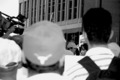
| 04/19/2006 10:20:54 AM | reporterby arsenalComment: Man, you got flamed! Whilst I wouldn't call this completely successful, it certainly doesn't deserve these ignorant and thoughtless and plain stupid comments - 'rules' of candids my **** | | Photographer found comment helpful. |
| 04/19/2006 10:06:31 AM | Capitol Nightsby MaverickComment: from the underneath of the Crtique Club
Technically, there is nothing to criticise here, of course: great detail, definition, light and so on. Especially given the sutter speed. The problem comes with entering essentially an architectural shot into a texture challenge, despite the wording of the challenge details. I've done that myself, and there's no point bemoaning it, even to yourself, just learn the lesson and get on. Folks just aren't really going to consider it suitable, I fear.
One other thought that comes quickly to mind: your chosen aspect ratio, and the inclusion of that lower wall and the flag, make this shot more about the building perhaps than the texture of the decoration of the dome itself; a bit of judicious cropping, to emphasise the textural elements of it, might have helped your score over the 6 mark. | | Photographer found comment helpful. |
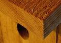
| 04/19/2006 09:50:55 AM | Cedarby joebokComment: from the Critique Club
I think perhaps it was simple choice of subject that let you down here, in challenge terms. Certainly there is texture available, and reasonably well defined in your image, but there isn't the ping of a new vision to add to it. Perhaps if you could have manipulated the available light a touch to enphasise the ridges of the wood, or perhaps have taken the contrast even further, it might have had more success. I also wonder if your composition might not have been more thoroughly thought out: the conjunction of that angle of the roof (?) and the hold of the bird house might have been happier in compositional terms: place the hole so as not to obscured by the wood, whilst keeping the strong diagonal of the roof, and you'd have some more impact, and some balance across the image frame more than you have here.
I like that you've filled the frame, although that perhaps was an obvious idea and didn't help with the stand-out-in-a-crowd necessity of these challenges. It's a pleasant enough shot, but just doesn't have that impact, and you get so little time to hit the voters here. | | Photographer found comment helpful. |
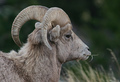
| 04/19/2006 09:41:25 AM | Bighorn Ram Texturesby hahn23Comment: from the edge of the Critique Club
This has a certain similarity to my own shot, actually, although the treatment is different. Whilst there is obviously texture here, I think for a challenge of that title, in the eyes of the voters, you really need to pull out all the stops to emphasise it - make that possibly over-emphasise it. A heap more contrast in the fur areas, and a deal of work around the horns themselves would have helped no end - purely in challenge terms, of course. There's also that love of the more stylised photography here, and so I think your placing of the animal in frame also doesn't help you: playing with different ideas of cropping might make things work more successfully.
All if which is not to say that this isn't entirely successful in its own right: the detailing, the focus, the stillness of the animal and that extra ping of the straw in its mouth make for a nice wildlife shot, if not spectacular. It has a strong realism, a real sense of the photographic - that's just not very DPC, I'm afraid. The centre-frame placing of the subject is one of average voters bugbears too, so you were bound to fall down on that a little. Mind you, 5.9whatever is no poor score, by comparison.
Ed | | Photographer found comment helpful. |
|
Showing 731 - 740 of ~2866 |
Home -
Challenges -
Community -
League -
Photos -
Cameras -
Lenses -
Learn -
Help -
Terms of Use -
Privacy -
Top ^
DPChallenge, and website content and design, Copyright © 2001-2025 Challenging Technologies, LLC.
All digital photo copyrights belong to the photographers and may not be used without permission.
Current Server Time: 08/18/2025 01:06:14 PM EDT.
|