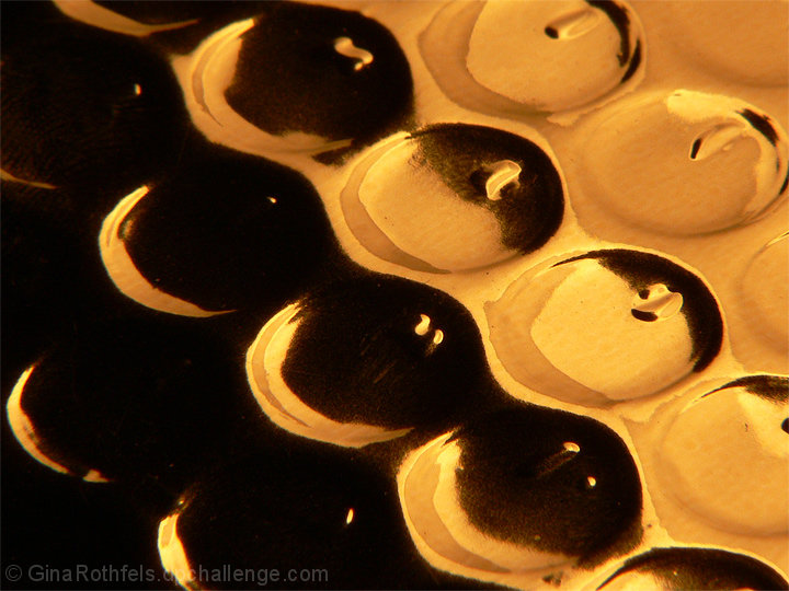
from the underneath of the Critique Club
SO: compositionally strong - that heavy diagonal works well as a concept to hang the image on, but evidently not meeting the voters idea of what was required here. I think perhaps that might be a simple function of the scale of your shot: most if not all of the successful images depended on texture being apparent on both the fine and the grand scale: so the detail works, as well as the overall structure of the image (one might phrase this as saying that the shot worked as thumbnail as well as in full). This just doesn't really communicate on the finer scale, I think; at least, no more than it doesn on the larger. The progression and patterns of reflected light in those hollows are possibly too untidy, not clean and smooth ewnough to enhance the metallic nature of the whole.
That's only a suggestion, but evidently something put folks off this one. The colouration may have hindered things too - I can see a feeling that it might have removed some sense of tonality, or rather imposed its own sense of tonality onto the shot, rather than letting things come through. perhaps, in the end, it was just too close to the abstract (well, absolutely close to my eye), and the voters actually wanted to know exactly what texture they were looking at? Who can tell sometimes ...
Some more info from yourself might have helped make sense of things though. |