from the Critique Club
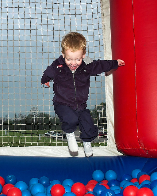
Now I quite like this in a certain way - mind you, I can see why the voters haven't given it their seal of approval, too. It has a certain similarity with some of the work of Martin Parr - though he uses flash less brutally than here, he makes good use of super-saturated colour and strange conjunctions of location like this. That contrast of the dull grey parking world and the bright tones of the ball-pool certainly have an impact. The flash shadows need help though, for sure - some kind of diffuser would stop the harshness of them a little?
Compositionally, I think we'd want more of the ball-pool and it's colours - they're actually only just part of this image, and if you had a slightly wider angle on this the composition of your son's placing and that background carpark would sit mich more comfortably in frame. This way, he's very uncomfortably central, and more of the pool would give a stronger sense of a jump out of the grey everyday into the child's fantasy world - with him so central to the frame, it becomes pretty much just a portrait - and we know what happens to all but the more 'emotional' child shots here.
Those two things, I think, have hurt your score more than anything. Pehaps also a lack of 'air' in the jump - from the results, it seems to have been a requirement how far up in the air the subject was; the voters though can be a strange collective, and one can only guess at the process.
I think this was slightly hard-done-by. I don't think it was 6 territory, given the flash and the compositional things, but it shows potential and should have been the other end of the 5-zone, for me.
All the best
e |