| Image |
Comment |
| 02/19/2004 07:46:28 AM |
Birch Curlsby snowflakeComment: Choice of colour temperature is different - and quite effective. Lends a mystical quality to the subject, makes the first perception one of a landscape rather than a detail, which I quite like - in fact I'd go so far as to say you might have cropped this to contain only the tree, and lose the sky and stuff top right of frame. DOF is a bit too shallow to really show us a breadth of texture - it rather concentrates on a very narrow area bottom third of frame, but there's still great interest there. One function of this colour that I don't like so much is the coldness it brings to the image, but that's inevitable. Intersting. |
 Photographer found comment helpful. Photographer found comment helpful. |
| 02/19/2004 07:36:29 AM |
My Blanketby marboComment: Good mood - great use of muted colour, and you've captured a wistful moment well, and the catch-light in the eyes really lends some life to what might have been a rather drear scene without it. I do find the out-of-focus foreground area to be distracting - mainly because it seems to loom up into the image, rather than being a function of distance - don't get much sense of teh blanket receding into focus, if you follow me. texture? Good smoothness of skin, and a sense of softness and not or wiriness in the blanket. Borderline twee for me - I find that with a lot of child portraits, but excellently done. |
| Photographer found comment helpful. |
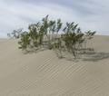
| 02/19/2004 07:28:53 AM |
Dry Heatby beekperComment: Good work - a first thought was that this was too muted in its contrast, but I don't know now whether that's really the case. next though was that it was a desert shot - that those were trees, and it maintains that sense of scale even after the realisation that they're perhaps more properly termed shrubs. Great use of the lines in the dune and the lines in the sky to emphasise the composition. |
| Photographer found comment helpful. |
| 02/19/2004 07:26:16 AM |
Napkin Stashby NebulousComment: I'm never going to put one of these muted, low-contrast images in my favourites, but I do rather appreciate them when they come up. I mean low contrast in the sense of subject, rather than technically in terms of black and white points I should say. A criticism would be that the pure rhythm of this shot focus the mind more on pattern than texture, but I'm perhaps being pedantic. |
| Photographer found comment helpful. |
| 02/19/2004 07:23:13 AM |
Lindor Chocolateby mcraelComment: Good work - great use of the light-tent kind of trick, although there is suspicion of some detailed reflection toward (presumably) camera. Gives a sense of the smoothness and creasing of the foil very well. Perspective is well handled too - no sign of distortion that I can see. That glow of light toward the top of the thing really speaks quality - advertisers would love you. A bit bland, as a subject, but you're by no means the only one to suffer from that here. |
| Photographer found comment helpful. |
| 02/19/2004 07:20:04 AM |
Orange Orangeby 37vaComment: Great subtlety of tone and colour - really a good piece of work. Lighting is excellent for the purposes, and there is a great sense of texture to it. No real reservations other than that in neither its subject nor its presentation does it really get to me at all. But technically, rather good. |
| Photographer found comment helpful. |
| 02/19/2004 07:15:02 AM |
Curiously Strongby omnibusComment: Intriguing - might make a good wallpaper. Your very muted b&w has some merit, though perhaps to bring out the quality of texture you might want to try setting black and white points further away from grey than this, to allow more graduation of light and shade throughout the image. |
| Photographer found comment helpful. |
| 02/19/2004 07:13:27 AM |
Sweetby StevePaxComment: heavily saturated colour - to the extent that in the brightest area of the fruit it's begun to lose detail, and yet the overall image isn't very bright at all. The idea is good, and the execution not far off, but perhaps brightening the whole thing and then reducing the saturation to bring back those details would help graduate the light across the skin? Still, a good illustration of the smooth/shiny and pitted feel of orange skin. |
| Photographer found comment helpful. |
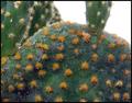
| 02/19/2004 07:11:15 AM |
Feather Soft Cactusby drgsoellComment: Not a good composition I'm afraid. Those shapes don't lead the eye anywhere, and the blown out sky attracts the eye by sheer force of its whiteness. It's difficult to say exactly where you think the main centre of interest is here, as there appears to be no one thing as a primary subject. The light is far too general to capture good texture. |
| Photographer found comment helpful. |
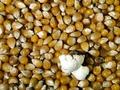
| 02/19/2004 07:07:18 AM |
First One Out!by drydocComment: Good lighting, though I think you are just a touch over-exposed on that bloom (it actually looks like a piece of paper screwed up). beyond that it's well poitioned within frame, and the texture of those seeds is well caught. The over-exposure loses you some level of detail and thus texture in the bloom itself, which is a shame as it is inevitably the main subject of this image. |
| Photographer found comment helpful. |
Home -
Challenges -
Community -
League -
Photos -
Cameras -
Lenses -
Learn -
Help -
Terms of Use -
Privacy -
Top ^
DPChallenge, and website content and design, Copyright © 2001-2025 Challenging Technologies, LLC.
All digital photo copyrights belong to the photographers and may not be used without permission.
Current Server Time: 08/15/2025 03:14:03 PM EDT.