| Image |
Comment |
| 05/04/2007 06:29:28 AM |
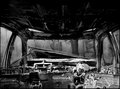
DAY 4. B&W. car interior with a difference.by rozComment: Roz
I like this, great job turning something that is essentially ugly into something that is so visually appealling
Appreciate that there was a lot of pp going on here, but it was totally worth it. In terms of this challenge I always try to provide some (no matter how minor) point where I think a tweak could be made, but I really cant with this shot
|
 Photographer found comment helpful. Photographer found comment helpful. |
| 05/04/2007 06:20:14 AM |
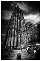
Cathedralby MelethiaComment: Debs...Blimey you come in late and then blow us away with an image like this...clear off we dont need your sort here ;-)
What a fantastic image, for me one of your best. I love the perspective and you really get a feel of the spire of the Catherdral towering into the sky
The PP you have done gives a real 3D feel and those wispy white clouds are magnificent
An imposing shot without being over powering. The placement (be it lucky or otherwise)of the chap at in the bottom middle of the frame is great. You can follow a percendicular line up from the top of his head to the very peak of the spire and again for me this just adds to the sense of grandeur of the architecture if you compare the two elements
If your APril Free Study is better than this I cant wait to see it |
| Photographer found comment helpful. |
| 05/04/2007 06:07:31 AM |
4by sevilduvarciComment: Its an odd shot but not the worse for it. Have to say that my initial reaction about the 'spare knee' was that I didnt like it, but the more I look at the image the more it grows on me
I reckon in the world of DP Challenges this one might have done badly as I think the majority of people who score give no more than a quick once over to an image and this is definitely a shot that warrants more consideration |
| Photographer found comment helpful. |
| 05/04/2007 06:03:03 AM |
Day-2by SandyPComment: I love this shot...and yearn for the day that I can get one as good as it.
I do agree with the comment regarding the contrast on the upper right hand side and in an ideal world maybe a tad sharper reflection, but the bottom line is, if this was in a challenge I would be giving it 9
Awesome |
| Photographer found comment helpful. |
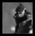
| 05/04/2007 06:01:04 AM |
Day-3by SandyPComment: Well outstanding bokeh and another great capture...Is it just me or do that monkeys eyes look slightly skew whiff? Guess (and I appreciate getting a monkey to pose is never the easiest thing in the world) that would be my one minus point as it is a bit strange being able to see the white of the iris on the left side of the image and not on the right side |
| Photographer found comment helpful. |
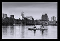
| 05/04/2007 05:58:00 AM |
Day-4by SandyPComment: Sandy you are just killing the 'competition' in this challenge
I cannot begin to describe the beauty of this cityscape. The sky is fanatsic and the tones and contrast simply breathtaking
Once again I am not generally a fan of borders but this works magnificently.
This could (and should) be being sold somewhere
|
| Photographer found comment helpful. |
| 05/04/2007 05:12:06 AM |
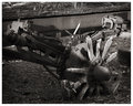
Day 4by edmengComment: Well you tried something different and it worked very well. Love the lighting and composition. Stunning depth of field, great tones and contrast (the grain on the frame of the cart is outstanding) and a very interesting and appealing image |
| Photographer found comment helpful. |
| 05/04/2007 03:20:57 AM |
4 - Selfby JutildaComment: Judy
I love off centre portraits and this is a stunning example of its kind. Tones and contrast are to perfection
I look at an image like this and then compare it with my day 1 shot and I realise I have sooooo much to learn
Wonderful |
| Photographer found comment helpful. |
| 05/04/2007 03:17:34 AM |
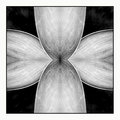
Symmetryby sherpetComment: Wonderful wonderful wonderful wonderful wonderful wonderful wonderful wonderful....Oh and did I mention wonderful
A true and genuine image of beauty |
| Photographer found comment helpful. |
| 05/04/2007 03:16:04 AM |
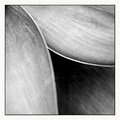
Day 3 - Threeby sherpetComment: I love good abstracts and this is a VERY good abstract, which would not look out of place in any exhibition.
Having said that I have to say that personally I think that symmetry is an even more striking image
Two magnificent shots! |
| Photographer found comment helpful. |
Home -
Challenges -
Community -
League -
Photos -
Cameras -
Lenses -
Learn -
Help -
Terms of Use -
Privacy -
Top ^
DPChallenge, and website content and design, Copyright © 2001-2025 Challenging Technologies, LLC.
All digital photo copyrights belong to the photographers and may not be used without permission.
Current Server Time: 08/05/2025 10:05:31 PM EDT.