| Image |
Comment |
| 07/09/2007 12:36:53 AM |
Fire & Smokeby vtruanComment: Not really a dichotomy I am afraid. Smoke comes from fire so they aren't really two part of a greater whole. |
 Photographer found comment helpful. Photographer found comment helpful. |
| 07/09/2007 12:31:52 AM |
Body & Soulby AlexSaberiComment: A lot of people probably had this dichotomy in mind. Few likely figured out how to portray it. I like the way you've presented it. Even if you take the title away the image stands well enough on its own as the title you've selected would be a likely one. |
| Photographer found comment helpful. |
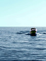
| 07/09/2007 12:30:21 AM |
Where Sky Meets Waterby libertyComment: Strange purple fringing around the boat. Since this is in advanced editing I would have definitely corrected it.
Composition could be better but thats kinda tough in itself. A 50 - 50 split would have been symbolic but rather static. |
| Photographer found comment helpful. |
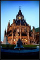
| 07/08/2007 12:43:56 AM |
Canadian Historyby ShecoyaComment: I recently visited Ottawa for the first time and was also very taken with the unique architecture of the Library of Parliament- beautiful! |
| Photographer found comment helpful. |
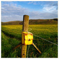
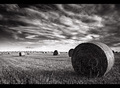
| 07/06/2007 09:07:07 PM |
Fields Of Goldby gsalComment: Moving the box off centre and then using the fence line you could create nice leading line. With the box so central it feels like its the subject rather than the fields.
Aside from that you got really great late afternoon light and some really nice colors in the crop. |
| Photographer found comment helpful. |
| 07/06/2007 09:04:56 PM |
|
| Photographer found comment helpful. |
| 07/06/2007 09:03:56 PM |
|
| Photographer found comment helpful. |
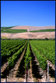
| 07/06/2007 09:00:44 PM |
The Vineyardby kandykarmlComment: I'm not really sure why you chose portait orientation for this shot. For me the shot kinda ends at the end of the vineyard. A landscape orientation would have given us a nice perspective of the dimensions of the vineyard. Also the sky portion of the shot really feels like dead space for me as it is not a strong enough element to balance out the bottom of the shot. |
| Photographer found comment helpful. |
| 07/06/2007 08:57:35 PM |
One Momentary Impression Upon Earth.by JopperTomComment: If we read the challenge description it specifies that we are looking for landscape shots. This unfortunately is not a landscape shot.
That aside? I really like the diagonal line of the water going through the shot. The subtle footprints in the sand are quit nice. The reflection of the sun kinda through off the exposure and made this a little bit dark (especially in the top left corner) but its not too bad. I like how the texture in the sand was captured along witht the "offerings of the sea". |
| Photographer found comment helpful. |
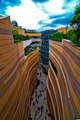
| 07/06/2007 08:54:04 PM |
Man Made Grand Canyonby heavyjComment: This is a great image but you got really carried away in post processing. The colors, especially in the sky are far too saturated. This is quite oversharpened which is evident in the halos around the people. When you get right down to it you need to ask yourself: Is this anything like what I saw through the view finder?
I really like the uniqueness of this shot however. Most city shots are taken of skylines etc whereas this one takes the "inside" the city perspective. The curves of the buildings are esthetically pleasing and I like how you chose a portrait shot for this picture especially with the path in the middle to lead your eye through the image. Exposure is pretty good especially considering the lighting you had to work with. |
| Photographer found comment helpful. |
Home -
Challenges -
Community -
League -
Photos -
Cameras -
Lenses -
Learn -
Help -
Terms of Use -
Privacy -
Top ^
DPChallenge, and website content and design, Copyright © 2001-2025 Challenging Technologies, LLC.
All digital photo copyrights belong to the photographers and may not be used without permission.
Current Server Time: 08/15/2025 04:39:53 PM EDT.