|
|
| Image |
Comment |
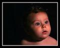
| 09/23/2005 12:15:42 PM | Bubbles? My Bubbles!by SchuffComment: Greetings from the Critique Club.
This is a very cute portrait, your model is very cute. The bubbles are a nice effect and I think the placing of the on his nose is perfect.
There are few things tha I don't like in this picture. The subject is looking away from the camera and that's fine, but because of the direction he's looking in, I would have placed him on the othe side of the frame and had the negative space in the directon he was looking at.
The hair and he background sort of blend together, there is no real definition between them, perhaps another light or a reflector would have fixed that problem. The loss of detail in the shadows is really shame because this is a nice portrait.
The bubbles around his hair are not very defined either and all we see is the bright spots and this a little distracting, I would have cloned them out. The whites in his eyes are bit dark and I think dodging them a little would greatly improve the overall look.
Another thing, I don't know if you used Neat Image or not cause you don't specify, but in my opnion the whatever noise reduction software you used was set too strong, he almost looks plastic.
This is just my opinion and you did very well in the challenge so keep it up.
If you have any questions or comments about this critique, please feel free to PM me.
June |  Photographer found comment helpful. Photographer found comment helpful. |
| 09/23/2005 11:45:39 AM | Charmby magnusComment: Greetings from the Critique Club.
I like compostion here. The placement of the model in a corner works in this case and the negative space doesn't take away from the subject. The facial expression is nice and the pose looks very relaxed. The contrast between the background and the model's skin color is also nice, it definitely makes her pop out and be the center of attention, as it should be.
While the lighting on the model is good, bar hotspots on here face, I think the background needed another light source on the left. This would have given you a perfect white background and made this portrait much stronger. The bracelet is another thing that bothers me a little, it really doesn't add anything to the image and is distracting. The eyes could benefit from some dodging, they are the first thing that people see in a portrait but in this case my eye keeps getting drawn to the much brighter smile.
This is just my opnion and you did well on the challenge so keep up the good work.
If you have any questions or comments about this critique, please feel free to PM me.
June | | Photographer found comment helpful. |
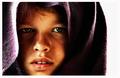
| 09/23/2005 11:23:39 AM | Look of despairby bobdaveantComment: Greetings from the Critique Club.
Let me start by saying this is a great portrait. I like the compositon an the landscape mode, it works well. I would have cropped the white part on the right as this make the image look off balance.
The blown highlights on the side or her face are very distracting, my eyes keep wandering there taking attention away from the subject. The loss of detail in the shadows are also a bit distracting.
I like the post processing. I have no idea what you did because you didn't provide any details but it works. The only thing I would try to fix there is the slightly blown nose. This obviously just my opinion and you did very well, keep it up.
If you have any questions or comments on this critique, please feel free to PM me.
June
| | Photographer found comment helpful. |
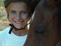
| 09/23/2005 10:21:09 AM | Happyby glad2badadComment: Greetings from the Critique Club.
The first thing I noticed in this image was that the horse's face was cut off at the bottom. I know that the subject is the girl and not the horse but that is very disctracting. Perhaps a wider crop would have been better in this situation. Perhaps an even closer crop, just the girl's face would have worked too because this is such a nice expression.
I like the expression on the girl's face. The light is good and she is properly exposed without any blown highlights, specially on the tshirt where it would have been easy to do so, good job. I think the eyes could benefit from a little bit of dodging, just a tiny bit.
If you have any questions or comments about this critique, please feel free to PM me.
June
| | Photographer found comment helpful. |
| 09/22/2005 06:53:12 PM | Autumn Slumberby kendall6Comment: Greetings from the Critique Club.
My first thought when I saw this image was "WOW" This is a very creative portrait, definitely miles away from the typical head and shoulders shots.
I love the color and the contrast between the light, rosy skin and the deep red leaves. The exposure is spot on and so is the focus. Closed eyes works well in this shot, it gives the feeling of peace and rest which contrasts in a weird but complimentary way with the deep red that predominates in the image. I don't know if that makes much sense to you but it does to me.
There is really nothing that I would change in this picture. Awesome job, keep it up!
If you have any questions or comments about this critique, please feel free to PM me.
June
| | Photographer found comment helpful. |
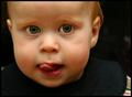
| 09/22/2005 06:35:13 PM | Mischievousby DogAngelComment: Greetings from the Critique Club.
This is a funny picture. I like the facial expression and it totally matches the title, he really looks like he's secretely planning something. Great capture.
As far as the composition, nice job with filling the frame. I think a slighly tighter crop would have been beneficial as it would have gotten rid of the distracting bright area on the lower right corner. My eyes keep getting drawn to it and it takes attention away from the subject. Since this was an Advanced Editing challenge, I would have probably gotten rid of the bright spot on his right shoulder and on the middle right hand area of the picture as well.
The focus is right for a portrait of this nature but I think perhaps slightly sharper eyes would look better. The lighting is also good, no blown highlights. Keep up the good work.
If you have any questions or comments about this critique, please feel free to PM me.
June
| | Photographer found comment helpful. |
| 09/22/2005 06:20:28 PM | Sweet Revelationby esdarbyComment: Greetings from the Critique Club.
I like the lighting in this image, it is even and flattering. I like the composition too. I find the background a little distracting, specially the bright areas by the model's face. Perhaps a slightly different angle would have taken care of that. Another thing that bothers me is that her eyes seem to be closed, I would have liked to see them. The soft focus works well here, the image is soft but not blury. This is a good image that could be greatly improved with just a few minor changes. Keep up the good work.
If you have any questions or comments about this critique, please feel free to PM me.
June | | Photographer found comment helpful. |
| 08/31/2005 05:30:29 PM | Mom, Get Out!by kyeboshComment: Greetings from the Critique Club
First off, I want to say this is a really funny picture. I love the expression on the guy's face and it makes you think about what is really going on in the scene. However, I just can't get passed the fact that he seems to be floating in mid-air. There is no context, if you know what I mean. I think perhaps it would be better if the person was in a real life environment.
I think the exposure is pretty balanced and detail was kept where needed. I like the black and white conversion and the warm tones. This is just my opinion and you did very well, so congratulations.
If you have any questions or comments about this critique, please feel free to PM me.
June | | Photographer found comment helpful. |
| 07/02/2005 08:46:02 AM | Space. The Final Frontierby CorySmithComment: Greetings from the Critique Club.
I must admit that I may be a bit biased here......I love blue. I like the different shades in the background, I think they compliment the subject well.
As far as meeting the challenge, I don't think it does. If it wasn't for the title that is.
Good composition and overall feel. I like it but it would have perhaps done better in another challenge. If you have any comments or questions about this critique, please feel free to PM me.
June | | Photographer found comment helpful. |
| 06/14/2005 06:54:09 AM | | | Photographer found comment helpful. |
Home -
Challenges -
Community -
League -
Photos -
Cameras -
Lenses -
Learn -
Help -
Terms of Use -
Privacy -
Top ^
DPChallenge, and website content and design, Copyright © 2001-2025 Challenging Technologies, LLC.
All digital photo copyrights belong to the photographers and may not be used without permission.
Current Server Time: 09/03/2025 10:22:21 PM EDT.
|