| Image |
Comment |
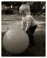
| 07/12/2005 11:19:03 PM |
come playby whiteroomComment: I would like to see the child facing the camera. Otherwise, I really like this photo - the composition, lighting, tones, etc. are all good. I onlyy wish I could see the child's expression.... |
 Photographer found comment helpful. Photographer found comment helpful. |
| 07/12/2005 11:01:11 PM |
star warsby mrsamsaComment: Since this challenge has brought out the "Title Monster" - I need to mention that I think you could have come up with a better title - but I am not marking you down because of it.... your title is unexpected. |
| Photographer found comment helpful. |
| 07/12/2005 10:48:31 PM |
|
| Photographer found comment helpful. |
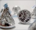
| 07/12/2005 10:48:13 PM |
Chocolate Makes the World Go 'Roundby karmatComment: This is an interesting idea. I would have left out the kiss in the extreme foreground out of the picture - as it stands it is distracting. I think the light should also be a tad dark and increase the tones. |
| Photographer found comment helpful. |
| 07/12/2005 10:25:59 AM |
Steps Of Solitudeby singeComment: Initial impression is that this is a different perspective on this subject. I like the colors and lighting. I would suggest to include a bit more of the steps. They feel chopped off.... |
| Photographer found comment helpful. |
| 07/11/2005 10:41:04 AM |
Meadowby hvauxComment: Originally posted by RonBeam:
Meadow's final placement in this particular popularity poll underscores the higher representation of illustrative conscious eyes (magazines, calendars, etc.) in contrast to artistic interpretive eyes.... |
I definetely agree! This was probably one that most people just did not understand... and after looking at your portfolio, I would say this photo is absolutely one at the top!
|
| Photographer found comment helpful. |
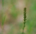
| 07/07/2005 10:17:59 PM |
daisy impressionby ursulaComment: A bit more in focus would have increased the interest in this photo... also would like to see less diffusion or blur. |
| Photographer found comment helpful. |
| 07/07/2005 10:16:05 PM |
Javaby MinutiaComment: Light is a bit harsh. a different perspective would have enhanced this overall - like maybe a coffee pot or cup in the background. |
| Photographer found comment helpful. |
| 07/07/2005 10:14:15 PM |
|
| Photographer found comment helpful. |
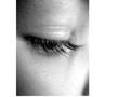
| 07/07/2005 10:13:33 PM |
Lashesby sbridgwaterComment: I am bothered by the sizing of this canvas - the extra white margin to the right. Additionally, the light is a bit harsh. Overall, the focus is good. |
| Photographer found comment helpful. |
Home -
Challenges -
Community -
League -
Photos -
Cameras -
Lenses -
Learn -
Help -
Terms of Use -
Privacy -
Top ^
DPChallenge, and website content and design, Copyright © 2001-2025 Challenging Technologies, LLC.
All digital photo copyrights belong to the photographers and may not be used without permission.
Current Server Time: 06/17/2025 05:23:13 AM EDT.