| Author | Thread |
|
|
07/19/2005 11:29:46 PM |
*Greetings from Critique Club*
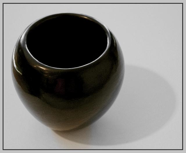
First of all, I think this met the Circle Challenge very well (I scored it a 7). This shot has a lot going for it. It screams simplicity - which is great. The composition is terrific - I like the offset subject with the leading shadow. I can't really tell too much about the lighting (other than the shadows) because of the graininess of the image, but we'll get to that in a minute.
I like the color use too - black and white always work in my book, and the additional color in the light reflection on the vase is nice, not overpowering. I also like the border - again, simple and elegant, not too flashy.
Now to the graininess (I assume it was not an artistic choice, as I don't feel it adds to the image or mood of the piece). This could be from the original, just poor focus/DOF or a result of post-processing - maybe a mixture of both. Any way you slice it, that is the biggest downfall of this image IMHO. Because you're working on simple as a theme, it needs to be sharp, crisp, and distinctive. I think if you were to pump up the contrast and reduce the backlighting, it would add a sharpness to your shot that it is currently lacking. It would also increase the "pop" factor with the additional contrast.
Overall, I still think it's a strong entry and perfectly suited to the challenge. You might want to consider reshooting it and experimenting with your camera settings and the lighting to see if you can get a sharper image, because it has all the makings of a really great one.
Remember, this is just my 2 cents - your opinion is the one that matters!
Jimmy
|
|
 Photographer found comment helpful. Photographer found comment helpful. |
Comments Made During the Challenge  |
|
|
07/12/2005 10:48:31 PM |
|
| Photographer found comment helpful. |
|
|
07/11/2005 12:55:35 AM |
Subject Impact: Low
Meets Challenge: High
Technical: Average
Composition: Average
Creativity: Low
Score: 5 |
|
| Photographer found comment helpful. |
|
|
07/10/2005 02:04:28 PM |
|
circle no doubt, but the color of pot and background spell bland rather than beautiful. |
|
| Photographer found comment helpful. |
|
|
07/10/2005 06:55:11 AM |
|
too grainy.. i think you messed too much with the picture. |
|
| Photographer found comment helpful. |
|
|
07/08/2005 05:11:41 PM |
Subject Impact: High
Meets Challenge: High
Technical: Average
Composition: Average
Creativity: Average
Score: 7 |
|
| Photographer found comment helpful. |
|
|
07/07/2005 09:35:50 AM |
|
|
|
07/06/2005 03:53:16 PM |
|
I like simplicity, but, this one got a bit too plain. Maybe a different background would have helped because the pot itself is neat. 5 |
|
| Photographer found comment helpful. |
|
|
07/06/2005 02:24:36 AM |
|
Very simple, but nice. The lighting is perfect with nice shadow. Well focused. This reminds me of an drawing class study subject. Shows a little grain, but oh well. Meets challenge criteria. Good composition. I can't think of any reason not to give it a 10 |
|
| Photographer found comment helpful. |
Home -
Challenges -
Community -
League -
Photos -
Cameras -
Lenses -
Learn -
Help -
Terms of Use -
Privacy -
Top ^
DPChallenge, and website content and design, Copyright © 2001-2026 Challenging Technologies, LLC.
All digital photo copyrights belong to the photographers and may not be used without permission.
Current Server Time: 06/28/2026 08:23:37 PM EDT.