| Author | Thread |
Comments Made During the Challenge  |
|
|
07/10/2005 02:13:38 PM |
|
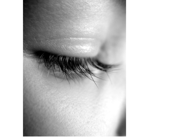
I don't like this border at all. It looks more like the site isn't displaying the full image than a border. It's completely distracting and detracts from what might otherwise have been a good image. |
|
 Photographer found comment helpful. Photographer found comment helpful. |
|
|
07/10/2005 03:35:59 AM |
|
I'd like it better with the eye open |
|
| Photographer found comment helpful. |
|
|
07/10/2005 01:27:55 AM |
hmmm, i'm not quite sure how i feel about this border.
a little more focus on the lashes would help this image, considering most of them are out of focus. either way, i hope you do well, good luck |
|
| Photographer found comment helpful. |
|
|
07/08/2005 07:17:05 AM |
|
| Photographer found comment helpful. |
|
|
07/07/2005 10:13:33 PM |
|
I am bothered by the sizing of this canvas - the extra white margin to the right. Additionally, the light is a bit harsh. Overall, the focus is good. |
|
| Photographer found comment helpful. |
|
|
07/07/2005 05:22:29 PM |
|
I really like this shot, but I don't like the border (I guess that's what it is) around it. Great detail on the lashes, nice soft lighting and good cropping. |
|
| Photographer found comment helpful. |
|
|
07/07/2005 04:45:15 PM |
|
Clear photo of a pleasing subject. Meets the challenge. But for me, diminished by the unusual border. |
|
| Photographer found comment helpful. |
|
|
07/07/2005 05:49:05 AM |
|
I guess you are probably already getting lots of gruff about the uneven border. Your close-up is nicely done and well focused. The lashes, however, are a little unruly. A little spit on the fingers could shape them up nicely. |
|
|
|
07/06/2005 07:39:49 PM |
|
I don't really think the extra white space flatters the photo at all. |
|
|
|
07/06/2005 04:52:02 PM |
|
|
|
07/06/2005 07:09:09 AM |
|
your border treatment had me take a longer look so it did its job of drawing attention to the shot... vignetting balances the composition... like the imbalance right and left - would like a bit of framing at the top. |
|
| Photographer found comment helpful. |
|
|
07/05/2005 05:23:48 PM |
|
| Photographer found comment helpful. |
|
|
07/05/2005 10:57:23 AM |
|
Nice tone and composition and lighting. |
|
| Photographer found comment helpful. |
|
|
07/04/2005 05:40:58 PM |
|
this is not the best composition and I don't like all the white space everywhere |
|
| Photographer found comment helpful. |
|
|
07/04/2005 04:23:12 PM |
|
I think your white frame around this photo really detracts from the effect. It would be really exceptional if you cut all that extra white out. |
|
| Photographer found comment helpful. |
|
|
07/04/2005 12:44:28 PM |
|
Definately would have been better without the extra white space |
|
| Photographer found comment helpful. |
|
|
07/04/2005 11:59:16 AM |
|
framing is messed up i think you will suffer alot from this, sorry to see this. |
|
| Photographer found comment helpful. |
|
|
07/04/2005 11:56:13 AM |
|
Just not enough depth of field... |
|
|
|
07/04/2005 11:55:57 AM |
|
nice long eyelashes, but am not sure what's behind the idea with your border. |
|
| Photographer found comment helpful. |
|
|
07/04/2005 11:33:12 AM |
Base: 5
Tech: +2
Subj:+1
Chln:
Total: 8
|
|
| Photographer found comment helpful. |
|
|
07/04/2005 06:02:54 AM |
|
Why this white space on both ends ? the image is nice .. but i dont like the "border". |
|
| Photographer found comment helpful. |
|
|
07/04/2005 03:49:40 AM |
|
I find the frame distracting and would prefer a bit taken off the bottom ... my taste on symmetry is probably much different than yours I can only state my preference ... not meant to be a criticism. |
|
| Photographer found comment helpful. |
|
|
07/04/2005 03:46:30 AM |
|
There is something wrong with he framing, other then that, it is a nice capture. |
|
| Photographer found comment helpful. |
|
|
07/04/2005 01:13:45 AM |
|
why the white sides? did you scan this? |
|
| Photographer found comment helpful. |
|
|
07/04/2005 12:40:23 AM |
|
This seems out of focus to me. Good close up but the right edge is way too blurred for my taste. |
|
| Photographer found comment helpful. |
|
|
07/04/2005 12:33:42 AM |
|
| Photographer found comment helpful. |
Home -
Challenges -
Community -
League -
Photos -
Cameras -
Lenses -
Learn -
Help -
Terms of Use -
Privacy -
Top ^
DPChallenge, and website content and design, Copyright © 2001-2026 Challenging Technologies, LLC.
All digital photo copyrights belong to the photographers and may not be used without permission.
Current Server Time: 07/01/2026 04:48:22 PM EDT.