| Image |
Comment |
| 06/15/2009 02:24:07 PM |
Leaning on a Lamp Postby DistantColoursComment: I loose all sense of scale, only the lamp post clues me in that I'm not looking at tiles in a bathroom or something. Very neat effect. |
 Photographer found comment helpful. Photographer found comment helpful. |
| 06/15/2009 02:23:04 PM |
You Missed A Spotby meowComment: Funny concept and a clever idea. I think the really shallow dof you usually get with macro shots rather hurts it though. It would be outstanding with more of the flower and at least all of the centre flower pin sharp. |
| Photographer found comment helpful. |
| 06/15/2009 02:21:48 PM |
|
| Photographer found comment helpful. |
| 06/15/2009 02:21:27 PM |
Jazzby MaryOComment: Abstract feeling and beautiful. The purple toning works really well too. |
| Photographer found comment helpful. |
| 06/15/2009 02:21:04 PM |
|
| Photographer found comment helpful. |
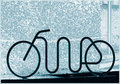
| 06/15/2009 02:20:15 PM |
Bikeby JuliBocComment: I don't know how to feel about this photo, the negative looking background is somewhat distracting but I do like the interesting shapes in the bike ornament/sculpture thing. |
| Photographer found comment helpful. |
| 06/15/2009 02:18:09 PM |
Dreaming Ansel Adamsby Rino63Comment: It's a beautiful landscape, the photo itself is a little too low contrasty for me as in there are blacks missing atleast on my screen, especially since Ansel Adams was so good at handling the tones in black and white images.
I do love the tiny figures off to the side there. |
| Photographer found comment helpful. |
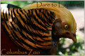
| 06/14/2009 05:26:20 PM |
Columbus Zooby aprudhommeComment: Ok the post processing killed this one for me I think. I mean both a watercolour type filter AND papyrus aka one of the most over used fonts in existence.
I would be interested in seeing the original photo though and the text and layout works. |
| Photographer found comment helpful. |
| 06/14/2009 05:16:59 PM |
Walk on the Wildsideby RmacComment: ..and we have papyrus again, I know that 5-6 out of 86 isn't really that bad but I just really can't stand the font.
Apart from that it's a beautiful photo. |
| Photographer found comment helpful. |
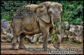
| 06/14/2009 05:06:56 PM |
We're having a party!by KelliComment: The processing on this one lost me. I'm not a fan of this look in photos, the skin of elephants is textured enough to be interesting without pushing it into looking like a coloured in ink drawing. |
| Photographer found comment helpful. |
Home -
Challenges -
Community -
League -
Photos -
Cameras -
Lenses -
Learn -
Help -
Terms of Use -
Privacy -
Top ^
DPChallenge, and website content and design, Copyright © 2001-2025 Challenging Technologies, LLC.
All digital photo copyrights belong to the photographers and may not be used without permission.
Current Server Time: 08/01/2025 07:55:45 PM EDT.