| Image |
Comment |
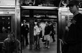
| 05/02/2007 07:31:59 AM |
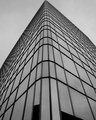
Office.jpgby weegi70Comment: I really like the lines and shapes here - especially the slight asymmetry of the picture.
I agree with the comments below about lacking contrast. You could do levels, curves, contrast as suggested below but I'm guessing you destaurated with the destaurate command so I'd suggest using the Channel Mixer, ticking the monochrome box, and playing with the sliders. Aim for a total of roughly 100 percent. Then you can do the other stuff and dodge and burn.
If you knew this already and are sat there thinking 'Who does this freak think he is to try to tell me how to do something that obvious' then just ignore me or PM me to piss off. |
 Photographer found comment helpful. Photographer found comment helpful. |
| 05/02/2007 02:48:32 AM |
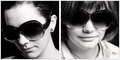
one.by xantangummiComment: Nice. I like the one on the left, slightly blown, but I like the angle of the jaw and the lighting. The one on the right looks soft. |
| Photographer found comment helpful. |
| 05/02/2007 02:43:40 AM |
|
| Photographer found comment helpful. |
| 05/01/2007 12:19:33 PM |
crisisby boysetsfireComment: Wonderful.i'd like to see a bigger, less central crop, but not instead of this crop, as well as this one. in my favourites. |
| Photographer found comment helpful. |
| 05/01/2007 12:15:33 PM |
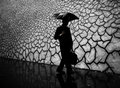
1by sevilduvarciComment: I like this one a lot - I always think it's a shame that street photography doesn't do well on dpc except in specialist challenges - excellent composition and tones |
| Photographer found comment helpful. |
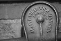
| 05/01/2007 11:58:13 AM |
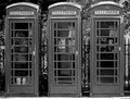
Fire Doorby jackal9Comment: I like the subject and the composition - a bit more dof on the letters would have been nice, perhaps alittle over sharp ? |
| Photographer found comment helpful. |
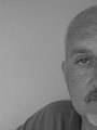
| 05/01/2007 11:56:20 AM |
Day 1 - Evby jonfrommkComment: I like the composition here - not quite half face - looks very angsty and Bergmanesque - i do find it too grey though - maybe converting to mono through the channel mixer and then d&d would help ? |
| Photographer found comment helpful. |
| 04/30/2007 07:35:00 PM |
DAY 1. B&W. full moon ..by rozComment: I like the shape of the cross and he second upright, but i'd have like a looser crop - and maybe without the moon, although this would cause titling problems. |
| Photographer found comment helpful. |
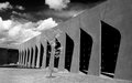
| 04/30/2007 07:19:17 PM |
Strongby RetroesqueComment: Great shot - I like the lines AND the tree, which for me breaks up the symmetry in a slightly uneasy way, quite edgy. Strangely it is the clouds and the chimney which I find slightly distracting. It looks Islamic, which is not what I'd expect in Virginia. |
| Photographer found comment helpful. |
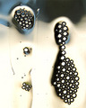
| 04/29/2007 09:35:53 PM |
random bubblesby LlamboComment: I hope this does well, I suspect it won't - 10 from me I think it's wonderful |
| Photographer found comment helpful. |
Home -
Challenges -
Community -
League -
Photos -
Cameras -
Lenses -
Learn -
Help -
Terms of Use -
Privacy -
Top ^
DPChallenge, and website content and design, Copyright © 2001-2025 Challenging Technologies, LLC.
All digital photo copyrights belong to the photographers and may not be used without permission.
Current Server Time: 08/04/2025 10:57:49 PM EDT.