| Image |
Comment |
| 08/01/2006 10:58:58 PM |
Weatheredby SDWComment: Looks a little blurred at the base, but I hope you find time/inclination to process this black and white - I think it would look great. Looks good as is, but BW would really show off the grunge on that statue. Nice one. |
 Photographer found comment helpful. Photographer found comment helpful. |
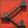
| 08/01/2006 10:57:31 PM |
Shadowsby SDWComment: Of all your recent batch of shots, I like this one best. In part because I like architecture shots, and in part because of the stark contrast between the red and black. I would rotate it clockwise a hair to try and get things level, but really this is great. I love the shadows too. That little light and the windows on the one door break up the picture just enough to keep it from looking sterile. This is a really nice photo. |
| Photographer found comment helpful. |
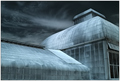
| 07/31/2006 04:17:36 PM |
Zen & the Art of Architectureby lwkimagesComment: It's a nice shot, like the color and the composition. It gives me a sense of nightmare though as it is so unnatural. To that end, I don't find serenity or harmony here. Ethereal - yes, other worldly - yes, gothic - yes. Nice shot, just not the shot for this challenge. 5. |
| Photographer found comment helpful. |
| 07/31/2006 04:17:30 PM |
Chopsticksby shudderbugComment: Very simplistic. Certainly presents a serene image. The composition would benefit from moving the plants down and more to the right and cropping out about half of them. Overall this needs more contrast. Meets the challenge, but the shot itself could use some work. 5. |
| Photographer found comment helpful. |
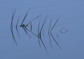
| 07/31/2006 04:17:20 PM |
the heart of the matterby IreneMComment: This is an interesting image. I like the material you've used and the textures it presents. I like how the lighting plays across it. The yellow/greenish banding in certain areas detracts greatly (and I've checked this on 3 monitors now). Possibly a shallower DOF would enhance the shot. Composition is nice. This has a very edgy feel to me though, something that might have been muted with a little blur or more subdued lighting especially in that center hotspot. It doesn't show me harmony or serenity and even though it is a simple object it is a very complex arrangement of lines for the eyes to follow. So I'm judging it a good photo that wasn't so hot for this challenge. 5. |
| Photographer found comment helpful. |
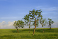
| 07/31/2006 04:17:15 PM |
Silent Sentinelsby MelethiaComment: I like the dreamy effect here. Very serene, good balance between sky and earth. Meets the challenge well. Trees should be in sharp focus, doing so would not destroy the effect. I would also move them to the right and crop out that little scraggly one. Horizon is a bit sloped. Overall, a nice shot. 5. |
| Photographer found comment helpful. |
| 07/31/2006 04:16:31 PM |
B R E A T H Eby -Bec-Comment: Composition is good. Nice color on the background void. Overall, it just doesn't grab me. I'm sorry I can't give some technical insight as to why, but it just doesn't do it for me. Possibly some better lighting on the cloth that would give some better contrast and bring out those wrinkles and folds. Not sure. |
| Photographer found comment helpful. |
| 07/31/2006 04:16:27 PM |
Zen Photographyby MayaMComment: Very, very busy photo. Looks to be a bit oversharpened and there is simply too much for they eye to focus on. Shallower DOF maybe, cutting off right behind that little ornament. Overall it's just too busy (and a bit too dark) to promote the sense of serentiy, balance and harmony that is the goal of the challenge. 4. |
| Photographer found comment helpful. |
| 07/31/2006 04:14:53 PM |
...and I, I took the one less traveled byby jerseyjimComment: This shot had some potential and suffers from a few things. Unfortunately in 'simple' shots, any flaw stands out that much more. First, I'd suggest taking this shot on your knees. The persepective of the road would be flattened out a bit and add much more to the sense of a path off into infinity. I like the light coming through the trees quite a bit and I like the white surface of the road. All very serene and do well by the challenge. Composition is well balanced. Don't care for the amount of darkness on the left side of the shot. Suppose you can't control nature's lighting, but if the fade to black was a bit more gradual and those trees jus a bit more defined as they came towards me on the left it would have worked better. Overall, nice work. 5. |
| Photographer found comment helpful. |
| 07/31/2006 04:12:30 PM |
Concertby ImagineerComment: Nice shot and probably no easy feat to capture it. Would like the flower to be sharper. As it stands with the bee so razor sharp, it appears to be hovering a good distance more towards the viewer than the flower it is apparently trying to get to. The whole image begs for increased contrast as well. This image does give a sense of harmony, though at the same time it does not give me a sense of serenity. Nice bokeh, and I think the grayscale works well. Nice job, 5. |
| Photographer found comment helpful. |
Home -
Challenges -
Community -
League -
Photos -
Cameras -
Lenses -
Learn -
Help -
Terms of Use -
Privacy -
Top ^
DPChallenge, and website content and design, Copyright © 2001-2025 Challenging Technologies, LLC.
All digital photo copyrights belong to the photographers and may not be used without permission.
Current Server Time: 06/17/2025 08:42:29 AM EDT.