| Image |
Comment |
| 10/01/2010 12:02:11 PM |
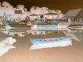
Ghost Town.by mrbig65Comment: Back to comment: I actually like the positive of this image better than the negative. As a negative, the composition is very cluttered and lacks a focal point. |
 Photographer found comment helpful. Photographer found comment helpful. |
| 10/01/2010 11:57:44 AM |
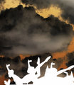
Sky Dancersby andresedComment: Back to comment: The building in the background really takes away from the shape of the statues. I'm sure you choose this perspective because of the building but there is way too much sky, which makes the composition look unbalanced. |
| Photographer found comment helpful. |
| 10/01/2010 11:53:48 AM |
Dare to Stareby ke5milComment: Back to comment: An interesting subject and the conversion to a negative provided some fun colors.
On the technical side:
a) The image needs to be straighten a little. It is leaning to the left
b) The image is smaller than allowed in the challenge
c) You need to sharpen your image after you downsize it for the challenge. Almost ever image gets softer when downsized. |
| Photographer found comment helpful. |
| 10/01/2010 11:52:42 AM |
Parachute from the Starsby colorcarnivalComment: Back to comment and bump: I'm not sure if I like the negative or positive of this image better. That in itself tells me that the subject matter may be a little weak in wow factor. I'm giving you a bonus point for the uniqueness of your concept. |
| Photographer found comment helpful. |
| 10/01/2010 11:50:19 AM |
Blacklightby GeneralEComment: Back to comment: I'm not sure if I like the negative or positive of this image better. That in itself tells me that the subject matter may be a little weak in wow factor. |
| Photographer found comment helpful. |
| 10/01/2010 11:37:44 AM |
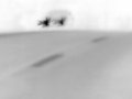
cARby bvyComment: Back to comment and bump: This is a very interesting concept and I think you did a good job with the execution. However, the image lacks depth, as the fading of the road into the night doesn't translate as well when converted to a negative. I also imaging that you are getting a lot of comments about the noise/grain. I like it but I'm sure it is hurting your score. |
| Photographer found comment helpful. |
| 10/01/2010 11:30:09 AM |
Zebra by matoComment: Back to comment: My favorite zebra shot of the challenge. For me, this is one of the best negatives of a B&W in the challenge. I think the negative ended up looking better than the positive (yes I switched it back to see what the contrast was before turning into a negative). Nice job. |
| Photographer found comment helpful. |
| 10/01/2010 11:25:44 AM |
flightby tph1Comment: Back to comment and give a major bump. The more I look at your image the more I love the motion. I also think the colors look better as a negative than your original image (yes I did a print screen and ran a "Make negative" action). Nice job. 10 |
| Photographer found comment helpful. |
| 09/29/2010 07:30:55 PM |
Arrr, who goes thar? by hawkeyefilmsComment: Great concept and congratulations on your first ribbon. Another change you could try in your post processing steps is to not do any sharpening until after you size the image to 800 pixels. I don't know if your software has Unsharp Mask (USM) but if you do, here are a couple of settings you can use after you size the image.
Amount 100% Radius 1.0 or Amount 75% and Radius 0.75.
I find one of these two settings will work after I downsize my image.
Tim Message edited by author 2010-10-03 13:59:54. |
| Photographer found comment helpful. |
| 04/21/2010 11:44:40 AM |
After 20 years... who needs lingerie?by AarthekComment: Responding to your forum thread for comments: I found the concept to be fairly creative and the shallow dof a plus to the composition. Where this image earned a 5 from me was that it lacks contrast. I'm not sure how you converted the image to b&w but there is a good tutorial here DPC B&W Tutorial.
Tim |
| Photographer found comment helpful. |
Home -
Challenges -
Community -
League -
Photos -
Cameras -
Lenses -
Learn -
Help -
Terms of Use -
Privacy -
Top ^
DPChallenge, and website content and design, Copyright © 2001-2025 Challenging Technologies, LLC.
All digital photo copyrights belong to the photographers and may not be used without permission.
Current Server Time: 06/15/2025 01:53:03 PM EDT.