| Image |
Comment |
| 03/21/2004 07:41:04 AM |
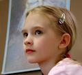
Krissieby vtruanComment: I like the catchlights in the eyes. They bring a real sparkle to this young lady's face. I also like the Degas you've used in the background. That adds a special dimension to your portrait. |
 Photographer found comment helpful. Photographer found comment helpful. |
| 03/21/2004 07:36:34 AM |
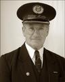
The Station Masterby trainComment: Excellent! I would try to get the subject a bit further away from the background so that the wrinkles in the BG don't show. You've done a very good job of eliminating any reflections in the eyeglasses while retaining catchlights in the eyes and you've portrayed a man obviously proud of what he is and proud to serve his public! Very powerful image. |
| Photographer found comment helpful. |
| 03/21/2004 07:31:19 AM |
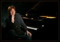
The Key's to Successby jefalkComment: Execellent composition and posing. I would tone down the highlighted button and the specular hightlight on the piano. I like how the hair light adds separation between the subject and background. |
| Photographer found comment helpful. |
| 03/21/2004 07:27:53 AM |
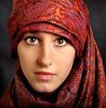
portre ressami by kiwinessComment: I only see two very slight flaws in this excellent portrait. First is the second catchlight in your subject's right eye and second is that the tip of her nose is slightly out of focus. Her eyes are captivating; you've done a marvelous job of lighting. 10. |
| Photographer found comment helpful. |
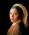
| 03/21/2004 07:19:28 AM |
The Girl With A Pearl Earringby sherComment: This is a VERY good recreation of Vermeer's classic including the angle of the body, the costume, the lighting on the face, etc. If you every try this again, I would have the blue wrap cover less of the ear as in the painting and maybe lower the camera slightly and have the subject look over her shoulder just a bit more. I enjoyed studying this one! |
| Photographer found comment helpful. |
| 01/26/2004 01:00:56 AM |
Cherishby katlynComment: This appears too "hot" with the highlights. Such a solid shadow implies that you didn't move the light very much if at all. Composition is fine although it seems too tightly cropped. |
| Photographer found comment helpful. |
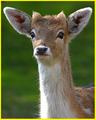
| 01/21/2004 09:40:30 AM |
Fallow Deerby RHoldenSrComment: Just my opinion, but I think this would have been better if it weren't so tightly cropped and if we could see more of the body of the animal. Sometimes it's good to fill the frame, but this time, I don't think it works as well. Generally, the exposure is good and I like the attentiveness of the animal. 8 |
| Photographer found comment helpful. |
| 01/19/2004 07:47:03 PM |
|
| Photographer found comment helpful. |
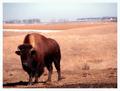
| 01/19/2004 07:37:54 PM |
Home on the Rangeby ShannonComment: You'll probably get this comment from several people but I'll say it anyway. I think this would have looked even better if the bison was facing into the picture space. Still, an impressive photo and I could, indeed, see this as appearing in NG. |
| Photographer found comment helpful. |
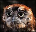
| 01/09/2004 07:06:05 AM |
I Will Try To Make Wise Choices by GolferDDSComment: We've always taken the owl as a symbol of "wiseness" and you've used it nicely to illustrate your NYR. Nice and sharp where it should be and DOF was used "wisely" here. |
| Photographer found comment helpful. |
Home -
Challenges -
Community -
League -
Photos -
Cameras -
Lenses -
Learn -
Help -
Terms of Use -
Privacy -
Top ^
DPChallenge, and website content and design, Copyright © 2001-2025 Challenging Technologies, LLC.
All digital photo copyrights belong to the photographers and may not be used without permission.
Current Server Time: 07/30/2025 01:30:13 PM EDT.