| Image |
Comment |
| 07/16/2006 11:27:40 AM |
|
 Photographer found comment helpful. Photographer found comment helpful. |
| 07/16/2006 11:27:25 AM |
|
| Photographer found comment helpful. |
| 07/16/2006 11:27:10 AM |
The Monolithby ArtysteComment: Too dark and too low contrast. The shape's great, and if it were brightly lit against the dark sky, or dark against a bright sky, it'd be much better. probably bright against dark would be best, to capture the lines going up the tower, which enhance the perspective effect.
This is one where I'd love to see some post-processing and another version of it in your portfolio. |
| Photographer found comment helpful. |
| 07/16/2006 11:25:48 AM |
Two Sidesby whiteroomComment: Too dark and blurry, and the black thing on the right is distracting. |
| Photographer found comment helpful. |
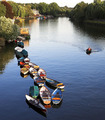
| 07/16/2006 11:25:15 AM |
Summer Meanderby AlexSaberiComment: I can't decide whether the focus is on the boats or the shoreline. If it's the boats, a lower angle would've conveyed perspective better. The shoreline's a little too far away and becomes visually flat at tjavascript: do_vote(5)
5 his angle. |
| Photographer found comment helpful. |
| 07/16/2006 11:24:16 AM |
|
| Photographer found comment helpful. |
| 07/16/2006 11:22:52 AM |
Head Onby GolferDDSComment: The DOF is a little too shallow. It ends up focusing all of my attention on the head, while the entire body fades into the background.
It doesn't "recede" into the background, but rather becomes part of the flat background, so perspective disappears.
That said, simply as a random picture, I'd love to see this cropped tightly to the head and brightened up a bit. It looks like you captured very nice details on the head. |
| Photographer found comment helpful. |
| 07/16/2006 11:21:22 AM |
Diveby ZigomarComment: The angle and cropping remove all sense of distance, so the perspective is lost. |
| Photographer found comment helpful. |
| 07/16/2006 11:19:52 AM |
Rites Entrance IVby banmornComment: I think you cropped this too tight, and the angle's too high. It comes across as an abstract, so the sense of receding into the distance gets lost. |
| Photographer found comment helpful. |
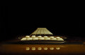
| 07/16/2006 11:19:10 AM |
"Sunny" The Marquisby khdossComment: I see the perspective of the lines. I would've preferred it in better focus and more contrast.
I don't understand the title. I thought this was a guitar. |
| Photographer found comment helpful. |
Home -
Challenges -
Community -
League -
Photos -
Cameras -
Lenses -
Learn -
Help -
Terms of Use -
Privacy -
Top ^
DPChallenge, and website content and design, Copyright © 2001-2025 Challenging Technologies, LLC.
All digital photo copyrights belong to the photographers and may not be used without permission.
Current Server Time: 08/28/2025 02:16:39 AM EDT.