| Image |
Comment |
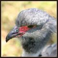
| 05/11/2004 12:40:28 PM |
Headshotby tyt2000Comment: Great details in the features and the beak. Very sharp and good exposure. Good composition too. The lower right corner looks a little odd to me, although not exactly sure why. It looks like it has the green of the background where the body should be, and an odd OOF section of gray. Even so, it's a good bird portrait. |
 Photographer found comment helpful. Photographer found comment helpful. |
| 05/11/2004 12:36:57 PM |
WTC-Amishby Herblacklist12Comment: The top right corner is very bright in comparison to the rest of the shot, specifically the sign, and I'm not too sure about the composition but also not sure how you could 'better' it either. The color combo of blue and yellow go well together, and the tear and the overall weathered appearance of the sign adds interest. |
| Photographer found comment helpful. |
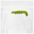
| 05/11/2004 12:34:28 PM |
Garnishby crabappl3Comment: I like the minimalism of the shot and the basic white and green color combo also gives it a nice simplistic look. The lack of reflections on the glass is good, but I'm glad there are some marks so you still know that it is indeed a glass. The composition is great, and the detail in the caterpillar is excellent. Wonderful shot! |
| Photographer found comment helpful. |
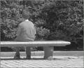
| 05/11/2004 10:43:02 AM |
Freedom of speech.by DufusComment: OK I admit it, I had to chuckle when I saw 'Hotel Borg' - it's the nerd in me. The grayscale could prolly do with a little more contrast, especially on the background. I'm not sure I particularly like the cropped head at the front either, looks a little odd to me. Stepping back some and getting a little more of the crowd may have helped. I'm not sure what the signs say, but it's an interesting photojournalistic shot. |
| Photographer found comment helpful. |
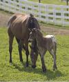
| 05/11/2004 10:39:08 AM |
Mother's Loveby shkelly587Comment: This definitely comes across as a springtime shot. The mix of white fence, green grass, and tan horses compliment each other well. The detail and exposure of the horses are good. The composition is good, although I'd be tempted to try a different crop - a little off the right side to get rid of the black pole and the top until the gap above the fence is gone, and the faded line at the bottom - which I think would center in on the horses more. |
| Photographer found comment helpful. |
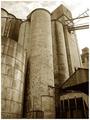
| 05/11/2004 10:33:35 AM |
Abandoned Flour Mill circa 1950by L1Comment: The toning is good and ages it well to go with the title. The textures of the silos with the peeling paint is also great and adds to the whole mood of the shot. I like the perspective, it makes them towering and intimidating, which is what I usually feel when I see these huge constructs. It certainly looks like it has a few stories to tell. |
| Photographer found comment helpful. |
| 05/11/2004 10:31:09 AM |
Lion heartedby neenee1999Comment: Something strikes me as odd about her head but it could be because her ears are down. I wonder if this is a crop of a larger image as there seems to be some low quality to the shot. The composition is good, as is the background. The lioness seems to be a little soft and also some slight noise in her coat, which is why I thought it may be cropped and size increased. It certainly has all the elements of a good shot, just a little lacking in quality. |
| Photographer found comment helpful. |
| 05/11/2004 10:26:19 AM |
Need laundryby russiComment: The use of DOF to give the image depth with the two pairs of clothespins. is excellent. The detail on the foreground pegs are great and the light on them is good too. I'm not sure about the composition as the image doesnt really grab me, but not sure if another composition would improve it any better than this either. |
| Photographer found comment helpful. |
| 05/11/2004 10:22:50 AM |
bad boy gets a time outby coolharComment: The first thing I notice is that the boy sticks out from the background as his toning/contrast is quite different from the rest of the image. It almost looks like he was pasted into the shot. The composition is good, and the detail on the branches are good with the mix of light and shadow. The boy looks too light and could probably do with some more contrast so to blend in a little more. |
| Photographer found comment helpful. |
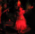
| 05/11/2004 10:18:38 AM |
A Dance With a Ghostby artvetComment: This is more a particular style that appeals to some and not to others. I wouldnt know where to begin to try and critique it as it is not really a style I am familiar with or particularly care for. Good luck in the challenge! |
| Photographer found comment helpful. |
Home -
Challenges -
Community -
League -
Photos -
Cameras -
Lenses -
Learn -
Help -
Terms of Use -
Privacy -
Top ^
DPChallenge, and website content and design, Copyright © 2001-2025 Challenging Technologies, LLC.
All digital photo copyrights belong to the photographers and may not be used without permission.
Current Server Time: 08/06/2025 09:27:18 AM EDT.