| Image |
Comment |
| 06/24/2005 02:38:49 PM |
Interdimensional Visitorby amberComment: Good black point and an alien theme meets the challenge.
Some reviewers may not feel this is a very creative attempt at the challenge topic and vote it lower.
The main downfall of this image is noise. It has a lot of electronic noise that will be interpreted by most voters as a low quality image. This effect is pronounced since it does not have much detail to begin with. This image would benefit greatly with noise reduction applied. Message edited by author 2005-06-27 14:40:11. |
 Photographer found comment helpful. Photographer found comment helpful. |
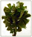
| 06/24/2005 02:11:26 PM |
If Only.......by singsunshineComment: A money tree fits a fantasy world concept in a way anyone can relate to. Sharpness is good and the choice of a white background works very well.
There are a couple technical items that will hurt this image in scoring. One is that the background is not solid white. Some 'dirtiness' shows through that will be a distraction for some viewers.
There are some digital 'jaggies' that show up prominently on the edges of the dollars on the tree. These are also distracting and should be corrected.
The biggest flaw is lighting. The tree needs some front illumination. It is too dark in the center and it is made more apparent when contrasted to the white background.
There is something you might try in post processing without reshooting that might work well with this image for this particular challenge. You could apply dodging to lighten various areas in the darkened interior of the tree to give it a more surreal look and added viewer interest. But you have to be careful not to overdo it. It is very easy to lighten to much and give the image a washed out look. I'd recomment a brush opacity of around 5% or maybe a little more and make broad circular strokes. |
| Photographer found comment helpful. |
| 06/24/2005 01:58:10 PM |
Solaris by LevTComment: Nice job. High technical quality. Picking an outdoor location for the tiny refracted images in the bubbles is a terrific idea. Does not look like camera or photographer got into those images. This image will place very high in voting. |
| Photographer found comment helpful. |
| 06/24/2005 01:53:36 PM |
Woodland Fairy Castleby SJCarterComment: Good attempt at creating a fantasy world. The use of softness in the background is a good idea. Colors are fine, particularly the surrealistic look of the background tree trunk.
Some viewers will not buy into the world as you've created it and will vote it lower.
Technically, there are a couple things that hurt the image. There is a high amount of detail in the main focal point and it does not come across as sharply focused. It is very difficult to get fine detail like that correct in digital images. It also has a couple of hot spots on the lower left of the side of the main subject that should be corrected.
You might try some burning to both mute the oversharpened granulated appearance and remove the hot spots. 10% darkening of the near trunk and foreground will also soften the image and bring out more detail with better tonal transitions. |
| Photographer found comment helpful. |
| 06/24/2005 01:44:18 PM |
Ylguby bucketComment: Concept works, colors are fine and the image is not overexposed.
Viewers will not be able to figure out what the fantasy is and that may hurt it in voting.
On the technical side the head is tilted clockwise considerably. This is a distraction that will hurt it in scoring. Unfortunately the only way to correct it is to reshoot after repositioning the head in the composition.
This is an otherwise fine image. |
| Photographer found comment helpful. |
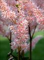
| 06/24/2005 01:37:43 PM |
Pink Forestby admart01Comment: Nice floral image. Good shallow depth of field (DOF) with low noise. Greens and pinks work well together. High technical quality.
Some viewers may not like having a floral entry for this type of challenge. Flowers are common in almost all challenges and viewers tend to rate them lower if they feel they do not fit well.
Though there really isn't anything specifically wrong with the composition there is not a lot in the framing to add interest for the viewer. You might consider other perspectives and/or arrangements of the flowers for added visual impact. The rule of thirds, of course, is always good for this purpose.
You might consider judicious use of dodge and burn to add texture to image and reduce the slight overexposure in some of the flower petals. |
| Photographer found comment helpful. |
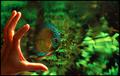
| 06/24/2005 01:30:37 PM |
A Portal from their World into Ours.by banditComment: Nice concept, good colors and an appealing composition. The hand is a great idea. General photographic quality is high. Works very well for this challenge. It should finish high in scoring.
|
| Photographer found comment helpful. |
| 06/24/2005 01:28:12 PM |
Tentaclus - a Nebulan jellyfishby naomikComment: Colorful abstract with a good solid black background.
Pure abstracts that do not have an immediately discernable tie with reality like this one typically do not do well in DPC voting. There are exceptions but they must be technically perfect. Viewers likely will think this is a spur of the moment idea that was not particularly well thought out.
This image has two bright washed out areas at the center of the composition. They are major viewer distractions that will hurt it in scoring. It also has some image noise. Exessive noise reduction software smoothing would probably work well with this particualar image. |
| Photographer found comment helpful. |
| 06/24/2005 01:18:32 PM |
Nithhogr - protector of Yggdrasil! (aka "Norbert")by muggle_girlComment: Color and general image technical quality is good. The setting is nice and hiding your main subject behind out of focus leaves works for this composition.
Toys have been overused in DPC entries in the past and generally do not do well in challenges. Viewers have become jaded to them. This will hurt the score of this image more so than any technical flaw. |
| Photographer found comment helpful. |
| 06/24/2005 01:14:25 PM |
Through Saturn's Ringsby banmornComment: Composition and color generally good. Concept is fine.
The general poor photographic quality of this image will hurt it in scoring. It has a lot of granulated detail that will be interpreted as an image defect by most viewers.
You might consider a couple things for improvement. First apply an excess amount of noise reduction to remove the granulation and smooth the borders in the trasition areas. It would add to the ring illusion you are trying to achieve. Then pick a couple colors and increase their saturation a lot to draw attention to them and add more visual interest to the composition. Color painting in a 50% greyscale layer is probably the best way to do that but simple saturation increases for the selected colors would probably work well too. |
| Photographer found comment helpful. |
Home -
Challenges -
Community -
League -
Photos -
Cameras -
Lenses -
Learn -
Help -
Terms of Use -
Privacy -
Top ^
DPChallenge, and website content and design, Copyright © 2001-2025 Challenging Technologies, LLC.
All digital photo copyrights belong to the photographers and may not be used without permission.
Current Server Time: 08/23/2025 11:31:42 PM EDT.