| Image |
Comment |
| 07/25/2005 05:41:51 PM |
|
 Photographer found comment helpful. Photographer found comment helpful. |
| 07/16/2005 03:42:10 PM |
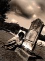
Judithby esdarbyComment: Good concept. Sepia and perspective work well for this image. Generally good exposure and dodge and burn done nicely to create an ominous sky. Overall technical quality is OK.
Some viewers may vote lower from a "meet the challenge" standpoint because they will blieve it is staged. It will be hard for them to believe that the model could have such profound sadness over a lost relative that died in 1904. Some may not like the angled perspective.
The sky and trees make a great background but the mausoleum and building in the background act as a distraction from your model. |
| Photographer found comment helpful. |
| 07/15/2005 12:12:03 PM |
In our shoesby mlhop05Comment: Creative method to express the idea of family. Perspective is fine. Your choice of shoes and colors complement each other.
This almost looks high key but might not be the effect you were after. The background either has to much or not enough wrinkles in it. Seems like the sheet should be completely flat so that there are no wrinkles at all or you should include more and strategically placed wrinkes to add texture and visual appeal to the image. |
| Photographer found comment helpful. |
| 07/15/2005 12:04:53 PM |
Dad & Daughters by roadrunnerComment: Nice early evening color. Good capture of a shared family moment. Horizon level.
On the technical side the smal rectangular object on the far left is a slight distraction and you might consider cloning it out.
Try out a couple things for a better silhouette and you might be amazed at the result. Add an adjustment layer for selective color and chahge just black to +70. Then add another adjustment layer for brightness/contrast with settings - +30 contrast, -40 brightness. These settings are a bit much but the effect on sky color is phenomenal and you have a better silhouette. |
| Photographer found comment helpful. |
| 07/14/2005 02:02:01 PM |
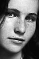
Bondby TranquilComment: Interesting B&W portraiture. Shallow depth of field with the center focus on the left eye is a great idea and makes the composition very interesting. Lighting is good with a full tonal range and it is properly exposed. Great capture of a Mona Lisa expression.
Nitpicking "meet the challenge" voters will call this is a "portrait" of an individual and NOT really "family" and vote this fine image lower because of it. |
| Photographer found comment helpful. |
| 07/14/2005 01:34:14 PM |
Disorder in the Familyby LokiComment: Interesting use of desat to draw attention to your main character in the image. It is unclear what people are looking at but it does not appear to be the boy. Fits the challenge.
The white dress and blouse are overexposed and should be burned to try to get more detail. Horizon needs to be level. This wrong horizon shows up three distinct ways. One is the people all appear to lean to the right. A second is the apper to get shorter moving from left to right. and lastly the background wall shows a strong downward right tilt. |
| Photographer found comment helpful. |
| 07/14/2005 01:28:37 PM |
Siblings At The River's Edgeby beautyqn25Comment: Touching subject taken from an interestng perspective. Very strong and well composed. B&W works well.
Fits the challenge topic exceptionally well. In general it is technically well done. Theer are a couple hot spots on the image you might consider burining in. One is at the upper left corner and the other are a couple spots on the left side child's pants. While you are burining in things you might consider additional dodge and burn to add more tecxture to the tocks and water. It will give the image more visual impact. |
| Photographer found comment helpful. |
| 07/12/2005 03:58:19 PM |
Knightby esdarbyComment: The perspective and composition is generally good. The yellow/orange color in the background adds visual interest to the image. It has low noise. General technical quality is decent.
Ironically, the incredible strength of the other images entered in this challenge may have had a slight negative impact on your score, but not lots.
It isn't so much that the DOF is super shallow but it is where it is centered that hurts. Almost always you want the eye to be center focused, even with a chess piece. Yours is center focused on the forehead. That is a fault.
The background, though dark, is still distracting because it has detail that makes the viewer wonder what is back there. Anything that detracts from the main subject should be eliminated from the composition. All elements in an image should always support the main subject.
The biggest distraction is the brownish shadow on the piece itself. Whether it is real or not, the browness and shape of it looks unnatural. The viewer really can't figure out what the heck it is. However, it is distinct from the nice black shadow on the right. The brown color is not appealing and it sorta looks like bad burning to most viewers. Message edited by author 2005-07-12 16:01:10. |
| Photographer found comment helpful. |
| 07/09/2005 04:08:41 PM |
Darknessby arsenalComment: Nice solid black background. Good use of the rule of thirds and framing is fine. In general, the exposure looks OK. Black and white is a good choice.
The weakness of this image is not so much in technical quality as it is in composition and content. Your image will fail to make a connection with most viewers. The reason is that it lacks a clear and visible meaning. Every photograph must make a connection to the viewer.
There is nothing wrong with the viewer having to figure out what an image means. The greatest photographs ever taken make people think. But it is the duty of the photographer to provide enough reasons for them to care. Yours does not.
From the image title you hint the main subject may be in a melancholy mood. But by looking at the picture the guitarist could just be having a good time jamming as far as we can tell. If you included their face it would go a long way toward the viewer understanding what this image is supposed to mean. An anguished face would make a strong viewer connection.
The distant objects in the background are indiscernable. As such of most viewers will find them to be major distractions and only contribute to their confusion as to what this image is supposed to be about.
Practically every darkened image of a musician strumming a guitar is blurry. The first 100 or so times you see blurry muscians work, but after that if comes across as an old, overused technique unless captured in a new or unique way. If you are going to show motion blur then design or capture it in a dramatic way to show a clear and purposeful meaning to the motion. Otherwise, the viewer just assumes the photographer doesn't know how to take a clear picture.
In terms of photography it is not a bad picture technically, but it is a confusing one and that hurts. |
| Photographer found comment helpful. |
| 07/04/2005 08:34:08 PM |
Underground station by aKiwiComment: Congrats on winning a ribbon, even if through DQ. You are right, the colors are what makes this entry and you were smart to take the picture because of it. It is a super picture. |
| Photographer found comment helpful. |
Home -
Challenges -
Community -
League -
Photos -
Cameras -
Lenses -
Learn -
Help -
Terms of Use -
Privacy -
Top ^
DPChallenge, and website content and design, Copyright © 2001-2025 Challenging Technologies, LLC.
All digital photo copyrights belong to the photographers and may not be used without permission.
Current Server Time: 08/17/2025 01:47:40 PM EDT.