| Image |
Comment |
| 06/17/2005 12:27:51 PM |
Night Lifeby BKerrComment: Nice twist. This could be interpreted both in a positive fun way or as a bright manifestation of a dark addiction - gambling.
The overall general quality of the image is good. Lighting works well. Most viewers will search for a central place to focus their attention but will not find one. The will also wonder why the crane on the right side of the frame is included. The casino with lavender lighting in the foreground occupies a prominent place in the image but is the least architectually intersting building in the scene. It would have been better to have a more intersting building occupy such a prominent place. All that will contribute to lower scores. |
 Photographer found comment helpful. Photographer found comment helpful. |
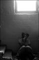
| 06/17/2005 12:21:43 PM |
Lossby LadeeMComment: What better theme for a darkness challenge than an image of despair and hopelessness? Well done B&W. Including the bright window is perfect contrast to your subject's despair. That gives the feeling she has given up on life.
This may have been intentional but the focal plan is in front of your model and on her legs rather than her face. Focusing on the face would be worth consideration. There are two tiny items, one on the far laft side of the screen and the other on the far right. Since the viewer cannot tell what they are they act as a distraction and probably should be removed from the composition through a framing change or cloning. |
| Photographer found comment helpful. |
| 06/17/2005 12:11:49 PM |
Tools of the tradeby _Io_Comment: Strong blue is a great color for high scoring images. Just review past ribbon winners and you will see that it crops up frequently.
At first glance it is not immediately apparent what this image is about. In most, but not all cases, viewers should instantly recognize what the image is and make a connection to it. That is probably difficult for most male voters.
Though not particularly creative or unique the composition of this image is fine. The focus perhaps is too soft. It needs a stronger and more apparent central theme. |
| Photographer found comment helpful. |
| 06/17/2005 12:05:59 PM |
into the darkness...by rileyComment: Good attempt to convey darkness. There is a fine line between artistic soft focus and just plain being out of focus and this image flirts with that line. It likely will not work with many voters. Use of some type of luminosity filtering might convey the concept a little more concretely and make it more acceptable to viewers.
verall this image has very low contrast and that was probably done on purpose as well. But in the concept of darkness a good solid black point is probably advised.
A great artistically altered image always starts out with a great image to begin with. Ask yourself, "Is this a great image to begin with?". Is is an image that stands strong on it's own before adjustment and outside the concept for this DPC challenge? This image probably does stand strong on its own but adjusting it for the challenge degraded it's appeal.
When taking picture if you find yourself thinking "If I just do this and this and this it will be great" then the image is probably not right in the first place. |
| Photographer found comment helpful. |
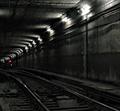
| 06/17/2005 11:55:11 AM |
Commute to Obscurityby StrikeslipComment: Technically well done image. Good capture of a subway tunel and well within the concept of darkness for most viewers. Generally speaking the use of selective desat for images at DPC is gratuitous in most cases, but it works very well here to add considerable interest to the composition. The bright red light just plain works well! |
| Photographer found comment helpful. |
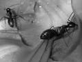
| 06/17/2005 11:52:24 AM |
Blackby dphillipsComment: Kudos to you for a fascinating macro. B&W is perfect for this shot even though I am sure it is quite colorful in reality. The first impression is that it is inside someone's ear which is a very "dark" thought. :) This is fresh lettuce or something like that. The fact the ant is feeding contributes to a feeling that gives the viewer the willys. :) Great job and congrats on a fine image. |
| Photographer found comment helpful. |
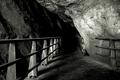
| 06/17/2005 11:48:22 AM |
Treacherous Pathby LevTComment: Conveys a sense of darkness well. Good view toward the darkness of the cave. A significantly lower or significantly higher angle for this photograph would work well in this situation. The technical quality of the rock wall fine detail seems harsh and overcontrasty which is very hard to process properly. Wish there were a sharpening technique to recommend to take care of that. I'd use in myself. :) |
| Photographer found comment helpful. |
| 06/17/2005 11:30:39 AM |
Favorite Dark Barby kcumanComment: Intersting concept and decent sepia. Good use of the rule of thirds to add interest to the image and the fact there is not facial detail works very well here. It is usually hard to pull that off. Good job. |
| Photographer found comment helpful. |
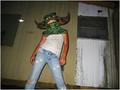
| 06/17/2005 11:25:00 AM |
unfounded fearsby cheleComment: The first question most viewers will ask is... why did you take this picture? Because it is not immediately apparent your score will suffer. Taking the picture from a low perspective is a good idea, but should have chosen a different and darker background. The background is far to distracting and adds little to the composition. The image has more of a look of a kid playing around than it does to darkness. A different posture and different lighting from unexpected angles with a less a distracting and clutter background could make this image work. |
| Photographer found comment helpful. |
| 06/17/2005 11:19:59 AM |
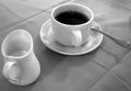
Cup 'O' Morning Darknessby mahobbesComment: Interesting twist on the darkness theme. Looking into the cup of black coffee is like looking into the darkness of and overworked life that just repeats itself over and over every day. It is a certainty that many voters will NOT see the darkness in this image. The simplicity and perspective of this image is it's strength. |
| Photographer found comment helpful. |
Home -
Challenges -
Community -
League -
Photos -
Cameras -
Lenses -
Learn -
Help -
Terms of Use -
Privacy -
Top ^
DPChallenge, and website content and design, Copyright © 2001-2025 Challenging Technologies, LLC.
All digital photo copyrights belong to the photographers and may not be used without permission.
Current Server Time: 08/20/2025 04:33:39 AM EDT.