| Image |
Comment |
| 06/20/2005 03:52:11 PM |
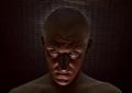
the darkness withinby aplomb76Comment: This is a very interesting composition. The facial expression is ominous and the lighting has just the right angle and harshness to support your purpose very well. The lighting around the back of the head to keep the head defintion from getting lost in the background is both effective and adds interest to the image. The way you use subtle color is inspired. The hint of red in the face is perfect.
A couple technical items may hold down the score slightly. It appears that the eyes are not level. If this is intentional then you need have the head tilted more to exaggerate the effect and make it plainly visible to viewers. If not then make sure the eyes are absolutely level.
The background netting should be level as well. The two areas where it is pulled upward slightly draws the eyes away from your subject and acts as a distraction.
The minor shadows on the right and left of the subject that show on the background netting will yield a higher score for this image if they were even.
That being said... this is one of the most creative images in this challenge and should do very well. Kudos to you for such a great shot. |
 Photographer found comment helpful. Photographer found comment helpful. |
| 06/20/2005 03:32:16 PM |
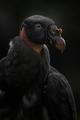
Enemy Withinby moodvilleComment: Vultures are always great fodder for a darkness theme. Yours is an exceptionally high quality image and should finish high in the scoring. Clarity and technical quality is far, far above average. Composition is excellent.
There will probably be some voters that think you are shoehorning this image into this challenge and it is really an outtake from your birds entry. That would be too bad but some folks surely will think like that. You should not be surprised.
The only minor technical flaw is that it appears to be overly smoothed in the lower chest and lower wing of the bird. This could be from noise reduction being aplied but it is not bad.
|
| Photographer found comment helpful. |
| 06/20/2005 03:25:57 PM |
The Closetby CEJComment: You applied the technique of a solid black background to convey a sense of darkness correctly.
Like many entries this one is very low contrast. In this case it might be better if you applied autocontrast or other color/contrast adjustments to bring out the red, yellow and blue in the mask face. You could still leave some shadow on the ears to relate to the theme, but those colors are just too good to be muted. |
| Photographer found comment helpful. |
| 06/20/2005 03:08:37 PM |
Dark Recordingby monnoneComment: This is a very photograph. Lighting is good and the depth of field works nicely. Composition is fine and the technical quality is better than most images in this challenge.
Some voters will think this image is being shoehorned into the challenge just to have something to submit and may vote it lower because of that.
It is a very good image that will likely get a score lower than it deserves. |
| Photographer found comment helpful. |
| 06/20/2005 03:05:33 PM |
Darkness........ of her eyes !by kbhatia1967Comment: Great framing of those penetrating eyes. Nice concept for this challenge and has high viewer interest.
There are some technical issues that will affect the final score.
The eyes are not level. That acts as a distraction to the typical viewer. They should be rotated counterclock a degree or so.
The lighting is unbalanced. Either you want to darken the image so the the eye on the left is in darker shadow to enhance that effect ot add lighting so that both eyes have similar lighting. In this version the right side of the nose is a little overexposed. This image appears to be in that grey area where the photographer could not decide which way they really wanted to go.
The red dot has some tiny white specks that are distracting to the viewer that should be removed.
The image focus is soft. From this distance it would seem that you either want to have it in razor sharp focus to see all the tiny fine detail clearly or you would want to do something to make the soft focus seem more mysterious or foreboding.
|
| Photographer found comment helpful. |
| 06/20/2005 02:53:11 PM |
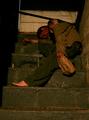
Aloneby holdingtimeComment: Certainly meets the challenge. You've capture darkness well.
There are a couple things that will hold down the score of this image. One is that the theme of alcholism is well represented in this challenge and voters will become jaded with it.
Just because of the theme this image would probably be better if it were converted to B&W. The color in this image does not add much to your message and B&W generally works better for images of this type.
The stairs are not level and that acts as a distraction. If that were intentional then you would need a steeper angle to be meaningful to viewers.
It looks like this image was taken with flash. In that case it might be better if you had stepped to the right slightly so the flash would illuminate the left as well as the right sides of the image. This could have been done purposefully, but will not look like it to casual viewers unless you move the flash further to the left to increase the shadow length. |
| Photographer found comment helpful. |
| 06/20/2005 02:38:17 PM |
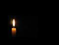
Enveloped In Darknessby crikComment: Nice minimalist interpretation of the challenge topic. The flame is not badly overexposed and the mid-tones (what few there are! LOL) are good. Nice solid black background.
There is really nothing wrong with this image photogaphically speaking at all. Its score will depend on how appealing voters find your minimlist interpretation. |
| Photographer found comment helpful. |
| 06/20/2005 02:16:27 PM |
Blue Darknessby tcrock41Comment: Like in all things, simplicity is a virtue in photography. This is a very clean image with no distracting elements. It has an appealing perspective and good angles. In mono-color images blue tends to score highest in DPC challlenges.
The blue color here, though, seems muted and gives the image a low contrast quality that many viewers will not find appealing. If you brightened it a lot more and make the blue color shimmer it will have a lot more appeal to voters and get a higher score. |
| Photographer found comment helpful. |
| 06/20/2005 02:05:05 PM |
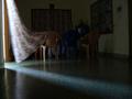
Where there is Darkness, there is Light.by herculeskspComment: The idea is good, especially with the movement of the drapes and the shadow lines in the room.
A photograph is like a well written novel. Pictures should only contain items that support the central theme of the image like text supports the storyline of the novel. If there is storylines that go nowhere or do not tie back with the main story then the novel is not very good.
The same is true of a photograph. In photography elemets that do not support the theme of the image are called distractions and there are several in this image that will cause it to get a lower score.
The electrical wires and whatnot on the wall on the right is a major distraction and so is the television set in the background. The things above the drapery on the far wall do not add to the composition at all. A viewer may wonder what purpose the chairs serve and why is there a blue one in the middle. They will also wonder what the furniture half hidden in the background is for. All this distracts the viewer from your wonderful shadow lines.
This requires some work but you could improve this image dramatically by removing all the distractions from the room and take EXACTLY the same picture. Only this one would be a minimalist interpretation of your theme.
In that picture you would remove all the furniture, the electrical plugin thing on the wall, the TV and chairs and the whatever it is above the far drape. If you cropped out the door on the left so that only the flowing drape can be seen and cropped out the edge of the wall on the right you would have a much improved photograph that viewers will easily understand and score much better. |
| Photographer found comment helpful. |
| 06/20/2005 01:47:51 PM |
Solace in Darknessby pidgeComment: This is an acceptable idea for this challenge.
It is easy to see why this image required validation. It looks as though you have rigged the image to reposition it on the image by adding a huge border or something.
However, that is not the real issue. If you had simply increased the contrast so there would be no small greyish square containing the candle it would not have shown up at all and nobody would have questioned the entry. That is a major image flaw and a big distraction for the viewer that will cause it to get a low score. Message edited by author 2005-06-22 07:48:38. |
| Photographer found comment helpful. |
Home -
Challenges -
Community -
League -
Photos -
Cameras -
Lenses -
Learn -
Help -
Terms of Use -
Privacy -
Top ^
DPChallenge, and website content and design, Copyright © 2001-2025 Challenging Technologies, LLC.
All digital photo copyrights belong to the photographers and may not be used without permission.
Current Server Time: 08/18/2025 06:19:07 PM EDT.