| Image |
Comment |
| 11/01/2007 06:57:10 PM |
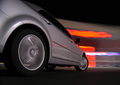
Zoomin'by CVetteComment: Hi from the Critique Club,
First of all, congratulations on your top 20 finish. This is a great capture of an interesting concept/perspective. The exposure is great, colours are very vibrant where they need to be, and the car is very sharp and in focus.
There isn't a lot to critique here. For one thing, it would be nice if the neon colours didn't bleed into the tire and the frame of the car near the passenger window. Of course, that's something that could be done outside of the challenge should you ever print the image.
That's about all I've got. Nice reflections, and great shutter length to get nice rotation of the mags. Well done, and very deserving of the score you got.
Regards,
Geoff |
 Photographer found comment helpful. Photographer found comment helpful. |
| 11/01/2007 06:34:16 PM |
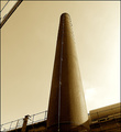
Not so long ago..by docjonnyComment: Hi from the Critique Club,
You've captured an interesting structure here with a fresh and probably not very often photographed perspective. I really liked this challenge, because it encouraged a perspective not often considered by many photographers, including myself. With that said, I think there are only a few things working against you here. First, the edge of the building caught in the upper-left corner is distracting. Rather than being drawn to the structure, my eye keeps being pulled to the negative space between the main subject and the edge of the building in the top corner. Second, the stuff in the bottom-right corner is competing for my attention; perhaps a slightly different composition would have helped. Third, it looks a bit oversharpened for the web; there's a bit of haloing at the top and along the shadow edge of the building.
On the positive side, the colours are nice and I like the textures of the bricks on the subject. Overall lighting is good and the gradation in the sky is nice.
Your score would improve a bit if the subject was a bit more captivating, but overall I think your technicals are quite sound and your image is quite deserving of the score it obtained.
Regards,
Geoff |
| Photographer found comment helpful. |
| 10/24/2007 03:42:12 AM |
|
| Photographer found comment helpful. |
| 10/17/2007 12:52:43 AM |
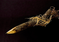
Twigby NodeComment: I like the sharp detail, and appreciate the fact that the background isn't entirely black (which would make the pencil look like it was just floating). |
| Photographer found comment helpful. |
| 10/17/2007 12:51:40 AM |
|
| Photographer found comment helpful. |
| 10/17/2007 12:50:19 AM |
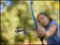
The Graphite Arrowby jasonlpriceComment: Great perspective. Good take on the challenge. Bokeh is nice, and I agree with your decision to blur out the archer. |
| Photographer found comment helpful. |
| 10/17/2007 12:49:37 AM |
|
| Photographer found comment helpful. |
| 10/17/2007 12:47:39 AM |
Let me tell you why I'm here, Mr Spadeby rinacComment: Great composition, excellent exposure and contrast, and the title is perfect (great reference!). The slight smoke is a perfect touch to bump it to a 10 from me. |
| Photographer found comment helpful. |
| 10/17/2007 12:46:39 AM |
|
| Photographer found comment helpful. |
| 10/17/2007 12:46:02 AM |
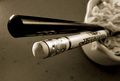
Chopstickby libertyComment: I like the composition, perspective, and focus on the eraser. B&W is great, too. |
| Photographer found comment helpful. |
Home -
Challenges -
Community -
League -
Photos -
Cameras -
Lenses -
Learn -
Help -
Terms of Use -
Privacy -
Top ^
DPChallenge, and website content and design, Copyright © 2001-2025 Challenging Technologies, LLC.
All digital photo copyrights belong to the photographers and may not be used without permission.
Current Server Time: 08/26/2025 05:02:12 PM EDT.