| Image |
Comment |
| 01/23/2003 06:07:27 AM |
Highway 314by vjozComment: I really like this picture! It's one of my very few favourits this time.
I like the color choice, the wonderfull composition (not many pictures of this challenge used special angles). It's one of the few pictures with space.
It could be a little darker though in the bright parts: the street reflection and the lamps are somewhat bright. I like the dark sky too.
So for me it is a winner and good luck to you. |
 Photographer found comment helpful. Photographer found comment helpful. |
| 01/16/2003 06:27:18 AM |
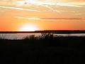
Sunset Lakeby LauraLeeComment: Why is it so small? The clouds are great with nice features I would like to see in more details. Also the color is great. You might have cropped the bottom portion a little more: the black area is not adding anything and thus unnecessary. |
| Photographer found comment helpful. |
| 01/16/2003 06:17:29 AM |
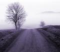
Road to Fogginessby kiwinessComment: while I first rated your submission not so high, on the second look it apears to me as beeing very good. When I rushed through the pictures I didn't notice the nice texture of the road and how it's bended. Also the asymmetric framing by the trees on the left and the bush on the right is good: the small bush gives way to allow the viewer to get a view to the hill behind the fog. This hill could have been more visible if you would have increased the contrast though or reduce the brightness. Still very good and fitting to the challenge topic. |
| Photographer found comment helpful. |
| 01/16/2003 05:59:18 AM |
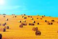
Hay, thats nice!by MartinComment: The composition is wonderfull and you have choosen a great topic. In my opinion it could have been improved by choosing a darker and deeper blue for the sky, but maybe this was not possible. Together with the yellow it looks a little artificial to me. Also the bright spot from the sun in the upper left corner does not add something in my opinion. Still a great picture for its topic and a 8 from me. |
| Photographer found comment helpful. |
| 01/16/2003 05:49:14 AM |
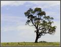
Windswept Treeby lisaeComment: I like the texture of the sky (could be a little darker though to show the blue parts better) the tight cropping at the bottoom and top and of course the center topic of your picture, the tree. It might have been nice if there would have been more room to the left and right to strengthen the feeling of space though. Still very good and a 8 from me. |
| Photographer found comment helpful. |
| 01/16/2003 05:45:10 AM |
As Sceneby BullwinkleComment: I like the mood of the picture: the tower looks great and the sky has just enough structure to make a statement (cold and grey day) because it's not overexposed. What disturbes me is the snow covered stone on the left: my eyes are attracted by it, although it turn's out that it is not important. Would have liked it to see more of the trees surrounding the tower. |
| Photographer found comment helpful. |
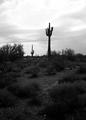
| 01/16/2003 05:30:32 AM |
Stenocereus Thurberiby AnnidaComment: The cactus and the sky are great (the sky is a little overexposed though) and using B&W was a good choice. You might have cropped the dark lower section stronger though. It's hard to see anything in there and it's not necessary, but it captures the viewer's eyes when it tries to find something without success. Still one of the many good pictures of this great challenge. |
| Photographer found comment helpful. |
| 01/16/2003 05:25:27 AM |
Summerby pikytoComment: This is a wonderfull scene, which lives from it's stepwise buildup: the beach in the front, the ocean, the houses behind it and then the wonderfull hills and mountains.
Also that everything is alligned and oriented to the the left side is great. You might have moved closer to the colored sunshades though, making them an surface on which the rest of the scene (ocean, houses, mountain) are rested. Would have been a better choice as the white tent in the front. Sharpness and colors are great. I hope you were able to swim a little. Good luck with this. |
| Photographer found comment helpful. |
| 01/15/2003 06:52:58 PM |
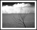
Desertby JackoComment: Now that's a keeper and for the livingrooms wall! I like what I see although I have no detailed idea what I look at and were exactly it is. But it does not matter!
The cloud (water, fog, dust?) in the back is just awesome, the piece of dark sky frames it and gives structure. The structure of the sand (beach, water?!) is just in the right way: in the front it gives an interesting texture and in the back it gives the basis on which the more important clouds settle. And the branch in the front is wonderfull: it catches the eye but does not take over. For me a winner, lets see what the other think. Good luck. |
| Photographer found comment helpful. |
| 01/15/2003 06:30:05 PM |
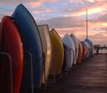
Boatscapeby FreebieComment: Now this is a great picture regarding the subject (haven't seen boots alligned that was before), the color (boats and sky) and the angle of view (you might have cropped it tighter on the right though). However, the picture comes short in my opinion regarding the challenge topic: therefor you were too close to the boats and the open-feeling is missing. |
| Photographer found comment helpful. |
Home -
Challenges -
Community -
League -
Photos -
Cameras -
Lenses -
Learn -
Help -
Terms of Use -
Privacy -
Top ^
DPChallenge, and website content and design, Copyright © 2001-2025 Challenging Technologies, LLC.
All digital photo copyrights belong to the photographers and may not be used without permission.
Current Server Time: 06/18/2025 09:04:15 PM EDT.