Hehe, thanks everybody!
I am my biggest critic! I have flogged myself over and over for posting an inferior (in my eyes) shot.
Gee Annida, I really don't think self-flagellation is warranted. I will without hesitation submit a "far less than perfect" photo for a three main reasons.
If people recognize and comment on the same flaws I find, it validates (somewhat) my ability to evaluate my own photos. Likewise, if they find new flaws, it will point out how/where I need to look more carefully at my own work.
Finally, people will sometimes find something wonderful, interesting, or unusual which I didn't notice myself, or offer a suggestion for reworking and improving the photo.
I try and submit something every week. Many photos are not technically perfect, but I try and make them all interesting, creative, or meaningful if not stunning.
Hehe, thanks everybody!
I'd like to say the most important reason why this shot didn't really work, and well, it might sound like whining.. but...
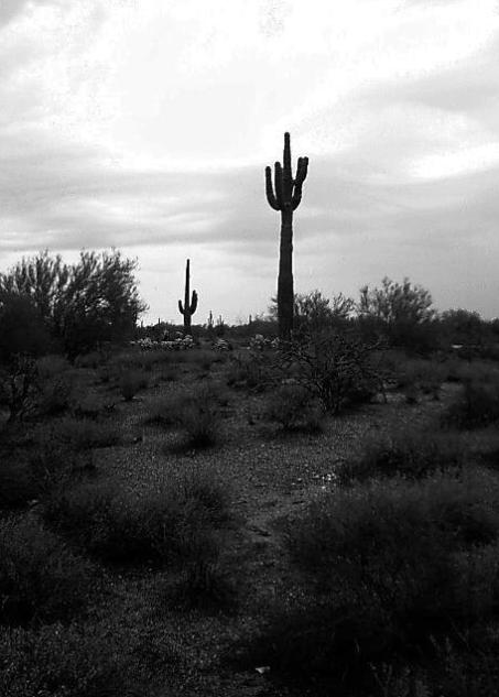
It had rained recently, and the ground was really soft, and every step I took closer to the cactii, I sunk deeper and deeper into the ground! So, I just took three or four shots of what I thought would work, and ran! As soon as I got into the car, the second storm started, and driving home was interesting in that we could hardly see 10 feet in front of the car! It was insane :)
I am my biggest critic! I have flogged myself over and over for posting an inferior (in my eyes) shot.
I agree with the suggestions to try shooting from another perspective, either lying on the ground or up on a ladder/box/car.
When I shoot into a bright sky (with auto-exposure), I usually take my light reading from the brightest spot, then re-frame. I've found that in most cases I can bring out detail in underexposed areas, but once the area is blown out to white (or a large flat-toned area) there's nothing you can do, except maybe use it as a base to create a composited image.
Well, Azrifel's CC comments are very in-depth and perceptive, but I'd just like to say some things. For Annida's first ever serious attempt at photography, she shows SO much flair it makes me jealous :P. And her score beat most of the photos I ever submitted using that camera.
From taking this photo and the one she has in the current challenge, Annida has learnt how to use the Gimp to crop, use levels, make borders, not compress too much, and sharpen.... all in two weeks! Watch out for her :).
Composition (content) The choice of subject is interesting, a lot can be done with this kind of landscape. There are however a lot of things that could improve this photo.
I think that for this shot a landscape view was more desirable to be able to do more with the composition. The width of the land is not enough for what the eye expects when it sees this. The huge empty sky above it enhances that feeling. Using a landscape view you can widen it and by positioning the horizon either at 1/3 or 2/5ths from the top or the bottom you get a more natural balance between the ground and the sky. It would also allow you to make more use of composition 'rules' (guidelines, they are ment to be broken when necessary) that are discussed in the tutorials (rule of thirds is just one example of many composition tricks, I'll provide a link further down).
You could perhaps put one of the cactii in one of the thirds crossings and cut some of the sky off the top of your picture.
A nice example of something that is already in this compostition is the perspective of the two cactii. You can see the height difference between the two, it creates depth in the image. That is something you could build on in relation to the more off-center positioning of the front cactii. Work on an idea with that and shoot from different positions for example.
Another thing you could try is a different vertical shooting angle. The way it looks now is a huge foreground sloping downwards toward you, with the background leveling out behind the cactus. That is also enhanced by the portrait view you used instead of the landscape view I think you could better use. Go up, stand up, use a household ladder, stand on the roof of the car, search for a small hill, stand on a crate. When you use the composition rules for the sky as well and use landscape mode, I think that you can get a better balance in the depth of the image.
I am not sure if black and white is the best choice (depends very much on the output of your camera, I understood from the forum discussions that the output of the Polaroid is often a bit messy). The tones of grey are very dark, but the sky is very bright. Perhaps that a bit of (good) color could have given a better contrasts in the details.
Background The background is the sky. The big exposure blow out white in the middle is very bright, it draws the eye out of the scene. I believe that this is almost unavoidable with this camera, the ccd simply can't cope with the exposure differences of the sky and ground.
The horizon is level, which is good.
Camera Work (Technical) The foreground looks a bit underexposed, but the sky overexposed. I already said something about this in the background section.
Not much to add really.
Digital Processing (technical) When you have photoshop, you could try adjusting the curves. Grab the curves line in the middle and pull it at a 45 degree angle towards the lower right corner. I did a quick curves like that and it turned the sky bright white, but equalling out the bright spot. The land itself became more nicely 'exposed'. Perhaps that the enhance colors/ gamma correction of the free Irfanview can do something like that. I encourage you to check that program out, I used it a lot before I got photoshop, it is easy and multifunctional.
I can't say much about the sharpness, because the jpeg quality is very low. There may be a huge improvement possible with just a higher quality setting. Your filesize is 34 kilobytes. Dpchallenge allows 150kb. Your low filesize tells me that the image is compressed very strong and my eyes could already see that it was too strong.
What is the result of strong compression? Loss of detail, halo's around subjects, loss of texture in the sky and ground, tone inconsistency, jpeg artifacts (square color shifts and strange fringing of details) etc etc.
You can see it here around the cactii and horizon, the loss of detail in the bushes, the overal soft and unsharp look of the image and artifacts above the right side of the horizon.
That can also be the result of the output of the camera, but at the highest resolution it should produce a 450kb file that you can work with. The highest setting is the best.
Now, to prevent all the above happening to the image, save it at a higher quality setting. You open the file from the camera, you work on it, you resample it (never resize, always resample with a bibubic or lanczos algoritm - lanczos available in irfanview), when necessary crop it. When necessary, now is the time to sharpen it. After that you save this as a tiff/tif file first!
Now use the tiff file (huge and dpchallenge will not take it) to create several copies at different quality settings and try to approach a filesize of 150kb. The closest will most often look the best and that is the one you need to submit.
My opinion As it is I don't find it very interesting.
I have made this cc comment this long because I understand that you are pretty new to this.
Here are also some useful sites:
Agfanet photocourses These very broad and useful Agfa photocourses are online for free. When I started I found this site very useful. Read them all. :)
Photo.net learn section This guy made me understand exposure and has great tutorials about subjects.
DPreview When you are looking for a new camera, this is the best place to check if it is worth the money. These camera reviews are the best you can find.
Megapixel.net articles Easy to read articles on many of the issues mentioned in this comment.
The cactus and the sky are great (the sky is a little overexposed though) and using B&W was a good choice. You might have cropped the dark lower section stronger though. It's hard to see anything in there and it's not necessary, but it captures the viewer's eyes when it tries to find something without success. Still one of the many good pictures of this great challenge.
cause your friend took the time out to get all girly on me I will try to remember the more succinct words i used when i first commented on this image.
-----------------------------------------------------------------------------------
good contrast in the sky, shame the horizon is dead center though.
the mass of scrub ground in the foreground ruins this shot for me by no having anything to offer. It seems like you wanted the cactus to be main subject, so get closer give it a funky perspective making it look huge or something, everything in the middle just comes across to me like one of those psyciatrists blotch drawings.
so it is those things (i think the black and white was a good choice) that go to make this image boring .. FOR ME .. my opinion, thats all, if you like it, then that is great as it's like they say no one likes great artists works until their dead, and theres not much great about that.
I explained to your friend why my response was so short. I had spent all day voting on images, and commenting on most all of them. I then started getting the same ones again, for no reason, yours was the third repeat i got, and so i got frustrated sorry, but i just summed it up quick.