| Image |
Comment |
| 08/02/2004 05:24:24 PM |
PHoto PHorkby scab-labComment: Lighting is well done, as is the composition. Should do well = ) |
 Photographer found comment helpful. Photographer found comment helpful. |
| 08/02/2004 05:23:29 PM |
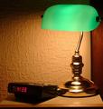
Good Morningby peeceeComment: Nice low-key shot. I like the framing, but would prefer to see more detail in the alarm clock. An analogue clock (preferably with some green in it to parallel the lamp) might be a better choice. Definitely "every day" objects. |
| Photographer found comment helpful. |
| 08/02/2004 05:21:50 PM |
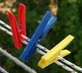
Clothes Pegsby TartugaComment: Interesting subject, but might work better without the bottom two lines showing, and maybe with the green channel desaturated to just show the red, blue and yellow channels. |
| Photographer found comment helpful. |
| 07/30/2004 05:33:36 PM |
|
| Photographer found comment helpful. |
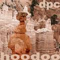
| 07/30/2004 05:32:10 PM |
Delicate Pinnacles Celebratedby dr rickComment: To give the viewer a clear point to focus, maybe desaturate all but the darker orange piller. This would add to the depth of the shot imho. |
| Photographer found comment helpful. |
| 07/30/2004 05:22:44 PM |
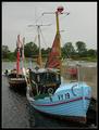
Distant Ports Callingby L1Comment: Since the band name begins with "distant", a wider angle of view would help this (depending on what is outside of the frame i guess). I'd like to see the dock much smaller in the background, to go with your title. |
| Photographer found comment helpful. |
| 07/30/2004 05:20:11 PM |
Drain Pipe Creatures by scalvertComment: I don't know what that is, but I love the creativity. The subtle text around the drain works very well, but might be a bit too subtle. The only technical issue I have is a little softness at the bottom right and top left of the drain (maybe a smaller aperture to bring them in closer focus), but other than that, this is a nice shot. |
| Photographer found comment helpful. |
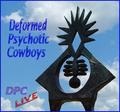
| 07/30/2004 05:18:03 PM |
Deformed Phsychotic cowboysby CamComment: This looks very compressed to me. The picture can be 150 kb max, but this is less than 80 kb. It detracts somewhat from your presentation. The composition here is good, but the frame is unnecessary in my opinion. Not sure about the font (both the style and color) either. |
| Photographer found comment helpful. |
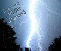
| 07/30/2004 05:16:03 PM |
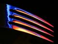
Diehard Power Chargersby TikicharmComment: As impressive as the lightning capture is, I would prefer a different composition. If you had the pixels to work with, maybe having the lightning biased slightly to one side of the frame, or rotating the canvas to give a different angle for the bolt. The centered composition doesn't work here imho. Great capture though. |
| Photographer found comment helpful. |
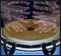
| 07/30/2004 05:14:43 PM |
Dynamic Percussion Companyby ToddhComment: Imho, this is a little too busy for an album cover. I think that with a slower hand movement and/or less times covering up the lens (depending on what technique was used), this would be improved. That way, there would be only a few of the hand "ghosts." With that, I think this would be a great shot. As it is now, it is still nicely done, just a little busy. |
| Photographer found comment helpful. |
Home -
Challenges -
Community -
League -
Photos -
Cameras -
Lenses -
Learn -
Help -
Terms of Use -
Privacy -
Top ^
DPChallenge, and website content and design, Copyright © 2001-2025 Challenging Technologies, LLC.
All digital photo copyrights belong to the photographers and may not be used without permission.
Current Server Time: 07/23/2025 02:23:26 AM EDT.