| Author | Thread |
Comments Made During the Challenge  |
|
|
07/30/2004 05:32:10 PM |
|
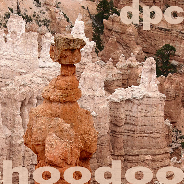
To give the viewer a clear point to focus, maybe desaturate all but the darker orange piller. This would add to the depth of the shot imho. |
|
 Photographer found comment helpful. Photographer found comment helpful. |
|
|
07/27/2004 05:12:21 PM |
|
It seems to me like a horrible name for a band. The shot seems to lack any sense of depth or much differentiation between the different rock formations, leading to a rather disinteresting mesh of brown. |
|
| Photographer found comment helpful. |
|
|
07/27/2004 03:20:14 PM |
|
Nice use of solid text in matching colours to image content. I kind of like this but it's just a touch bland. 7 |
|
| Photographer found comment helpful. |
|
|
07/27/2004 06:52:32 AM |
|
Well done..my only criticism (this is personal choice) would be to try the text in a more contrasting colour (black maybe). |
|
| Photographer found comment helpful. |
|
|
07/26/2004 05:40:39 PM |
|
really like your text effect mixed with the photo |
|
| Photographer found comment helpful. |
|
|
07/26/2004 12:45:15 PM |
|
Interesting photo. I'm not crazy about the band name. It seems shoehorned to fit the photo. IMO, the band name should have determined the photo content, rather than the other way around. I could be wrong in my assumption--this is just how it seems to me. The text is decent but I think "hoodoo" should not be resting right on the edge of the frame. |
|
| Photographer found comment helpful. |
|
|
07/26/2004 11:51:32 AM |
|
i really like the way you did the design. the faded lettering works well. i also like how close it is to the edges. nice job. |
|
| Photographer found comment helpful. |
|
|
07/26/2004 08:03:24 AM |
|
Good shot, but to really give it some "punch" you should try dodging and burning it a bit. |
|
| Photographer found comment helpful. |
Home -
Challenges -
Community -
League -
Photos -
Cameras -
Lenses -
Learn -
Help -
Terms of Use -
Privacy -
Top ^
DPChallenge, and website content and design, Copyright © 2001-2026 Challenging Technologies, LLC.
All digital photo copyrights belong to the photographers and may not be used without permission.
Current Server Time: 06/30/2026 02:52:52 PM EDT.