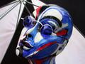
DPChallenge: A Digital Photography Contest You are not logged in. (log in or register
 
Browse Settings
Currently viewing:
Registered UserRiderGal

Show comments:

Per page:

Order:

Comments:


Comments Made by RiderGal
Pages:   ... [69] [70] [71] [72] [73] [74] [75] ... [78]
Showing 711 - 720 of ~776
Image Comment
Natural Stream in the Natural State
12/16/2002 06:43:07 PM
Natural Stream in the Natural State
by kandyj

Comment:
Good idea, and nice job of not having signs of man. However I don't think this photo is extremely visually appealing, and there is no real point that I can tell to look at. I don't care for the composition and I think this photo could have been done better. I maybe would have approched this photo from a different angle. You met the challenge, but I don't care for the photo. -4
Photographer found comment helpful.
Rocky Creek
12/16/2002 03:47:07 PM
Rocky Creek3rd Place
by joanns

Comment:
Beautiful, this looks like a painting. Love the way there is no obvious intrusion of man, no footsetps and everything is perfect. Great job! definitely fits the challenge, and I like the receding lines of the trees and the way you put this in black and white. It's a classic! Only thing I would say is that the top left looks a little light... not really a lot of definition there but that could have been caused by the weather, or that may have been what you were trying to achieve. -9 Great Job!
Photographer found comment helpful.
The Calm Before the Swirl
12/14/2002 01:08:53 PM
The Calm Before the Swirl
by Digipixer

Comment:
Critique Club
First off I just have to say, my boyfriend thought this was hilarious, and he loved it. :-)

Composition - I like the composition here... Good use of the rule of thirds. Good placement of the little guy.

Exposure - Its tough to tell on the exposure here cause you have something very light on a dark background. He almost looks a tad bit underexposed to me. Especially the tail, I wish I could see more detail on the tail.

Color - the color is interesting, rather bland though.

Focus - the focus on him is excellent,

Background - I don't care for the background here... maybe a solid background of blue tinted water would have looked good. Personally I can't tell whats in the background, and it's rather distracting.

Fit For Challenge - I suppose I can see where you were going with the blue water, however it turned out somewhat green. And this picture doesn't make me feel blue... it makes me laugh, which doesn't add to the challenge criteria of evoking blue.

Ligthing - tough to say, because of the water... good job on not having too many hot spots though!

Wowability - personally I don't think there is any, though I guess my bf saw some!

Final comments are that I would have maybe experimented some more with this picture... the water looks dirty on the top, and I"m just not sure if this is a very appealing picture. Good try though!
Photographer found comment helpful.
feeling blue
12/14/2002 12:48:50 PM
feeling blue
by KAOS

Comment:
Critique Club
First off I think this is a very interesting picture... I like what you did with it.

Composition - the composition of this appeals to me. Granted it is not classical composition but I like it all the same! I love the way the lines of the umbrella lead to "her" face.

Exposure - The exposure on this shot seems excellent to me! You got all the colors and nothing looks burnt out. Nice job on that!

Color - the color here is wonderful! Nice and bright, and very attractive.

Focus - once again, you've done a great job! Especially good at getting the glasses so sharp!

Background - I think the background would have been better with solid black, or something solid. The double colored detracts from the face which is what you want the viewer to pay attention to. You used what you had on hand though, and thats understandable. Great thinking on using the umbrella however, because the busy street, or whatever is behind the "girl" would have been distracting!

Fit For Challenge - here's where I have a bit of a problem. To me, her facial expression looks like she is smiling, and enjoying the rain. I don't see that she is feeling blue. However, adding the blue glasses was a great touch, and probably made it fit better. Maybe a more appropriate title would have been seeing blue. Just a suggestion...

Lighting - not bad. There is a somewhat bright spot at the top of her head, but otherwise I think this is wonderful. Nice job.

Wowability - Hey... I like it! It catches your eye... it's a hell of a lot more interesting then some of the blue pics, and its very different.

Overall wonderful job. I really liked this photo, and I think the only thing that subtracted points from it, was that it didn't look like it was feeling blue. Could have fit the challenge a tad bit better. This is great though, and I suggest you go and show the artist... I think she'll like it! Nice job!
Photographer found comment helpful.
Lemon DROPS
12/12/2002 04:46:03 PM
Lemon DROPS
by justine

Comment:
Beatiful colors, and I'm so glad you put in the droplets and the seeds for extra interest. Although I often like a shallow DOF, I think this picture may have been better with a wide one. Just personal preference though. Nice job though, and good luck! - 7
Photographer found comment helpful.
Spaghetti
12/12/2002 04:42:14 PM
Spaghetti
by Jacko

Comment:
Very interesting... not really a subject I would ever think of shooting. Very nice macro, as I assume those aren't gigantic spaghetti sticks! Hehehe... there is some loss of color and clarity at the corners, this can be due to the lens that makes up your lens. To correct this, you have to shoot a subject that you can crop. Just a suggestion though. Pretty good lighting, I love this pic! -7
Photographer found comment helpful.
Maybe I Can Sneak Into DPC2
12/11/2002 04:58:45 PM
Maybe I Can Sneak Into DPC2
by GeneralE

Comment:
When taking portraits pay special attention to your background! You have telephone wires coming out of his head, and a house growing out of his neck. This is a rather boring shot... but the focus is excellent.
Photographer found comment helpful.
Melancholy Melody
12/11/2002 04:37:15 PM
Melancholy Melody
by nards656

Comment:
Very interesting perspective on this beautiful instrument. Too bad about the hot spot bottom left and the reflection in the top right. Great photo though! - 8
Photographer found comment helpful.
Abstract Martini
12/11/2002 04:34:19 PM
Abstract Martini
by Alecia

Comment:
Very interstin picture here! I love th blue background and the bright colors of the martini. Very modern looking. Nice job! - 8
Photographer found comment helpful.
Harsh lands
12/11/2002 04:33:02 PM
Harsh lands
by Natasha

Comment:
Good choice of making this black and white, very dramatic and lovely! I love the sky... Really nice photo... I only wish the stuff aroundd the tree was a little more interesting. Nice job though! -8
Photographer found comment helpful.
Pages:   ... [69] [70] [71] [72] [73] [74] [75] ... [78]
Showing 711 - 720 of ~776


Home - Challenges - Community - League - Photos - Cameras - Lenses - Learn - Help - Terms of Use - Privacy - Top ^
DPChallenge, and website content and design, Copyright © 2001-2025 Challenging Technologies, LLC.
All digital photo copyrights belong to the photographers and may not be used without permission.
Current Server Time: 08/20/2025 12:57:45 PM EDT.