| Image |
Comment |
| 01/12/2003 07:42:30 PM |
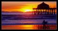
Beach Boys - Surfin' USA by byetkoComment: Very nice...great colour. I'd personally have tried to get the surfer out to the left, away from the shadow of the pilons where he seems a bit lost. Nice image though. |
 Photographer found comment helpful. Photographer found comment helpful. |
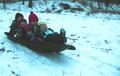
| 01/12/2003 07:38:41 PM |
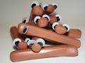
Who let the dogs out? Who?by justineComment: This is hilarious...I think I'd have chosen a different background than the bland grey for such a fun image. Perhaps a colourful, torn-open hotdog package or something. Great idea though. |
| Photographer found comment helpful. |
| 01/12/2003 07:37:00 PM |
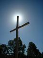
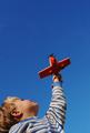
Amazing Grace, how sweet the sound, that saved a wretch like meby Delta_6Comment: I really like the top 2/3rds of the shot, lovely colours and tones. The trees are a bit of a problem, though...I think the tree behind the cross encroaches on it a bit too much for the cross to really stand out. I like how they converge on the spot but I think it'd have been more effective from a lower angle, getting the sun to shine from the cross' intersection. |
| Photographer found comment helpful. |
| 01/12/2003 07:33:46 PM |
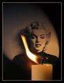
Candle in the Windby Harz_JoergComment: This is the pick of the week for me...love how the flame frames her face. Great lighting, and the frame really picks out the highights. 10. |
| Photographer found comment helpful. |
| 01/12/2003 07:32:39 PM |
tired of sexby andresComment: Weeezer...nice, though the lighing is a bit harsh. The image starts to degrade towards the left, and is a bit blown out at the right. White balance isn't really nailed. Good composition, though. |
| Photographer found comment helpful. |
| 01/12/2003 07:31:11 PM |
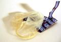
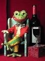
Jeremiahby mcmurmaComment: Not too bad...very clear and excellent sharpness. This might be a contender, if enough people get the wine reference. Did you help him drink it? I imagine yes... |
| Photographer found comment helpful. |
| 01/12/2003 07:28:32 PM |
Given to Flyby welcherComment: I'd have avoided the branches on the left...they're very distracting. Would like to see all of his head - if you centered him at the bottom of the frame it'd have a lot more impact. Big ups to the PJ. |
| Photographer found comment helpful. |
| 01/12/2003 07:24:05 PM |
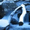
Iceby lumbusComment: The bright snowy bits are a bit blown out - the log in the middle of the frame doesn't really add much, and obscures the waterfall, which is the most interesting bit I think...technically well done, though. |
| Photographer found comment helpful. |
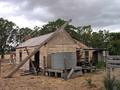
| 01/12/2003 07:21:27 PM |
This ol' House (Shakin Stevens)by PtmanComment: The fence on the right hand side cuts into the house a bit, I'd have taken the shot a bit more to the left I think. It's always challenging to shoot into the light source but you've managed to keep the detail in the shadows, for the most part. If I had to hazard a guess, this looks like PTMAN's work...?? Seems Australian to me! Nice clarity to the shot. |
| Photographer found comment helpful. |
| 01/05/2003 08:27:38 PM |
|
| Photographer found comment helpful. |
Home -
Challenges -
Community -
League -
Photos -
Cameras -
Lenses -
Learn -
Help -
Terms of Use -
Privacy -
Top ^
DPChallenge, and website content and design, Copyright © 2001-2025 Challenging Technologies, LLC.
All digital photo copyrights belong to the photographers and may not be used without permission.
Current Server Time: 08/26/2025 08:59:48 PM EDT.