| Image |
Comment |
| 02/10/2007 11:08:11 AM |
Shyby pacpintoComment: Love how the end of the stem looks just like a foot. And he really does look shy. Nice! |
 Photographer found comment helpful. Photographer found comment helpful. |
| 02/10/2007 11:07:32 AM |
|
| Photographer found comment helpful. |
| 02/10/2007 10:34:12 AM |
vergelijk1.jpgby AzrifelComment: Fantastic work! Once you see the larger version, it really becomes apparent just how time consuming this must be! |
| Photographer found comment helpful. |
| 02/10/2007 08:44:25 AM |
guitar3.jpgby manishComment: I love the dramatic lighting here! Again, levyj413 hit the points I would mention. The strings are a bit too dark... I don't know if a slight adjustment of the lighting would help or not. If not, brighten them up in editing. This is a great use of lighting though! |
| Photographer found comment helpful. |
| 02/10/2007 08:41:53 AM |
guitar2.jpgby manishComment: levyj413 hit a lot of the small nitpicks that I saw too. They add up and become distracting to what is an interesting idea. The colors on the guitar at the bottom get the halo effect which seems very unnatural, and I think that is the biggest distraction to me. Also, I think I would have given a bit more space when cropping the top of the shot. Fix up those things that levy mentioned and repost! :) |
| Photographer found comment helpful. |
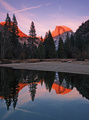
| 02/10/2007 08:34:18 AM |
Gorge Sunsetby matthewnComment: Beautiful colors! I love the silhouettes of the tree tops, but there's something about the composition that is a bit static. I think I might also fill in that one bright spot near the bottom. That is the one thing that my eye keeps moving towards after the sun. |
| Photographer found comment helpful. |
| 02/10/2007 08:22:54 AM |
Chrysalisby LeeDComment: Greetings from the Critique Club!
My first impression of this shot is that it is refreshingly creative and thought provoking. The green hues are a bit too harsh for my tastes.
It looks like you got plenty of comments to help you with this shot. The idea of changing this to a b/w, or a more muted tone I think is a good one. There is also a small section of the back which is less green than the other areas, which stands out once I noticed it.
The fabric around the head also seems somewhat cut out, and not as soft as the rest of the edges. Combined with the green border, it gives it more of a sci-fi look, than a soft and natural look. Adjusting the lighting might have also helped to make this softer.
Overall though, this is a great show of creativity. It isn't the typical DPC ribbon winning shot, but it clearly made an impact with the voters, recieving so many comments during the voting process. And sometimes, I think that is more important!
Please feel free to PM me if you have any questions about this critique.
|
| Photographer found comment helpful. |
| 02/09/2007 06:13:41 PM |
table topby whiterookComment: I didn't vote on this challenge, but I had peeked at the thumbnails. The left tilt, low contrast, grain and of course the chessboard, totally gave it away for me that this was a whiterook photo! |
| Photographer found comment helpful. |
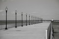
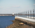
| 02/05/2007 07:31:45 PM |
Ft. Tabor Pier IIby CapeSailComment: I think one of the keys to B&W conversion is to use the full range of tones from black to white. Hope you dont mind... I did a quick edit of this shot, and listed the steps I used so you can see them. It's just in my workshop portfolio, so I believe only accessible by the link below. I was using Photoshop Elements for it.
 |
| Photographer found comment helpful. |
| 02/05/2007 07:02:32 PM |
|
| Photographer found comment helpful. |
Home -
Challenges -
Community -
League -
Photos -
Cameras -
Lenses -
Learn -
Help -
Terms of Use -
Privacy -
Top ^
DPChallenge, and website content and design, Copyright © 2001-2025 Challenging Technologies, LLC.
All digital photo copyrights belong to the photographers and may not be used without permission.
Current Server Time: 08/15/2025 11:55:49 PM EDT.