| Author | Thread |
|
|
02/10/2007 08:41:53 AM |
|
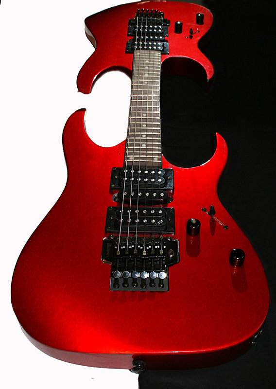
levyj413 hit a lot of the small nitpicks that I saw too. They add up and become distracting to what is an interesting idea. The colors on the guitar at the bottom get the halo effect which seems very unnatural, and I think that is the biggest distraction to me. Also, I think I would have given a bit more space when cropping the top of the shot. Fix up those things that levy mentioned and repost! :) |
|
 Photographer found comment helpful. Photographer found comment helpful. |
|
|
02/10/2007 12:09:58 AM |
I like the overall idea. A few nitpicks:
- The crop is very tight at the top.
- The shot's pretty noisy (all the little dots and apparent texture in what I assume is really a smooth red surface)
- There's a little point sticking out of the top guitar on its lower left corner
- The curved shadow under the left side of the top guitar is showing editing signs - it's not a smooth curve and it blurs and gets sharp at random. To clean that up, try zooming way in and using a very small brush that's not very hard. If you're having trouble seeing the shadow's edge to trim it, create a brightness layer and make it bright enough to see. Just turn that layer off for your final image. I use that trick often when working on dark areas of images.
- There's a little speck of darkness below left side of the bottom of the bottom guitar.
- There's a dark speck in the upper left corner
Each of those is small, but they add up. Keep at it! I'm regularly amazed at what I've missed after editing something for a long time. |
|
| Photographer found comment helpful. |
Home -
Challenges -
Community -
League -
Photos -
Cameras -
Lenses -
Learn -
Help -
Terms of Use -
Privacy -
Top ^
DPChallenge, and website content and design, Copyright © 2001-2026 Challenging Technologies, LLC.
All digital photo copyrights belong to the photographers and may not be used without permission.
Current Server Time: 07/17/2026 11:35:43 AM EDT.