| Image |
Comment |
| 02/02/2003 04:16:57 PM |
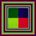
Borders Gone Mad :-)by marboComment: I started this, but it got to be a bit too much, as has this one. Right on for the challenge, nice combination of colors, clean and clear focus. Technically good photo. Mercy but it gets to my eyes. Still it's a good photo and well done. |
 Photographer found comment helpful. Photographer found comment helpful. |
| 02/02/2003 04:13:52 PM |
Croatian female soccer team- front detail :-)by miracComment: Sure meets the challenge of "square" but maybe ought to be counted off because your squares are rounded some. They're still good squares. Looks like the purina chow lady. Good clean focus, not too bright, but easy to see. Nice job. |
| Photographer found comment helpful. |
| 02/02/2003 04:09:39 PM |
squAreSby GordonComment: I see the squares and I see the "A" and the "S" (barely), now what? I know these 2 letters have something to do with it because they are in the title but what? Since they are in the title they should be lighter and in better focus, in my opinion. Hope you explain this one. |
| Photographer found comment helpful. |
| 02/02/2003 03:53:25 PM |
Krabby magnetic9999Comment: The crab looks good but I'm not too sure about whatever that is under the olive. Doesn't really look like sour cream. This is a unique idea. Well thought out and well photographed. The cropping doesn't do anything for me, one way or another. The shadow bothers me a little. Maybe some secondary light. Other than the shadow the brightness is real good. Good over all shot. |
| Photographer found comment helpful. |
| 02/02/2003 03:48:35 PM |
Shadow of a squareby dimitriiComment: Beautiful wood the shadow is on. And I really like how inside the square is real bright and around the outside is darker. Well done. The wood appears different inside the square, other than just the light. Nice one. |
| Photographer found comment helpful. |
| 02/01/2003 11:52:34 PM |
|
| Photographer found comment helpful. |
| 02/01/2003 11:49:01 PM |
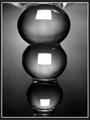
Distorted Squaresby MaYzComment: What is the square reflected in? A lamp? Can't quite figure it out. Like the tone of the photo. Good choice. Brings your eyes more to the squares. Well done. |
| Photographer found comment helpful. |
| 02/01/2003 11:45:53 PM |
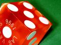
Las Vegasby LanceComment: Nice sharp focus. Wish you didn't have the shadows. Like the leaning of the die. It is so sharp you feel you can almost touch it. Like the green background. Adds to the authenticity of Vegas. Nice photo inspite of the shadows. |
| Photographer found comment helpful. |
| 02/01/2003 11:29:16 PM |
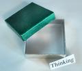
Something Too Rareby togtogComment: Nice photo with the exception - and you've probably heard it over and over - the "Thinking" sign is not cut straight. Really distracting - holds your attention - really stands out bodly. I hate it for you. Seriously, because without that it is a very restful and relaxing photo. Really like your choice of colors. |
| Photographer found comment helpful. |
| 02/01/2003 11:20:15 PM |
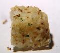
One Square Mealby AnachroniteComment: Not for me. The ants can have it. Wish it had been in a little better focus so the ants would really stand out. Especially the one falling off and the one laying on it's back. Looks like it wasn't good for them either. Nice photo. |
| Photographer found comment helpful. |
Home -
Challenges -
Community -
League -
Photos -
Cameras -
Lenses -
Learn -
Help -
Terms of Use -
Privacy -
Top ^
DPChallenge, and website content and design, Copyright © 2001-2025 Challenging Technologies, LLC.
All digital photo copyrights belong to the photographers and may not be used without permission.
Current Server Time: 08/07/2025 06:10:35 AM EDT.