| Image |
Comment |
| 10/10/2005 09:07:26 AM |
Complementary.Colors.by TejComment: Great closeup of the beautifully patterned butterfly against the yellow flower. Unfortunate that the complementary colour to the green leaves would have been a violet-tinged red. If the leaves were more of a blue to blue-violet tone, this fine photo would also have demonstrated the complementary colour contrast. |
 Photographer found comment helpful. Photographer found comment helpful. |
| 10/10/2005 09:00:06 AM |
Illuminated Equilibriumby theantonComment: The red and the dull green can be considered complementary colours, but the yellow light destroys the effect. Great composition, nice visual balance, but the LED needs to be green to demonstrate complementary colour contrast. |
| Photographer found comment helpful. |
| 10/10/2005 08:56:48 AM |
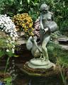
earth waterby drz01Comment: The predominant colours in this photo are green tones. To demonstrate complementary contrast, you would have needed more red-orange colours in the flowers. However, if you had changed your angle and shot the goldfish with the bronze of the statue or the green waterlily leaves, you would have had a fine demonstration of complementary colour contrast. |
| Photographer found comment helpful. |
| 10/10/2005 08:53:53 AM |
Children in Sapaby letuananhComment: Complementary colours are pairs of colours that contrast strongly when compared to each other.
Apart from the flashes of red in the children's clothing, all the colours are so desaturated that the blues and the oranges do not demonstrate the effect of complementary colour contrast. Your image demonstrates a duotone effect rather than the effect of complementary colours.
It's a touching photo, though, and sent me looking for more information on Sapa. |
| Photographer found comment helpful. |
| 10/10/2005 08:51:36 AM |
pretty in Pink and Blueby kiwinickComment: The predominant colour in this photo is the blue in the lower half. The child's jacket needs to be more orange-yellow to provide a complementary colour contrast. In addition, the green grass and the colours of the park scene above the child's head take away from the contrast of two colours against each other.
|
| Photographer found comment helpful. |
| 10/10/2005 08:49:09 AM |
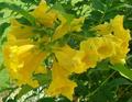
Bloomby dzone1Comment: Complementary colours are pairs of colours that contrast strongly when compared to each other.
The green foliage would require a red-toned flower to demonstrate complementary colours.
Check some of the forum discussions on complementary colours for suggestions on using colour for contrast.
|
| Photographer found comment helpful. |
| 10/10/2005 08:42:42 AM |
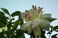
a very good compinationby hossamComment: Unfortunately, this fine photo does not show complementary contrast. Your flowers should have been a violet-tinged red to show up the yellow-green in the foliage. Nice shot and great cropping around the flowers! |
| Photographer found comment helpful. |
| 10/10/2005 08:39:17 AM |
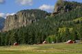
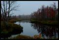
Conspicuous Barnsby RistyzComment: Complementary colours are pairs of colours that contrast strongly when compared to each other.
The red of the barns is lost against all the green, brown and blue toned background. Your shot would have been a more successful demonstration of complementary contrast if you had shot from a different angle so the barns aren't so far apart, and cropped tighter around the red and shown some of the green foliage around it as contrast. |
| Photographer found comment helpful. |
| 10/10/2005 08:37:16 AM |
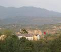
Flagby avermaaComment: Complementary colours are pairs of colours that contrast strongly when compared to each other.
The red of the flag is lost against all the blue toned background. Your shot would have been a more successful demonstration of complementary contrast if you had cropped tight around the red and shown some of the green foliage around it as contrast. |
| Photographer found comment helpful. |
| 10/10/2005 08:35:03 AM |
Complementary Reflections - Green and Redby notesinstonesComment: Complementary colours are pairs of colours that contrast strongly when compared to each other.
The colours in this photo are so desaturated that the effect of complementary colours is lost. Your image demonstrates a duotone effect rather than the effect of complementary colours.
Check some of the forum discussions on complementary colours for suggestions on using colour for contrast.
|
| Photographer found comment helpful. |
Home -
Challenges -
Community -
League -
Photos -
Cameras -
Lenses -
Learn -
Help -
Terms of Use -
Privacy -
Top ^
DPChallenge, and website content and design, Copyright © 2001-2025 Challenging Technologies, LLC.
All digital photo copyrights belong to the photographers and may not be used without permission.
Current Server Time: 07/31/2025 04:34:26 PM EDT.