| Author | Thread |
Comments Made During the Challenge  |
|
|
10/11/2005 03:35:31 PM |
|
the colour seems very flat on the flower |
|
 Photographer found comment helpful. Photographer found comment helpful. |
|
|
10/11/2005 12:12:55 AM |
|
I think you should have played with the colors a little more, nice picture though. |
|
| Photographer found comment helpful. |
|
|
10/10/2005 08:49:09 AM |
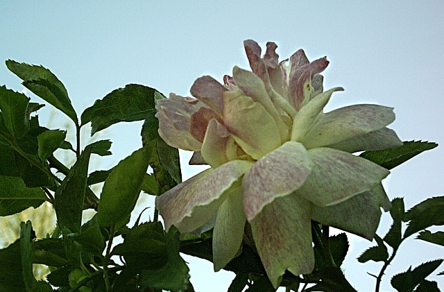
Complementary colours are pairs of colours that contrast strongly when compared to each other.
The green foliage would require a red-toned flower to demonstrate complementary colours.
Check some of the forum discussions on complementary colours for suggestions on using colour for contrast.
|
|
| Photographer found comment helpful. |
|
|
10/09/2005 08:58:30 PM |
|
those arent complimentary colors. |
|
| Photographer found comment helpful. |
|
|
10/09/2005 02:11:19 PM |
|
The blossom has a great deal of character and depth. The lighting on the bloom is dull, however. The background tree is somewhat distracting. Noise lends a bit of an old-fashioned feel to the subject, just too many distractors to make this an exception rendering of the subject. |
|
| Photographer found comment helpful. |
|
|
10/08/2005 11:43:36 PM |
|
Really grainy. Try lowering the ISO on this. |
|
| Photographer found comment helpful. |
|
|
10/06/2005 07:55:44 PM |
|
looks a little grainy, or oversharpened |
|
| Photographer found comment helpful. |
|
|
10/06/2005 12:08:22 PM |
|
Poor exposure, grainy, I don't see the complementary colours. |
|
| Photographer found comment helpful. |
|
|
10/06/2005 07:04:44 AM |
|
I am not sure as which are the Complementary Colours. This picture is a bit bland. There is also a lot of noise. |
|
| Photographer found comment helpful. |
|
|
10/06/2005 01:05:09 AM |
|
Interesting picture. Its a bit grainy and hard to really appreciate the colors that are on this flower. Maybe shoot from a different angle. |
|
| Photographer found comment helpful. |
|
|
10/05/2005 02:54:33 PM |
|
| Photographer found comment helpful. |
|
|
10/05/2005 02:25:33 PM |
|
This doesn't quite work as complementary colors for me. |
|
| Photographer found comment helpful. |
|
|
10/05/2005 09:08:54 AM |
|
| Photographer found comment helpful. |
Home -
Challenges -
Community -
League -
Photos -
Cameras -
Lenses -
Learn -
Help -
Terms of Use -
Privacy -
Top ^
DPChallenge, and website content and design, Copyright © 2001-2026 Challenging Technologies, LLC.
All digital photo copyrights belong to the photographers and may not be used without permission.
Current Server Time: 06/28/2026 07:41:37 PM EDT.