DPChallenge: A Digital Photography Contest You are not logged in. (log in or register
 
Browse Settings
Currently viewing:
Registered Userlivitup

Show comments:

Per page:

Order:

Comments:


Comments Made by livitup
Pages:   ... ...
Showing 231 - 240 of ~431
Image Comment
You Can't See the Cheese Because It's in the Mouse That I Ate...
12/14/2005 08:46:22 AM
You Can't See the Cheese Because It's in the Mouse That I Ate...
by sacs

Comment:
It's a good concept, but there are a few things wrong with this photo:

1) There's a blue cast to the whole thing.
2) The background is odd and doesn't add anything to the photo.
3) The lighting is poor.
4) There are sensor dust spots in the upper right corner.

I think this concept needed a little more development to make a better photo.
Photographer found comment helpful.
Carver
12/09/2005 01:57:10 PM
Carver
by GeneralE

Comment:
::: Critique Club :::
Greetings from the Critique Club!

First Impression - the most important one:
The composition is awkward... I've never wanted to be so close to a ham. :)

Composition:
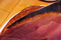
I think this is the weakest point of this photo. A fatty ham hock isn't something that I've ever really wanted to inspect in detail. As another commenter noted the plate in the upper right corner is distracting. I do like the lines of the table, they add grounding to the photo. I also would have gotten a brand new knife (even if it is just a $5 wal-mart special) so that it was nice and shiny. I also wouldn't have put the knife in and out of the ham, there's fat on the blade, which is kind of "oogy."

Subject:
The idea itself is a good one, and germane to the challenge. It's traditionally the man's place to carve the holiday feast. I just think this idea could have been presented in a far more photogenic way.

Technical (Colour and light):
The light falls off significantly on the right side of the picture. Actually, the more I look at it, the light falls out above the ham; really, it's the underexposure of the knife that bothers me. The color is nice and "pops," but it seems a little warm and orange-ish, perhaps the white balance was slightly off? The sharpening is right on, not too sharp, no strange artifacts.

Summary:
This seems like an "opportunistic" shot to me. You were there, getting ready to carve the ham, and said, "Wait, let me take a picture!" DPC rewards those who work hard at getting the shot, and that reflects in your score. I've looked through your past challenge entries and I think your shots fall into two categories: some that score really well, that you've put some thought into, and some which don't score so well, that look like you just snapped a picture because you were there. As long as you don't expect too much from the latter category, then that's fine.

Finally, I'd like to ask you to consider "critiquing the critique." A lot of effort goes into these critiques, and I enjoy learning how I can do them better. Does what I said make sense? Is it way off base? Did I enlighten you? Offend you? Please let me know via a private message what you think of this critique, so I can give better ones in the future.

Thanks, and good luck at DPC!
---Andrew
Photographer found comment helpful.
Industrial Bronze
12/07/2005 05:27:35 AM
Industrial Bronze
by fotomann_forever

Comment:
Didn't vote this challenge, but would have given it a 9.
Two things keep it from a 10 in my book...

1) Would have liked to see more detail in the hair.
2) The commenters are right, the expression in her face is awful.

Pity that more don't get it. I would ask if it was "worth it" for Van Gogh to cut off his ear, but they'd probably say no to that too... with a consenting adult who is aware of the risks what's the problem? And put clothes on her and you've got Rosie the Riviter. The nude adds 1000% impact to me.

A GREAT shot, something for you to be very proud of. Worthy of my favorites list, anyway. :)
Photographer found comment helpful.
Suits Me
12/04/2005 10:12:15 PM
Suits Me
by Brenb

Comment:
It's cute, and I get it, but...

Maybe it's too cute. I'm not sure exactly what the problem here is, but it's just not a strong contender in this challenge for me.
Photographer found comment helpful.
Maturity's Sacrifice Feeds the Vigor of Youth
12/04/2005 10:11:13 PM
Maturity's Sacrifice Feeds the Vigor of Youth
by DrAchoo

Comment:
A beautiful sharp shot, but I'm not sure what this has to do with the challenge.
Photographer found comment helpful.
Finally, some time to unwind!
12/04/2005 10:10:30 PM
Finally, some time to unwind!
by youngnova

Comment:
Not a strong tie to adulthood... more playful child than adult.
Photographer found comment helpful.
Summer to Fall
12/04/2005 10:10:08 PM
Summer to Fall
by jmritz

Comment:
Beautiful shot, but not a strong tie to adulthood...
Photographer found comment helpful.
Passion
12/04/2005 10:09:47 PM
Passion
by zapgrafx

Comment:
Not a strong tie to adulthood...
Photographer found comment helpful.
Daddy
12/04/2005 10:09:24 PM
Daddy
by sestevens

Comment:
Not a strong tie to adulthood. With the focus on the toy truck it seems almost more a story about childhood and play.
Photographer found comment helpful.
Night Rod
12/04/2005 10:08:42 PM
Night Rod
by vtruan

Comment:
Not a strong tie to adulthood...
Photographer found comment helpful.
Pages:   ... ...
Showing 231 - 240 of ~431


Home - Challenges - Community - League - Photos - Cameras - Lenses - Learn - Help - Terms of Use - Privacy - Top ^
DPChallenge, and website content and design, Copyright © 2001-2025 Challenging Technologies, LLC.
All digital photo copyrights belong to the photographers and may not be used without permission.
Current Server Time: 08/04/2025 10:02:44 PM EDT.