|
|
|
Showing 881 - 890 of ~1193 |
| Image |
Comment |
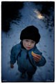
| 03/12/2007 10:54:44 AM | Day 2 - In colourby xianartComment: I have no idea what you did when you processed this (lots of terms there I don't know), but I love the shot. It is really strongly focused on the face and the orange, so much more so than the original (which already was, if that makes sense). Excellent image. |  Photographer found comment helpful. Photographer found comment helpful. |
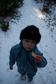
| 03/12/2007 10:53:01 AM | Day 1 - Straight from the cameraby xianartComment: I'm a bit behind in commenting, but here goes. I think this is great material for a wonderful image (as can already be seen from the thumbs of the processed versions). | | Photographer found comment helpful. |
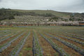
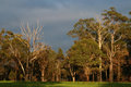
| 03/10/2007 06:12:20 PM | minimalismchallenge2.1web1.jpgby cogeroxComment: I like this shot, it draws me in, and it does look like the lighting was not cooperating. I like the lines, too, but I didn't get a feel from this of what you saw, and what you wanted us to see. Maybe if the trees were brighter (or popped, as was suggested), or if it was cropped differently, that would help. There's also "something" (lens reflection? smoke from a chimney), near the crease where the top hill meets the next one down that could probably be cloned out fairly readily. Looking forward to seeing the edits! | | Photographer found comment helpful. |
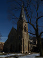
| 03/10/2007 06:08:26 PM | Day 1by HipychikComment: I love it, and yes, it looks like the steeple on the church I shot yesterday, but just at first glance. I like the shot, and the color of the sky is brilliant. I think doing anything with the building to the left is going to be double tough. A straight crop won't work (but might if you shift the perspective), and I don't think you could have composed this shot without including the building. A shot from the front without the building would be, well, different. I actually don't mind the building, as I find the church such a draw I really didn't "see" it when I first looked at the shot. | | Photographer found comment helpful. |
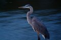
| 03/10/2007 06:03:13 PM | 1 Sec Heron, Minimal PAD.by MelonMusketeerComment: Excellent shot, especially under the conditions. Love how you've handled the lighting and the long exposure. Now, I hate that you can just "stop" on your way home from work and capture this kind of thing. Only even-semi-interesting things I could do that with are all stationary (so I can shoot them anytime). Now, for what  xxrozxx xxrozxx said, let me just say: "You stunned him, just as he was wakin' up! Norwegian Blues stun easily." Sorry, I couldn't resist. | | Photographer found comment helpful. |
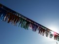
| 03/10/2007 05:19:08 PM | Fringeby AliciaComment: Neat shot, makes me see something I see too often, but in a different light. I love the deep blue sky away from the sun, and the use of the fringe to "hide" the sun just a bit (yet it shows up in the fringe again, giving nice highlights). Can't wait to see it edited. | | Photographer found comment helpful. |
| 03/10/2007 05:07:39 PM | DAY 2. minimal edit project . gumsby rozComment: I agree with what's been said; some greater material here. I like the trees, and the contrast might be up a bit, but I find that easier to deal with. A higher aperture here might have brought more into focus (the tops of the trees to the right should be in sharp focus, but don't seem to be). Was this an early morning/late evening shot? I'm wondering about a shutter at 1/20 with an aperture of f/8 during daytime (even in cloudy weather). Did you have the polarizer on again? That drags light down significantly, and would explain the slow shutter. Can't wait to see it edited; I might increase the saturation a bit and try to brighten the greens a bit. | | Photographer found comment helpful. |
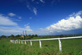
| 03/10/2007 06:02:47 AM | DAY 1. minimal editing project . perspective .by rozComment: Roz, I thought your no-processing shots were going to suck? That was you what said that on the original thread, wasn't it? This shot does not suck!
It's a great shot, and a very strong image to start with. I have a polarizing filter, but I always forget to bring it along! How do you adjust which way to turn it? I don't seem to be able to see a lot of differences in my view finder when I spin mine . . .
Here's what I might try with this shot if it was mine: levels and curves to up the contrast and try to get a bit more detail in the clouds on the right. I would probably also try upping the saturation (maybe with hue, depending on results) to bring up the color of the grass a bit (make it a bit brighter and greener). I would poke around with the channel selector, but I think here it's not needed.
I might also try cloning out the stick on the right, and I might go so far as to try to get rid of the two standing pieces of wood inside the fence (one of which crosses the house), but it's so busy behind them, and I suck so bad at cloning that I would probably give up!
Great shot, I'm looking forward to seeing the processing!
Rob | | Photographer found comment helpful. |
| 03/08/2007 03:11:38 AM | Oblivionby ValdoComment: I really like this image; I understand the post-processing (thanks for including that), but I'd love to hear the back story. Was this a setup? Did you find it "in the wild"? It has such nice balance and curves, but I'm also distracted a little from . Wonderfully done (I didn't vote this challenge, but if I had, this would have been at least an 8, probably a 9, depending on how tired I was by the end). I don't understand the 1-4 votes for it, either, by the way. | | Photographer found comment helpful. |
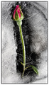
| 03/07/2007 04:54:40 PM | Reaching for the lightby XileboComment: My reaction to this shot was I think based primarily on the effect the colors had on the light in the image. They look bright, but really the whole thing seems bright. I'm not one to say that low key has to be B&W, but the red really exaggerates (at least to my eyes) the overall brightness it. This to me seemed bright overall (even with the background darkened as it was) to be low key. I did a quick conversion to black and white; do that and take a look, it might help you see what I think I was seeing in the color version. The histogram might help, too; it shows a spike at the dark end and then pretty level across the rest of the spectrum. Not definitive, but says something. I hope that helps a bit, sorry for rambling on. | | Photographer found comment helpful. |
|
Showing 881 - 890 of ~1193 |
Home -
Challenges -
Community -
League -
Photos -
Cameras -
Lenses -
Learn -
Help -
Terms of Use -
Privacy -
Top ^
DPChallenge, and website content and design, Copyright © 2001-2025 Challenging Technologies, LLC.
All digital photo copyrights belong to the photographers and may not be used without permission.
Current Server Time: 06/19/2025 06:33:55 AM EDT.
|