| Image |
Comment |
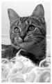
| 01/01/2003 03:40:06 PM |
Chloeby mcmurmaComment: The way the whiskers (especially the ones above the eyes) are much more illuminated than the rest of the face is really distracting to me here and it really takes away from my personal enjoyment of the shot. The focus is great here, and aside from barely clipping that right ear off the framing is great as well. An impressive shot. 7 |
 Photographer found comment helpful. Photographer found comment helpful. |
| 01/01/2003 03:37:31 PM |
Amber Brkich of Survivor II: Australiaby alanfreedComment: Great framing. Because the shirt is completely black, the arm reaching across her chest is impossible to see, and I think that gives the shot a somewhat awkward feel. However, I do really like how the hand is holding the hat, so I don't think the pose is all bad, but I think some contrast between the arm and the rest of the shirt would help. 7 |
| Photographer found comment helpful. |
| 01/01/2003 03:33:34 PM |
Liliby JackoComment: It'd be better off without the fluffy stuff at the bottom of the frame, otherwise I like the framing and the shot in general. 6 |
| Photographer found comment helpful. |
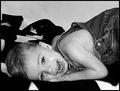
| 12/30/2002 12:36:30 AM |
blissby FrooberComment: The black and white of the blanket don't seem to work well along with the plain grey background. If one or the other were present I think it would work better. As is it seems to turn the top left corner into cluttered space instead of negative space. Good expression and a cute kid. 6 |
| Photographer found comment helpful. |
| 12/30/2002 12:31:23 AM |
97 years old and I STILL didn't get what I wanted!by GekkerComment: Looks like a flash was used, and I think the shot would have looked better with a different light source. The angle and the way the glasses are positioned I can't tell if she is looking down or sleeping. There doesn't seem to be enough contrast on the face itself, which I think goes back to the light source again. Framing seems to work pretty well. 4 |
| Photographer found comment helpful. |
| 12/30/2002 12:28:13 AM |
A Dogs Lifeby togtogComment: interesting idea, but this picture doesn't seem very visually appealing to me. The background (which makes up much of the shot) is uninteresting and somewhat distracting. The facial expression is good. I'm not sure if a dog's perspective was the best choice for a portrait shot, but I'll credit you for being more unique than most entries. 5 |
| Photographer found comment helpful. |
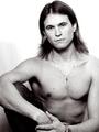
| 12/30/2002 12:24:59 AM |
Boldby AleciaComment: Nice, crisp shot. Looks a little bit like it should be going onto a romance novel cover, (a bit cliche looking) which turns me off somewhat. not bad overall. 6 |
| Photographer found comment helpful. |
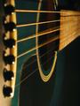
| 12/19/2002 11:21:22 PM |
Shaken, not stirred... by AleciaComment: The colors and general tone of this photo really appeal to me. Good call with the thin black boarder as well. Great shot. 9 |
| Photographer found comment helpful. |
| 12/11/2002 08:17:09 PM |
E-Motionby kandyjComment: Pretty good portrait. The background seems a little distracting, and the subject isn't particularly interesting to me. 5 |
| Photographer found comment helpful. |
| 12/09/2002 01:13:41 AM |
|
| Photographer found comment helpful. |
Home -
Challenges -
Community -
League -
Photos -
Cameras -
Lenses -
Learn -
Help -
Terms of Use -
Privacy -
Top ^
DPChallenge, and website content and design, Copyright © 2001-2025 Challenging Technologies, LLC.
All digital photo copyrights belong to the photographers and may not be used without permission.
Current Server Time: 08/23/2025 03:54:01 PM EDT.